
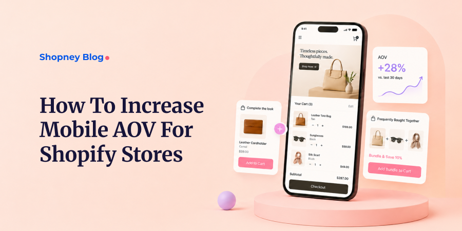

Most of your traffic is on mobile. Most of your average order value is not.
Across industry benchmarks, mobile now drives the bulk of eCommerce sessions, yet desktop has historically converted close to twice as well and produced a higher average order value per order.
Dynamic Yield’s device data and similar benchmarks show the same pattern, though express payment options have started to narrow the conversion side of that gap.
That gap is the opportunity. If mobile is where your shoppers are but your AOV underperforms there, mobile is your highest-leverage surface, not your hardest one.
This may also mean turning your Shopify store into a mobile app to create a faster, more focused shopping experience for returning customers.
This guide is for merchants who have already tuned their desktop experience and now watch mobile lag behind. You will get the specific levers that raise AOV on a small screen, the Shopify mechanics to set them up, and how to measure whether they worked.
One rule frames everything below: on mobile, you raise AOV by removing taps and decisions, not by adding them.
1. Why mobile AOV often lags behind desktop
Before you fix the gap, understand what causes it. Mobile suppresses AOV for reasons that have little to do with your products.
- Screen space is scarce. Every upsell, bundle, or progress bar competes with the one element that matters most: the add-to-cart button.
- Friction is higher. Typing, scrolling, and re-entering payment details cost more effort on a phone than on a desktop.
- Sessions are shorter and more distracted. Mobile shoppers browse in line, on the couch, or between tasks, so you have less attention to work with.
- Trust runs lower on small screens. Shoppers hesitate to build a larger cart when the experience feels cramped or slow.
There are also two different mobile surfaces, and they behave differently. Mobile web is where most sessions and most of this friction live. A native app is a more controlled, lower-friction environment, which matters in Section 3.
Watch out: The most common mistake is treating mobile as a shrunk-down desktop layout. A desktop upsell grid that looks elegant on a 27-inch monitor becomes an unscrollable wall on a phone.
Next action: Before changing anything, confirm the gap exists in your own store. That starts with measurement.
2. Find your mobile AOV baseline first
You cannot optimize what you have not segmented. Sitewide AOV hides the mobile problem inside the desktop average.
Shopify gives you device-level data in a few steps:
- Go to Analytics → Reports in your Shopify admin.
- Open the Sales over time or Sessions report.
- Add a breakdown or filter by Device type (mobile, desktop, tablet).
- Compare AOV and conversion rate across devices.
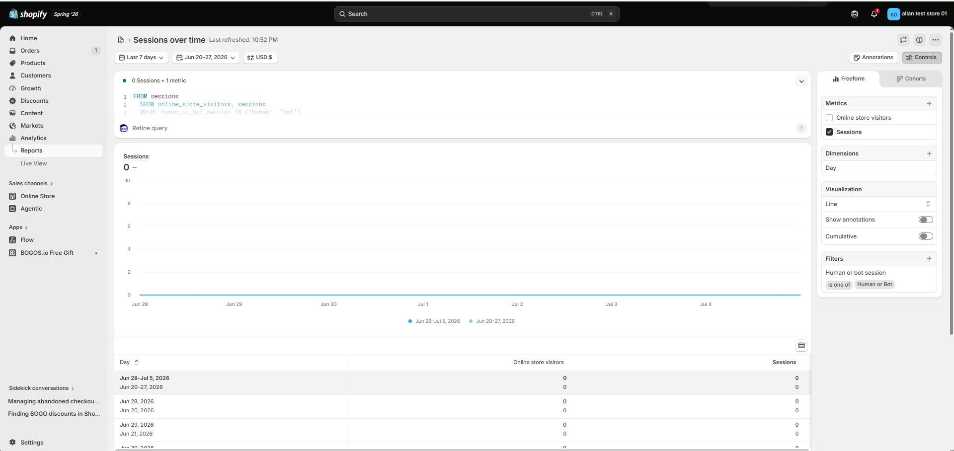
Read three numbers alongside mobile AOV: mobile conversion rate, items per order, and the take rate of any offer you already run. Together they tell you whether the issue is small carts, few buyers, or both.
Tip: Put mobile and desktop AOV side by side and calculate the gap as a percentage. A 25 to 40 percent shortfall is common. Anything wider usually points to a fixable experience problem, not just shopper intent.
Next action: Write down your mobile AOV, conversion rate, and items per order today. These are the baseline you will measure every change against.
3. Ways to increase mobile AOV
AOV moves in only three ways. You either get more items into the order, raise the value of each item, or remove the friction that kills larger carts before checkout.
Every tactic below maps to one of those three drivers. Promotions are part of the picture, not the whole of it.
#1 Get more items into the order
Mobile merchandising and discovery
Shoppers add more when they can find more. On a phone, that means a visible search bar, filters that work with a thumb, and a “complete the look” or recommended-products block sized for a narrow screen.
Place that recommended-products row directly below the product description, not buried at the page bottom where mobile shoppers rarely scroll.
Cart-drawer cross-sells
A slide-out cart drawer keeps shoppers in flow instead of sending them to a full cart page. Add one or two complementary items inside it, each addable in a single tap.
Keep cross-sells complementary, not competing. Offer a case and a screen protector to a phone buyer, not three other phones.
Bundles and frequently-bought-together
A Fixed Bundle or Mix & Match Bundle collapses several product decisions into one add-to-cart. That single-tap simplicity is worth more on mobile than anywhere else, because each extra tap loses shoppers.
For example, a skincare store groups a cleanser, toner, and moisturizer into one bundle priced 10 percent below buying them separately. The shopper makes one decision instead of three. (For how to price these without eroding margin, see our guide on bundle pricing [#].)
Post-purchase upsells
This is the strongest mobile-specific lever. A post-purchase Upsell appears after the shopper has paid, so it adds an item with one tap and no re-entering payment details.
It carries almost no risk: the original order is already complete, so a declined upsell costs you nothing. On mobile, where re-entering card details is the biggest friction point, removing that step is exactly why post-purchase upsells convert well.
#2 Raise the value per order
Spend-threshold offers with a progress bar
Set a threshold that nudges shoppers just above your current AOV, then show a progress bar so they see how close they are. Free shipping and Gift with Purchase (GWP) are the two most common rewards.
Worked example: if your mobile AOV is $48, set the threshold around $60 to $65. Close enough that a shopper adds one more item, high enough to lift the average. (For a full method on setting the number, see how to set the right cart threshold [#].)
On mobile, the progress bar has to be compact and persistent. A thin sticky bar that reads “You are $12 away from a free gift” works. A large banner that pushes the product below the fold does not.
Several Shopify apps build threshold-based GWP and free-shipping bars, including options like BOGOS. Whichever you choose, the strategy matters more than the tool: tie the threshold to real AOV data, not a round number that simply looks tidy.
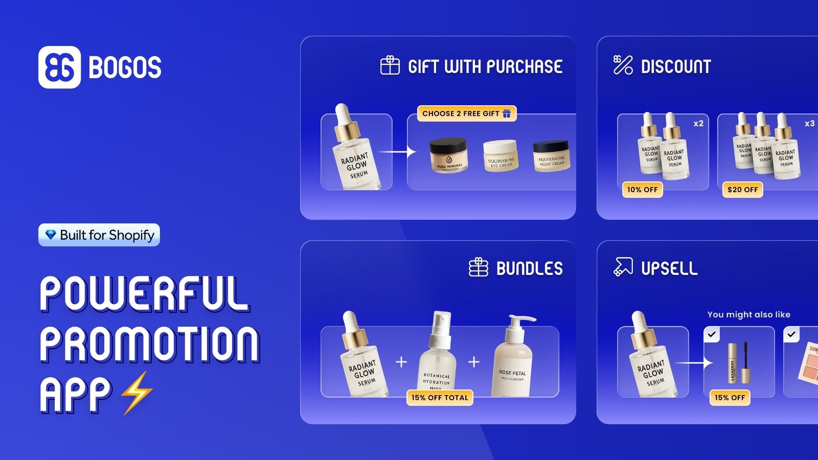
BOGOS: Free Gift, Bundle & Upsell helps Shopify merchants create promotion like Free gift, Bundle, Discount & Upsell
Volume and tiered discounts
A Volume / Tiered Discount rewards buying more units, for example “buy 3, save 15 percent.” On a phone, present the tiers as a compact selector, not a wide table that forces horizontal scrolling. (More on choosing tier breakpoints in our volume discount guide [#].)
Good-better-best merchandising
Offer a clear trade-up path so shoppers can choose a higher-value option. Three tiers presented as stacked cards read well on a narrow screen, and showing the middle option as the default anchors the choice.
Social proof near the buy button
A higher-value choice needs justification. Place a star rating and review count directly beside the price and add-to-cart button, where a mobile shopper actually looks, to support trading up.
#3 Reduce checkout friction for higher-value carts
Express checkout
A larger cart is worthless if the shopper abandons at a long mobile form, and cart abandonment already sits at roughly 70 percent across ecommerce (Baymard Institute, 2025). Enable Shop Pay, Apple Pay, and Google Pay so high-value carts clear checkout in a tap or two. Shopify reports that Shop Pay delivers around a 9 percent average conversion lift across checkouts, including mobile, and a higher lift for returning customers, by autofilling the payment and shipping details that cause most mobile drop-off.
A mobile app as a lower-friction sales channel
For stores with strong mobile traffic and returning customers, growth is not always about adding another website widget. Sometimes, the better move is creating a smoother sales channel for shoppers who already know the brand.
A native mobile app creates a smoother shopping experience for customers who already engage with your brand. Because the app lives on their device, it makes it easier for them to return, browse products, and complete purchases, helping reduce friction and support repeat buying.
With a no-code mobile app builder like Shopney, Shopify merchants can turn their existing store into native iOS and Android apps, sync products and orders, and bring offers such as bundles, discounts, loyalty incentives, and threshold campaigns into the app experience.
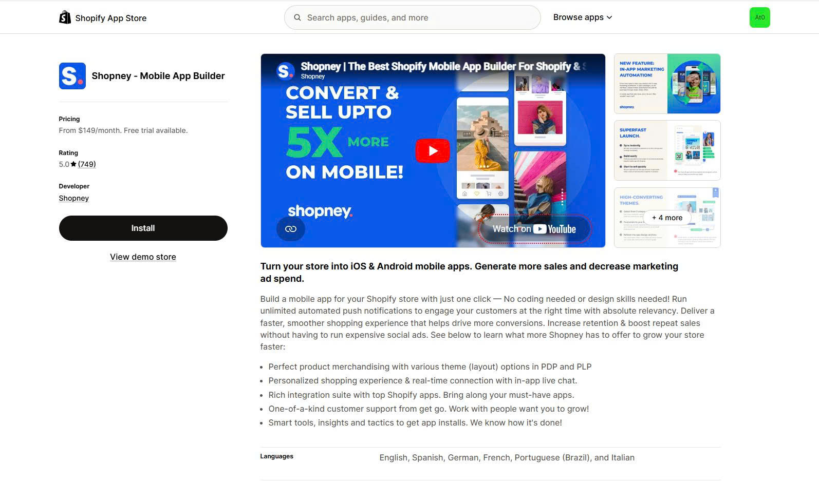
Shopney helps Shopify & Shopify Plus merchants turn their stores into a mobile app
Keep in mind: A native mobile app is not a shortcut for fixing weak mobile conversion at the first visit. It works best when shoppers already know your brand and have a reason to come back. For those customers, the app can become a faster, more direct channel for repeat purchases, higher buying frequency, and long-term retention, but only if you have a clear plan to drive installs and keep users engaged.
Quick reference: which mobile AOV tactics to test first
| Lever | AOV driver | Mobile execution note | Effort |
|---|---|---|---|
| Recommended products / complete-the-look | More items | Row below product description, not page bottom | Low |
| Cart-drawer cross-sell | More items | One-tap add inside the slide-out cart | Low |
| Fixed / Mix & Match Bundle | More items | Single add-to-cart for the whole set | Medium |
| Post-purchase upsell | More items | One tap after payment, no re-checkout | Low |
| Spend-threshold GWP / free shipping | Higher value per order | Slim sticky progress bar | Medium |
| Volume / Tiered Discount | Higher value per order | Compact tier selector, no wide table | Medium |
| Express checkout | Remove friction | Enable in checkout settings | Low |
| Native app | Remove friction | Same levers, lower-friction surface | High |
How to decide: start with the low-effort, high-leverage moves in the top rows, specifically a post-purchase upsell and a progress-bar threshold, because they add the most AOV for the least screen space. Treat bundles and volume discounts as the next layer, and the native app as a later step once repeat mobile traffic justifies the build.
Pro tip: Do not run all of these at once. Stacking a bundle, a threshold gift, a cart cross-sell, and a post-purchase upsell on one mobile session overwhelms the screen and the shopper. Pick one lever per driver and add more only after you measure.
Next action: Choose one lever from each of the three drivers, leading with a progress-bar threshold and a post-purchase upsell.
4. Mobile UX rules that make these offers convert
The same offer can lift AOV or sink conversion depending on how it sits on the screen. These rules keep the tactics above from backfiring.
Mistakes to avoid:
- Covering the add-to-cart button with a pop-up or sticky offer.
- Placing offers outside the thumb zone, where they are hard to tap one-handed.
- Requiring more than one tap to accept an offer.
- Loading heavy offer scripts that slow the page, since mobile shoppers leave slow pages fast.
- Using full-screen interstitials, which interrupt the buying flow.
Watch out: Google treats intrusive mobile interstitials as a negative signal, and shoppers treat them as a reason to leave. Use a slim sticky bar or an in-cart block instead of a screen-blocking pop-up.
Next action: Test every offer on an actual phone, one-handed, before launch. If you cannot accept it in one thumb-tap without losing sight of the buy button, redesign it.
5. Measure, test, and troubleshoot
Come back to the baseline from Section 2. A tactic worked only if mobile AOV rose without dragging conversion down.
Track three numbers per change:
- Device-segmented AOV (mobile specifically, not sitewide).
- Take the rate of each offer (how many mobile shoppers accept it).
- Revenue per mobile visitor, which combines AOV and conversion so you catch a lift that quietly hurts checkout.
Test one variable at a time:
- Threshold level (try $60 versus $65 against a $48 AOV).
- Gift or reward choice in a GWP offer.
- The product shown in a post-purchase upsell.
- Placement of the offer (product page versus cart drawer).
Troubleshoot by symptom:
- Mobile AOV flat and take rate near zero → the offer is not visible. Move it into the thumb zone or the cart drawer.
- Take rate decent but AOV barely moves → the threshold is too low or the reward too small. Raise the threshold toward 25 to 35 percent above AOV.
- Conversion drops after launch → too many taps or a blocked buy button. Simplify to one tap and clear the add-to-cart area.
- Cross-sell ignored → the pairing is irrelevant. Show complementary items, not alternatives.
Checklist: mobile AOV QA pass
- Offer is visible without hiding the buy button.
- Offer accepted in one tap.
- Progress bar or threshold reads clearly on a small screen.
- Page still loads in roughly three seconds with the offer active.
- Express checkout (Shop Pay, Apple Pay, Google Pay) is enabled.
Next action: Run one A/B test at a time and give it enough orders to reach a clear result before changing the next variable.
Conclusion
Mobile is where your traffic lives and where your AOV lags, which makes it the surface with the most room to grow. The whole playbook reduces to one rule: raise AOV by removing taps and decisions, not adding them.
Start in order:
- Measure your mobile AOV, conversion rate, and items per order today.
- Ship the two highest-leverage on-page levers: a progress-bar threshold and a post-purchase upsell.
- Test one variable at a time and read device-segmented results.
- Once repeat mobile traffic justifies it, consider a native mobile app to run the same levers with less friction.
Do the baseline measurement first, before you change a single offer. Everything else builds on that number.


Share this: