

Mobile shoppers do not have much tolerance for confusion.
When customers open a Shopify store on mobile, they expect to find products, collections, offers, cart, search, and checkout without extra effort. If the path feels unclear, crowded, or difficult to follow, they may leave before they ever reach the product they wanted to buy.
That is why clear navigation is not only a design detail. It is a conversion driver.
For Shopify brands, navigation affects how shoppers move from interest to action. It shapes how easily they discover products, browse collections, respond to campaigns, return to saved items, access rewards, and complete checkout.
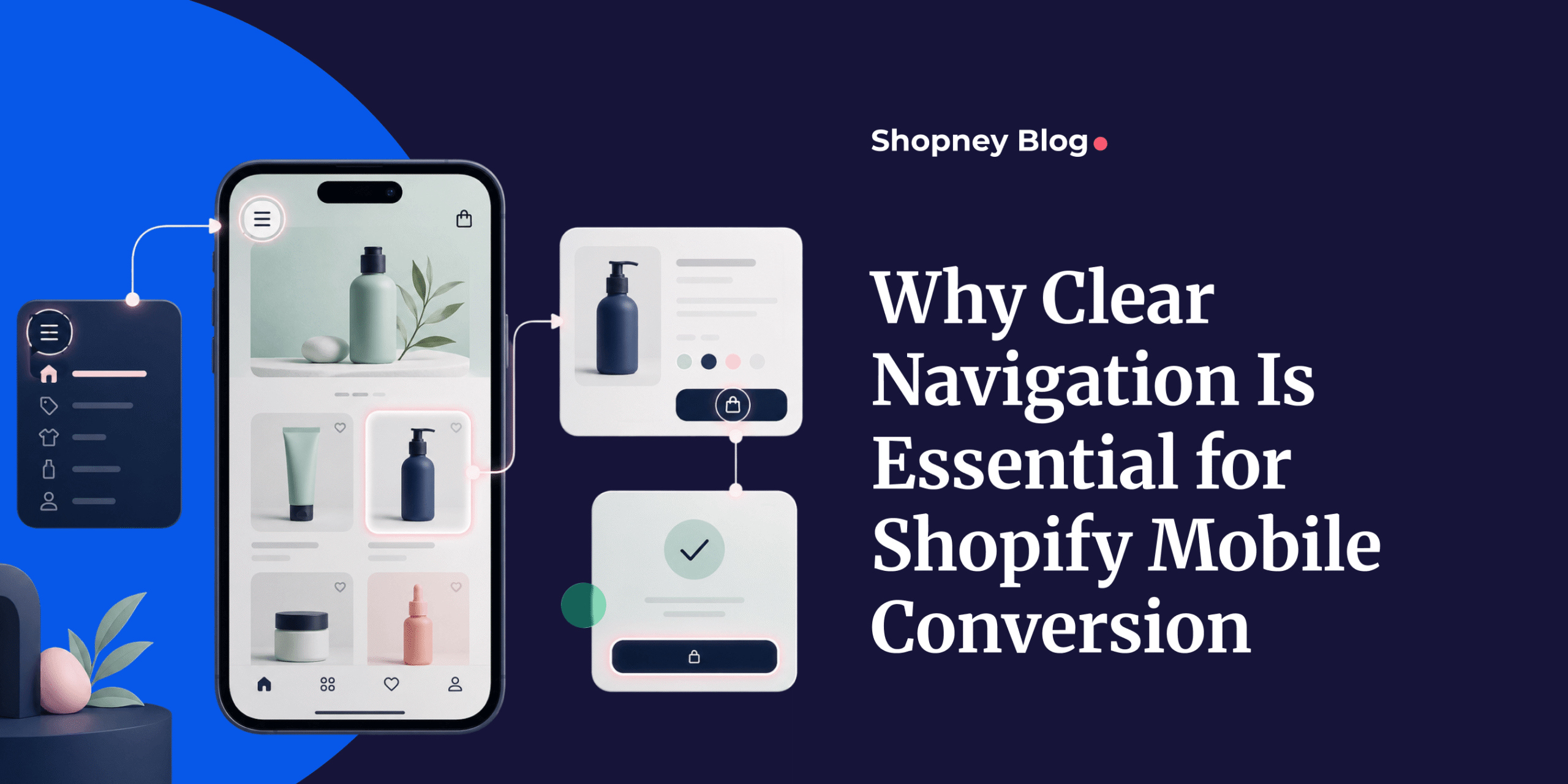
A mobile app for Shopify can make this journey stronger by giving merchants a more structured mobile shopping environment. With clear menus, bottom navigation, search, collection paths, campaign routing, personalized sections, and direct access to cart or account areas, merchants can help customers move through the app with less friction.
The goal is simple: help shoppers find what they need faster and make the path to purchase easier.
1. Clear Navigation Reduces Mobile Shopping Friction
Clear navigation helps mobile shoppers understand where they are and where they should go next.
This matters because mobile screens are smaller, attention is limited, and every extra moment of confusion can create friction. If shoppers cannot quickly find categories, products, cart, search, account, rewards, or offers, they may stop browsing before they reach a buying decision.
Friction can appear in small ways. A menu may be too crowded. Product categories may be unclear. Search may be hard to find. Cart access may not be visible enough. A promotional banner may lead to the wrong place. These details may look minor, but together they can make the mobile shopping journey feel harder than it should.
Clear navigation removes that uncertainty. It gives shoppers a simple path to follow and helps them continue browsing with confidence.
For Shopify merchants, this is important because mobile conversion depends on momentum. When the customer knows what to do next, they are more likely to keep moving toward product discovery, cart, and checkout.
2. Faster Product Discovery Keeps Shoppers Moving
Product discovery is one of the most important parts of mobile conversion.
If shoppers cannot find relevant products quickly, they may leave even if they were interested in buying. This is especially true for Shopify brands with large catalogs, seasonal collections, multiple product types, or frequent campaign launches.
Clear navigation helps customers reach products faster by organizing the store around how people actually shop. This can include categories, collections, bestsellers, new arrivals, product types, use cases, occasions, price ranges, or personalized recommendations.
A customer looking for skincare should not have to scroll through unrelated products. A shopper interested in new arrivals should not have to search the full catalog manually. A returning customer should be able to continue from recently viewed products or familiar categories.
When product discovery is easier, shoppers stay active for longer. They can browse with less effort, compare products faster, and reach the items that are most relevant to them.
This is one way clear navigation can help Shopify brands increase mobile app engagement while also supporting conversion.
3. Fewer Steps Create A Shorter Path To Purchase
Every unnecessary step gives shoppers another chance to leave.
On mobile, the path from interest to purchase should feel short and clear. If customers need to tap through too many screens, return to the homepage repeatedly, search again, or manually find a campaign page, the buying journey becomes harder.
Clear navigation helps shorten this path.
For example, a shopper who taps an app-exclusive offer should land close to the offer, not on a generic homepage. A customer who wants to check out should always be able to access the cart easily. A returning shopper who wants to reorder should not need to search the entire catalog again.
The fewer steps it takes to reach the right product, offer, cart, or checkout, the easier it becomes to complete the purchase.
This does not mean every page should push customers aggressively toward checkout. It means the app should remove unnecessary effort from the shopping journey. When customers are ready to act, the next step should be easy to find.
That is why navigation plays a direct role in helping Shopify brands boost mobile conversions.
4. Easy Access To Key Actions Supports Higher Intent
Not every shopper enters the app with the same goal.
Some customers want to browse. Some want to search for a specific item. Some want to check their cart, view rewards, revisit saved products, reorder something, or track a previous purchase.
Clear navigation helps by making high-intent actions easy to reach.
In a mobile app, this often means prioritizing the most important areas in places customers can access quickly. Bottom navigation can be especially useful for this because it keeps key actions visible while shoppers move through the app.
Depending on the store, these actions may include home, categories, search, cart, wishlist, account, rewards, or campaigns. The right structure depends on how customers shop and what actions matter most for conversion.
The goal is not to show everything at once. The goal is to make the most useful actions easy to access.
When shoppers can reach these actions without thinking too much, the experience feels smoother. That smoother experience can help turn intent into action.
5. Visible Search Helps Ready-To-Buy Shoppers Act Faster
Search is important because not every mobile shopper wants to browse.
Some customers already know what they are looking for. They may have seen a product in an ad, email, social post, push notification, or previous visit. When these shoppers open the app, they need a fast way to find the exact item.
If search is hidden or difficult to use, high-intent shoppers may lose momentum.
Visible search gives them a direct path. It helps customers move from intent to product discovery faster, especially when the store has many collections, product variations, or seasonal items.
Search can also support customers who are comparing options. A shopper may search by product type, color, size, ingredient, use case, or category. If the search experience helps them reach relevant results quickly, they are more likely to continue browsing and buying.
For Shopify merchants, search should not be treated as a secondary feature. It is one of the clearest signals of purchase intent.
When a customer searches, they are telling the brand what they want. Clear navigation should make that action easy.
6. Customer-Friendly Collections Make Browsing Easier
Collections should be organized around how customers think, not only how the business manages products internally.
A Shopify merchant may organize products by inventory logic, supplier, product type, or internal naming. But shoppers usually browse based on needs, occasions, styles, categories, benefits, seasons, or buying intent.
That difference matters.
If collection names feel unclear or too internal, customers may struggle to understand where to go. If collections are too broad, shoppers may need to scroll too much. If collections are too specific, the menu may become crowded.
Customer-friendly collections make browsing easier by matching the way people naturally shop.
For example, a fashion brand may organize collections by new arrivals, bestsellers, dresses, workwear, occasion, or seasonal edits. A beauty brand may organize by skincare concern, product type, routine step, or bestseller. A pet brand may organize by pet type, product category, or repeat purchase need.
The goal is to help shoppers feel that the store is easy to understand.
When collections are clear, customers can move faster from browsing to product consideration. That makes navigation more useful and conversion more likely.
7. Clear Campaign Routing Prevents Drop-Off
Campaigns can create interest, but poor routing can waste that interest.
When a Shopify merchant sends a push notification, shows an in-app campaign, promotes an app-exclusive offer, or runs a seasonal campaign, the customer should land in the right place.
If the message is about a specific product, the customer should reach that product or a relevant product page. If the message is about a collection, the customer should land on that collection. If the message is about a loyalty reward, the customer should be guided toward the reward or how to use it.
A campaign should not create extra work for the customer.
For example, if a push notification says, “Your favorite product is back,” but the app opens to the homepage with no clear next step, the customer has to search again. If an in-app campaign promotes a flash sale but does not route to the sale collection, the journey feels disconnected.
Clear campaign routing keeps the message and the shopping experience connected.
This is especially important for brands using push notifications and in-app campaigns together. The push can bring customers back, while the in-app experience should guide them clearly toward the action.
When campaign routing is clear, customers are less likely to drop off before completing the journey.
8. Simple Menus Help Shoppers Decide Faster
A mobile menu should help customers make decisions, not overwhelm them.
One common mistake is trying to fit the entire website structure into the mobile menu. This can make the app feel crowded and difficult to use, especially when shoppers are browsing on a small screen.
A simple menu does not mean removing important information. It means prioritizing what customers need most.
The menu should make the main shopping paths easy to understand. Key collections, important categories, account areas, rewards, support, and campaign links should be organized clearly. Less important pages can be placed lower or grouped in a way that does not distract from shopping.
Simple menus help shoppers decide faster because they reduce visual and mental effort.
Instead of asking customers to choose from too many options, the app gives them a clearer path. This helps customers continue browsing, find relevant products, and move closer to purchase.
For mobile conversion, clarity is often stronger than complexity.
9. Familiar Navigation Makes Repeat Shopping Easier
Repeat customers often return with a different mindset than first-time visitors.
They may want to reorder a product, check previous purchases, use rewards, revisit saved items, browse a familiar collection, or see what is new since their last visit. Clear navigation should support these repeat journeys.
A mobile app can make repeat shopping easier by keeping useful paths accessible. This may include previous orders, recently viewed products, wishlist, loyalty rewards, personalized recommendations, saved account information, and direct access to favorite categories.
When returning customers can quickly find what they already care about, the experience feels more familiar and convenient.
That familiarity matters for retention. If customers know how to move through the app and can easily continue their shopping journey, they have a stronger reason to return again.
Clear navigation helps Shopify merchants increase customer retention with a mobile app by making repeat shopping feel easier and more natural.
10. Navigation Performance Shows Where Conversion Breaks
Navigation should not only be judged by how it looks.
Shopify merchants should also measure how customers actually move through the mobile experience. This helps reveal where shoppers are finding products, where they are getting stuck, and where conversion may be breaking.
Useful signals can include search usage, collection clicks, product views, add-to-cart rate, checkout starts, campaign click-through rate, cart recovery performance, drop-off points, repeat visits, and conversion rate.
For example, if many shoppers use search but few click products, the search experience may need improvement. If a campaign gets clicks but does not lead to product views or add-to-cart actions, the routing may be unclear. If customers open the app but do not move beyond the homepage, the first navigation path may not be strong enough.
These insights help merchants improve the app experience over time.
Clear navigation is not something brands set once and forget. It should be reviewed, tested, and improved based on customer behavior.
When navigation is measured by customer actions, merchants can better understand how it supports conversion and where the shopping journey needs to become easier.
Conclusion
Clear navigation is essential for Shopify mobile conversion because it helps shoppers move through the buying journey with less friction.
It makes the mobile shopping path easier to understand, improves product discovery, shortens the path to purchase, supports high-intent actions, strengthens campaign routing, and makes repeat shopping more familiar.
For Shopify merchants, navigation should not be treated as a small design choice. It directly affects how customers browse, decide, and buy.
A strong mobile app experience gives shoppers clear paths to products, offers, rewards, cart, account areas, and checkout. When those paths are easy to follow, customers are more likely to stay engaged and complete their purchase.
To see how Shopney can help you build a clearer, conversion-focused mobile shopping experience for your Shopify store, Book a demo with Shopney.


Share this: