
A comprehensive guide to creating a high converting Shopify mobile app menu design
What good will having a catalog of amazing products do if your target consumer can’t find it on your app?
Within the space of a few seconds, users will open your app, tap away through any visible cues that guide them, and either find the product they were looking for, add to cart (and put your checkout funnel to the test), or they will swipe up and kill your app in frustration and annoyance—especially once you turn Shopify store into mobile app and expectations around usability rise
Nobody wants to guess their way through a confusing menu, especially on a device where screen real estate is hard to come by.
Realize this- your app’s success hinges on navigation optimization.
A well-designed app menu will boost conversions, increase average order values, and enhance customer satisfaction. And you can’t just copy your website’s menu design and expect it to deliver similar results.
But how do you get there? How do you go from a jumbled set of options to a streamlined, effective menu that works for mobile screens?
This is what we’ll guide you through in this blog post.
But first- basics. What are the most popular and common app menu designs out there and which one will suit your brand?
Types of Shopify mobile app menu design
Not all menus are created equal.
The effectiveness of your menu hinges on choosing the right design pattern that aligns with your brand’s identity and your customers’ expectations.
Let’s take a look at some of the popular ones:
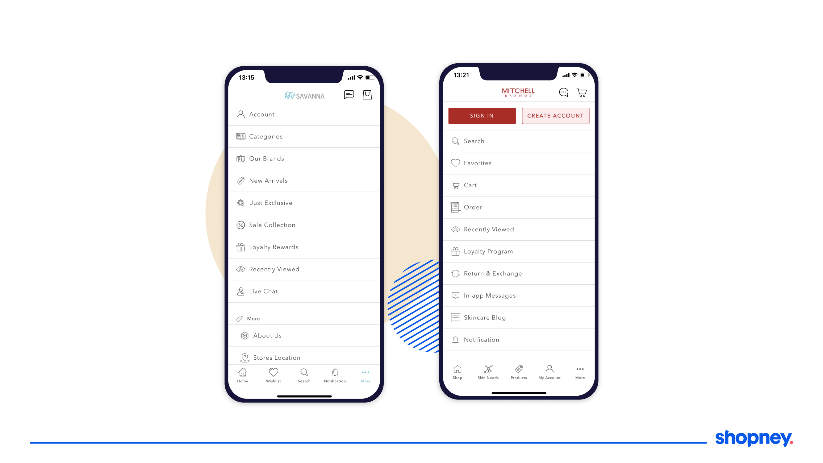
1. Top and bottom navigation design
These two are some of the most common menu design patterns you’ll find.
Usually, the top navigation bar will have search, shopping cart, and login. Meanwhile, the bottom navigation bar would include ‘Home,’ ‘Shop,’ ‘Account,’ and ‘Settings, etc.’
The placement plays an important role in user engagement- the top-left corner is not always easy to reach, especially for one-handed smartphone users.
Many brands note better engagement, speed, and customer satisfaction after moving their navigation to the bottom of the screen because it aligns well with natural thumb movements and allows for quick access to essential functions.
This pattern of Shopify mobile app menu design is ideal for stores that have a limited number of top-level categories but multiple important functionalities that customers often look for.
2. Card design
Also known as the Rectangular Design Pattern, this uses ‘cards’ or ‘rectangles’ to organize and present information in a clean, structured way.
Each card can represent an individual product or category, includes a combination of text, images, and action buttons, and is easy to adapt to different screen sizes.
What makes this design particularly beneficial for Shopify brand owners is its scalability and flexibility. As your product range expands, you can easily add more cards without compromising the user experience.
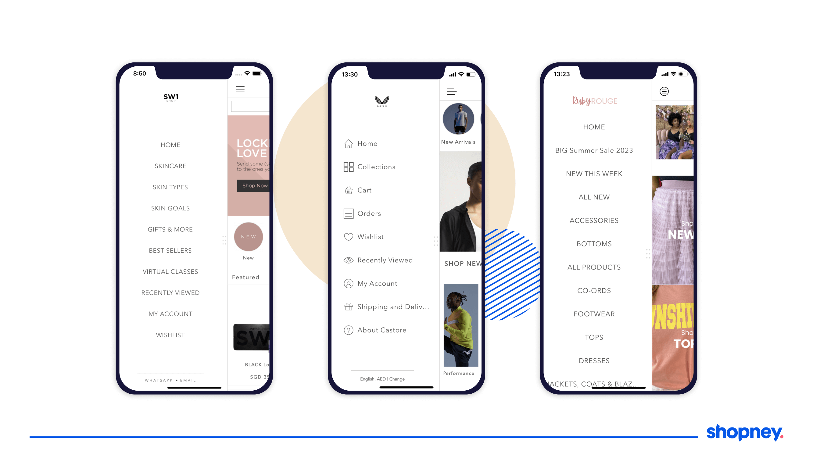
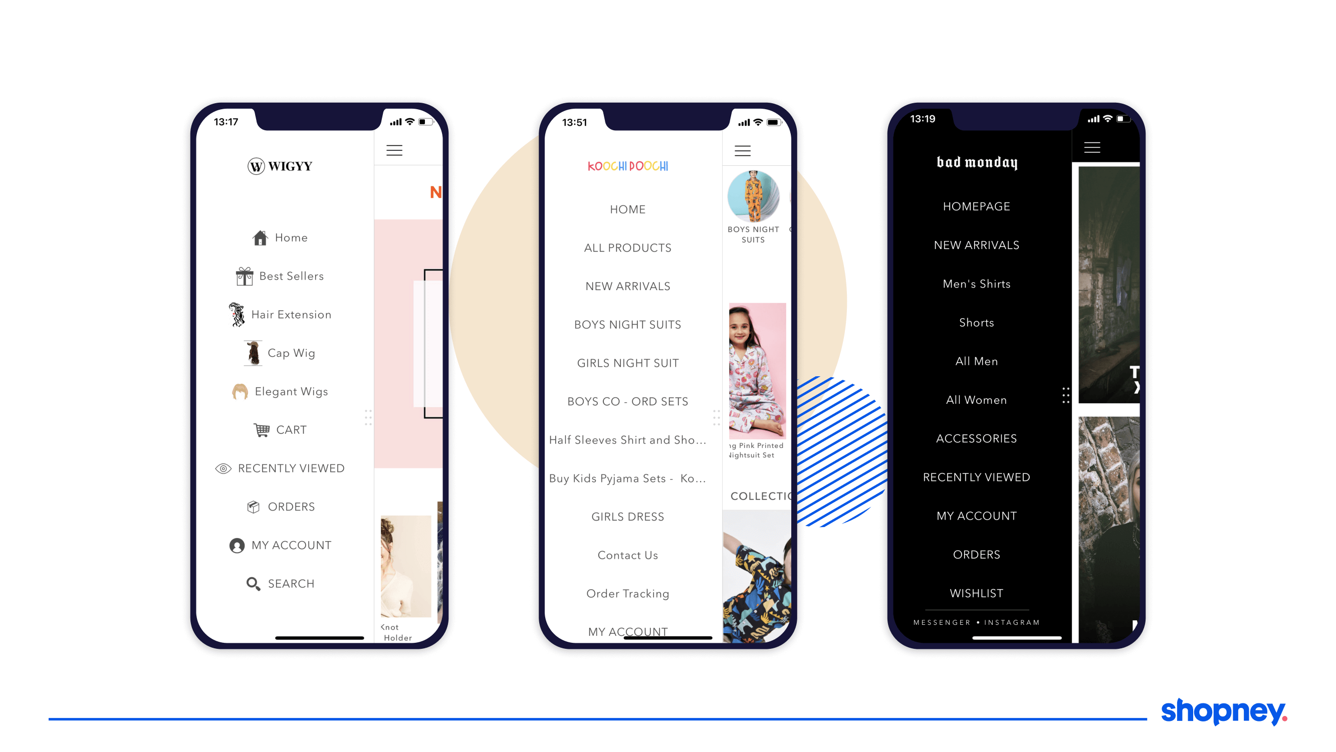
3. Hamburger menu design
The Hamburger Menu is one of the most recognizable and widely implemented mobile app menu design patterns, particularly among eCommerce brands.
You’ll spot it by its iconic three horizontal lines that symbolize a menu, placed in a corner of the screen, which expands when clicked or tapped, revealing a list of categories.
It frees up screen real estate by hiding less frequently used options, which makes it ideal for apps where screen space is limited.
However, because the menu is not immediately visible, users may overlook essential features or options, leading to decreased engagement.
Strategies for improving mobile menu design
A poorly designed menu can result in user frustration, abandoned carts, and decreased conversions.
Let’s deep dive into mCommerce navigation best practices:
1. Employ user-centric design
You need to create an intuitive, straightforward path from the home screen to checkout without any unnecessary detours or dead-ends.
Here’s a checklist you can refer to:
- Intuitive Navigation: Are the buttons and menu items easily understandable and clickable? Can a user reach their destination with the least number of taps and gestures?
- Readability: Are you using easy-to-read fonts that are clear and have sufficient spacing or are they distracting them from key actions?
- Quick Load Times: Is your menu loading quickly or leading to poor engagement?
- Logical Flow: Are the menu items designed in a way that reflects the user’s natural progression through the app, from browsing to buying?
2. Aim for a consistent layout
A uniform layout not only increases visual appeal but also improves usability, making navigation a breeze for the consumer.
Use a consistent set of icons throughout the app, stick to a limited color palette that aligns with your brand’s identity, and avoid gimmicks like shadow effects or gradient fills.
Their experience should not be a jarring one.
3. Keep it simple
You need to deliver maximum functionality with the least amount of clutter and offer only the most essential menu options to reduce decision fatigue for users.
Don’t cram too many features or menu items, avoid using technical jargon or abstract labels, and remember to design mobile screens that are small and accessible mostly with a thumb.
4. Use descriptive labels
A well-designed label will provide immediate clarity, removing the guesswork for users navigating through an app.
Ambiguous or overly clever labels can lead to confusion, reduce user confidence, and increase bounce rates.
For instance, instead of using a generic term like “Services,” a better label would be “Online Support” or “Shop all”.
Likewise, labels like “Get Started” or “Learn More” are more clearer than a generic “Click Here.”
5. Group similar or related items together.
Your consumers will expect similar things to be placed together.
For example, grouping all men’s clothing items under one heading and women’s clothing under another or by clothing type—shirts, trousers, accessories, etc.
This helps users intuitively find what they need without feeling overwhelmed by too many options.
it also increases discoverability as users are more likely to explore related options. This can lead to an increase in cross-selling and upselling opportunities.
6. Strategically place call-to-action buttons
Every time a user ‘guesses’ what the next step is, a clear call-to-action (CTA) button will reassure them that they’re on the right path.
This builds trust and guides users quicker towards taking specific actions, such as “Buy Now,” “Learn More,” or “Subscribe.”
Make sure you place CTA’s where the user is most likely to take action.
For instance, an “Add to Cart” button should follow after product description and price, while a “Continue Shopping” button should be easily accessible after a user has added an item to their cart, encouraging more browsing and potentially more sales.
Make sure that your CTAs are:
- easy to tap
- not so large that they distract from other important elements
- are action-oriented and clear
7. Design to scale
Your app’s user interface should not only look good on the latest iPhone- you need to provide a consistent, high-quality user experience across all platforms.
For starters, adopt a responsive design that adapts to different screen sizes without compromising on usability.
You can also use scalable vector graphics (SVGs) for icons and other UI elements. Unlike raster images, SVGs don’t pixelate when resized, thus maintaining their clarity and detail on all screens.
Lastly, implement adaptable text sizes and aspect ratios to ensure readability and visual appeal.
8. Implement a visible and efficient search
Add a quick search bar at the top of the menu to speed and aid navigation.
Search should be intuitive, offering auto-suggestions or predictive text as users begin typing, guiding them to their desired destination with minimal keystrokes.
It should also be
- able to handle typos and still deliver relevant results.
- be easily identifiable and accessible from all parts of the app.
Making it a fixed component of the menu ensures that users can jump to it no matter where they are in their navigation journey.

9. Utilize colors and fonts to guide user attention
Colors should be more than just an aesthetic choice; they should serve a functional purpose.
For example, warmer colors like red or orange are good for CTA buttons as they attract attention. Cooler colors like blue or green, on the other hand, can be soothing and indicate trustworthiness, making them suitable for information or settings icons.
Similarly, a more formal serif font might look more professional but could be harder to read on a small screen. A simpler sans-serif font could make for better readability.
10. Employ hover effects and transitions
Remember when we wrote how your user is looking for signs of reassurance with each swipe or tap?
Using this principle, hover effects, although more common on desktop interfaces, can be adapted for mobile use through long-press or tap-and-hold actions.
These effects provide users with instant feedback and can be used to highlight important elements, such as CTA buttons or promotional tabs.
11. Ensure your design is accessible
You need to ensure your mobile menu is navigable and understandable for people with various disabilities, such as visual, auditory, or motor impairments.
Simple tweaks, like adding text labels to icons, employing larger touch targets, or providing keyboard accessibility, can make a world of difference.
Use contrast effectively to make the text readable and ensure that the color scheme is friendly to those with color vision deficiencies.
Also, provide voice-over or screen reading capabilities to aid users who have difficulty seeing the screen.
12. Optimize for quick loading time
Don’t just focus on the speed of the server; check your design elements within the menu, too. Skip high-resolution images, heavy fonts, or complex animations, as it will increase load time.
Compress these files, and consider using CSS3 and HTML5 for lightweight animations and effects.
Lazy loading can also be implemented for elements that aren’t immediately visible.
Additionally, ensure that your caching strategies are properly configured so that recurring visitors experience quicker load times.
13. Onboard new users to the menu layout
Your onboarding process should introduce users to the menu’s layout, explaining where to find essential features and how to accomplish tasks quickly.
Utilize tooltips, progressive highlighting, or even a quick guided tour to pinpoint critical elements on the menu, especially (CTA) buttons.
This brief introduction gives users a clearer idea of how to make purchases, get in touch for support, or take other actions that could lead to conversion.
14. Employ contextual menus
Unlike static menus that present the same set of options regardless of where a user is in the app, contextual menus adapt to the user’s current activity or the section of the app they’re in.
This can reduce the time and effort needed to navigate through the app.
For example, if a user is browsing through the “Women’s Apparel” section, a contextual menu might offer options for filtering by size, color, or brand.
If they are in the “Checkout” section, the menu could change to display options like applying promo codes, choosing delivery methods, or contacting customer support.
15. Design overlapping menus
A simple mistake Shopify brands make is their quest to provide as much information as possible within a mobile menu, leading to complex menus filled with multiple submenus.
Instead, opt for overlapping menus that display only the most important categories and their relevant subcategories, without making the user sift through multiple layers of options.
16. Test, analyze, and refine
By employing analytics tools, you can monitor various KPIs such as click-through rates for menu items, time spent on different sections, and even the pathway a user takes through your menu.
These insights help you understand what’s working and what’s not.
For example, if you notice that a specific menu item has a low engagement rate, it’s a sign that either the item is not of interest to your users or it’s not easily discoverable.
User testing should be conducted periodically and with A/B tests, heatmaps, and user surveys.

Wrapping Up
A good Shopify mobile ecommerce app menu design will lead to more conversions. Overlooking this crucial component can result in missed opportunities, decreased user engagement, and a loss of potential revenue.
But remember, consumer expectations are continually evolving. A design that worked a year ago may now be outdated, so ongoing optimization and regular updates are critical.
Here’s where we come in. Our team at Shopney can help you quickly create and optimize an app menu design that is built to guide, nudge, and reassure. One that looks and feels just like your website store but is still designed for a mobile first experience.
Reach out to our team to know more!


Share this: