At Shopney, we’re all about learning and implementing new tactics and techniques of mobile app design quickly so your eCommerce store can enjoy consistent growth and profit — especially when you’re running a mobile app for Shopify — and build meaningful relationships with your customers.
Previously, we broke down the All Birds eCommerce app, and this time, for our series on breakdowns of the most popular shopping apps, we’re turning to Sephora – the leading makeup and beauty app across the world.
Keep reading to get inspired by the unique and engaging ways Sephora has managed to delight its customers as they sign up, browse, shop, and become a part of their community on their mobile app.
About Sephora Mobile App
Sephora is a global leader in the beauty retail space, founded in France in 1970, and is known for its wide array of cosmetics, skincare, and fragrance offerings.
With a presence in over 35 countries and an expansive online store, Sephora has revolutionized the way people shop for beauty products. From offering personalized beauty consultations to featuring an extensive range of high-end and indie brands, Sephora aims to empower individuals to look and feel their best.
Its unique in-store experiences, user-friendly mobile app, and loyalty rewards program make it a go-to destination for beauty aficionados worldwide.
Let’s take a look at their app now and dive deep into their best features and misses so you can find what could benefit your Shopify store mobile app and tweak and modify it so your customers keep coming back for more!

Sephora mobile app review: breakdown of the shopping mobile app design
If you search for reviews and posts on the Sephora mobile app, you will find that it has intrigued many people – there are students, designers, and agencies who have redesigned it as part of their projects.
There’s even a detailed breakdown by Andrew Birgiolas, Sephora’s Director of UX, Product Design, and Research, on how he and his team went on to research, design, and test a new version of their app to make it more fun and easy to navigate for their customers.
It’s clear to see a lot of thought, strategy and best practices from UX and UI’s principles have been implemented.
With such a high digital footfall, they have to design a great shopping experience for their loyal users.
Let’s take a look at some of the best features that caught our eye.
A. Onboarding
1. Easy sign-in option with Face ID
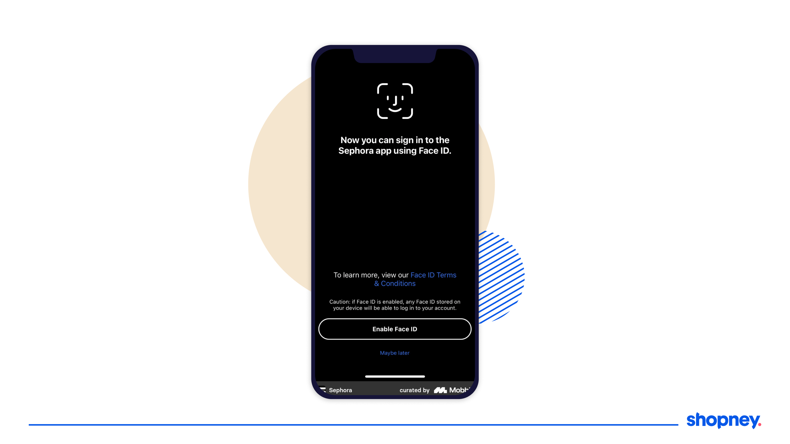
Let’s admit it- signing in is cumbersome, boring and if over complicated, can make your users leave your app immediately.
Sephora’s face ID sign in enables faster sign in and moves the customer down the funnel quicker!
2. Nudge to sign in for a personalized shopping experience
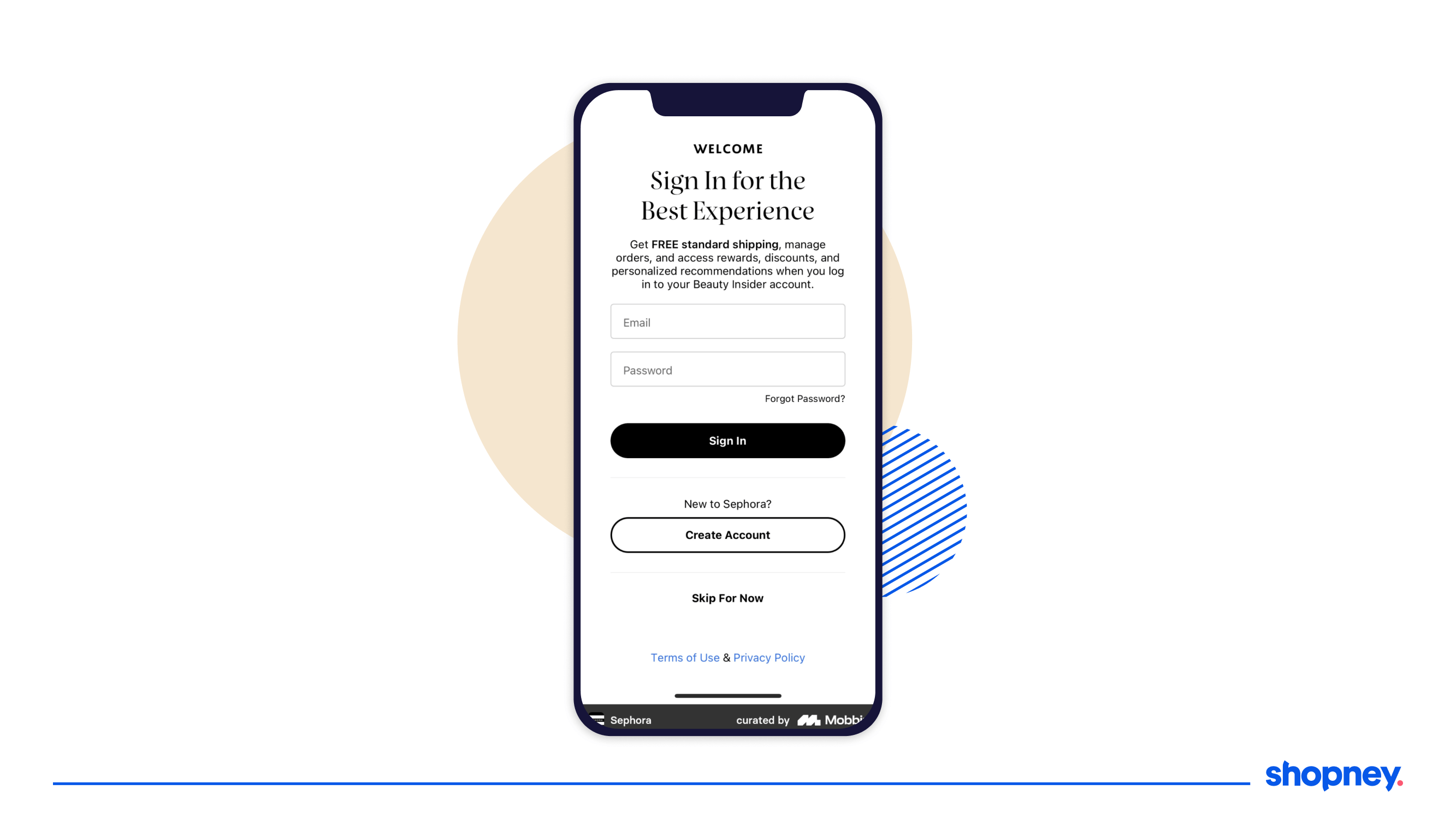
On Sephora’s mobile app, the onboarding screen suggests the advantages of doing so at the onset, because it knows how important it is.
3. Nudge to sign up for their membership program
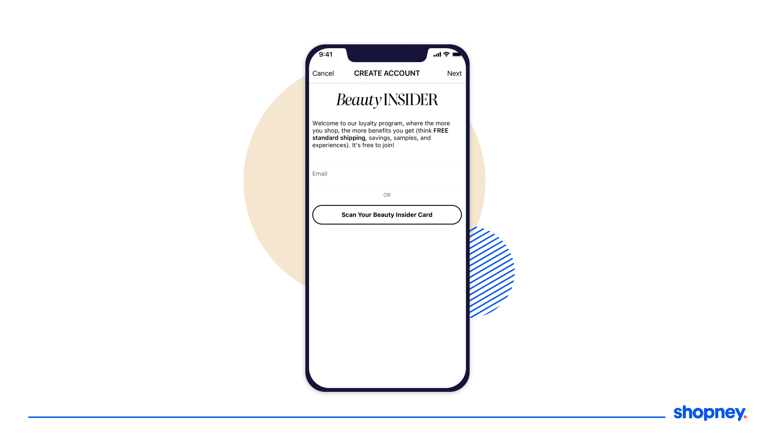
As part of their onboarding, Sephora allows the user to sign up for their loyalty program or sign in if they are already part of the club.
This is essential in personalizing the customer experience further as they find more curated product catalogs that would entice them to buy faster.
4. High text-to-negative space ratio
This tips is more along what you may NOT want to do. Complicated and text heavy onboarding screens can overwhelm your user, as can be seen in the first onboarding screen in Sephora’s mobile app (showcased above).
Remember, you can give your customers a tour of the app through nudges on main elements as well and do not need to compile all the information at the beginning.
B. Home screen
The home page is your main real-estate of mobile app design. It’s critical that its well thought out and showcases your best products, features and shopping benefits.
Let’s take a look at how you can learn Shopify design ideas for your store from Sephora’s home page.
1. Personalized home screen
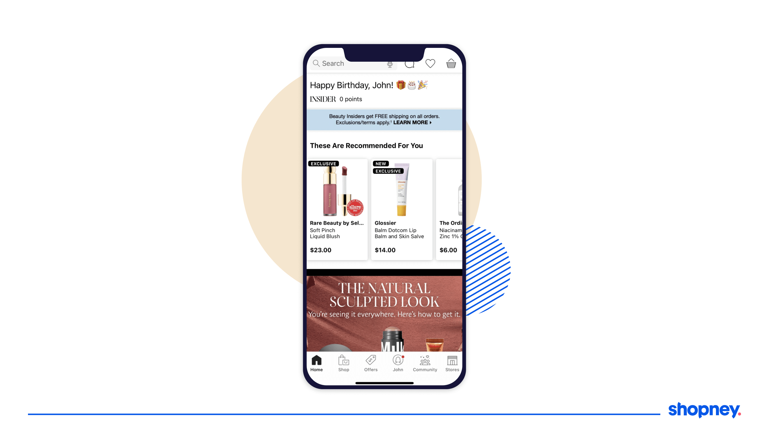
The benefits of signing in during onboarding leads to a personalized home feed.
Even the simple mention of your name, a happy birthday in case it is, and the re-emphasis on benefits of being a beauty insider (like free shipping) and how close your points are for their loyalty program, all strengthen the relationship between the app and the customer.
2. Bottom navigation bar
Previously, the Sephora mobile app had a hamburger menu, which had too many options.
Instead, they decided to build a bottom navigation bar that has six ‘signifiers’ (visual and interactive cues that guide the customer) that allows customers to easily navigate between the main sections of the app without losing their place, whether they are looking up product details or editing their shopping basket.
Imagine yourself holding your phone and trying to select options – your thumb would find it easier to tap across the bottom edge than the top left corner.
3. Recommended for You
With the details shared during onboarding, especially if the user has been a previous Sephora user part of their Beauty Insider program, the first few sections of products can be curated for you.
This is great to be showcased right in the first few scrolls on the home screen, propelling the user to browse and purchase a product faster.
4. Just dropped
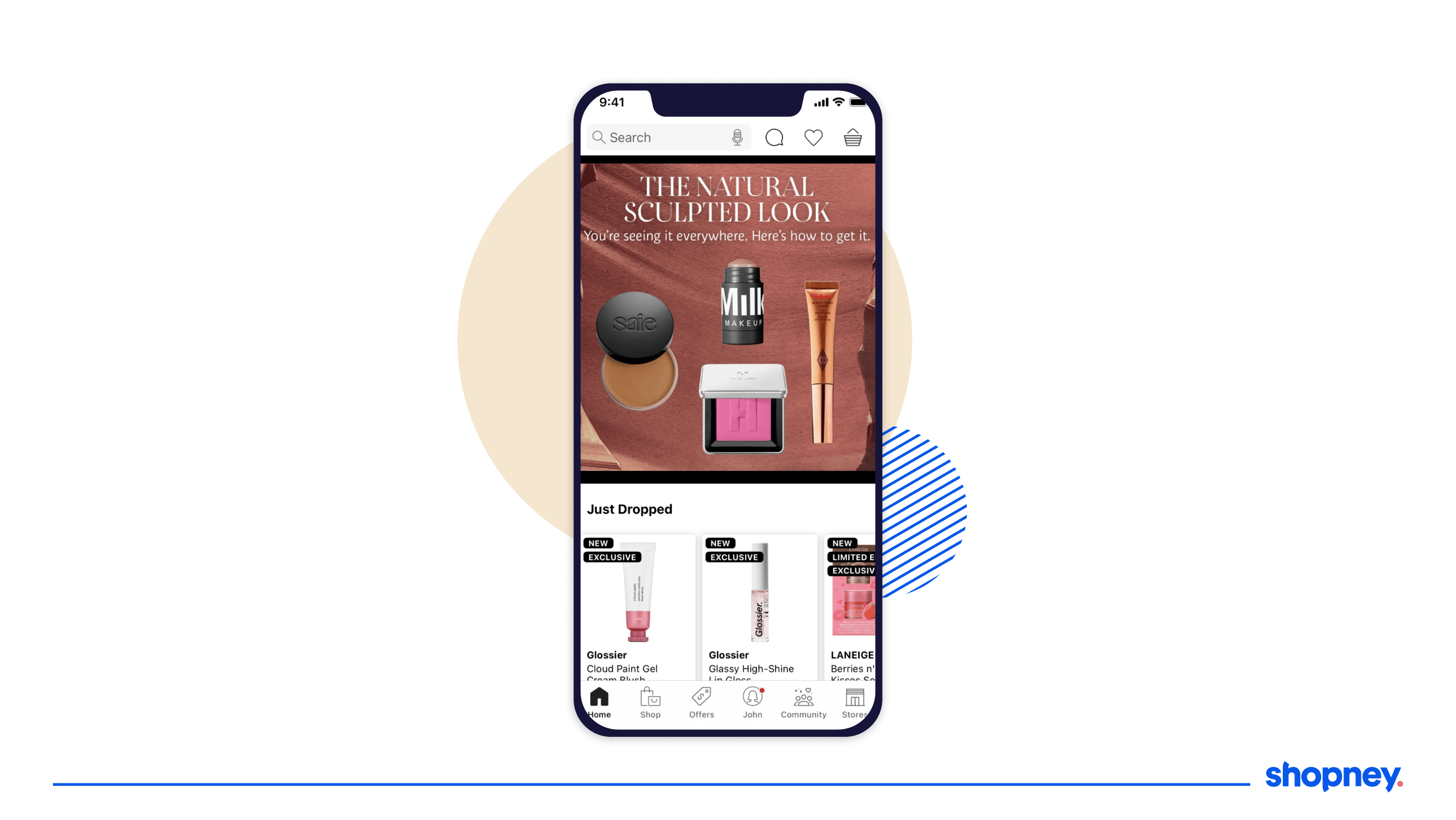
Users are also more curious to see what’s new, in order to be up to date with the latest products.
It is bound to catch eyeballs and move them on to the product catalog.
5. Selling fast
People don’t love missing out on best-selling products. Inducing FOMO through such a section creates a sense of urgency and will lead to higher conversions.
6. Online only
A hot tip that we discussed earlier in our post on Push Notification Types, a great way to increase app downloads and engagement is to capitalize on new collections on the app.
With the Exclusive label added to some products, it encourages customers to the advantage of opening and exploring the app often, to not miss out on limited products.
7. Brand’s social cause
Users are more eager to support a brand if its values align with theirs. As a result, Sephora has a section to inform their users on how they give back, and what is important to them.
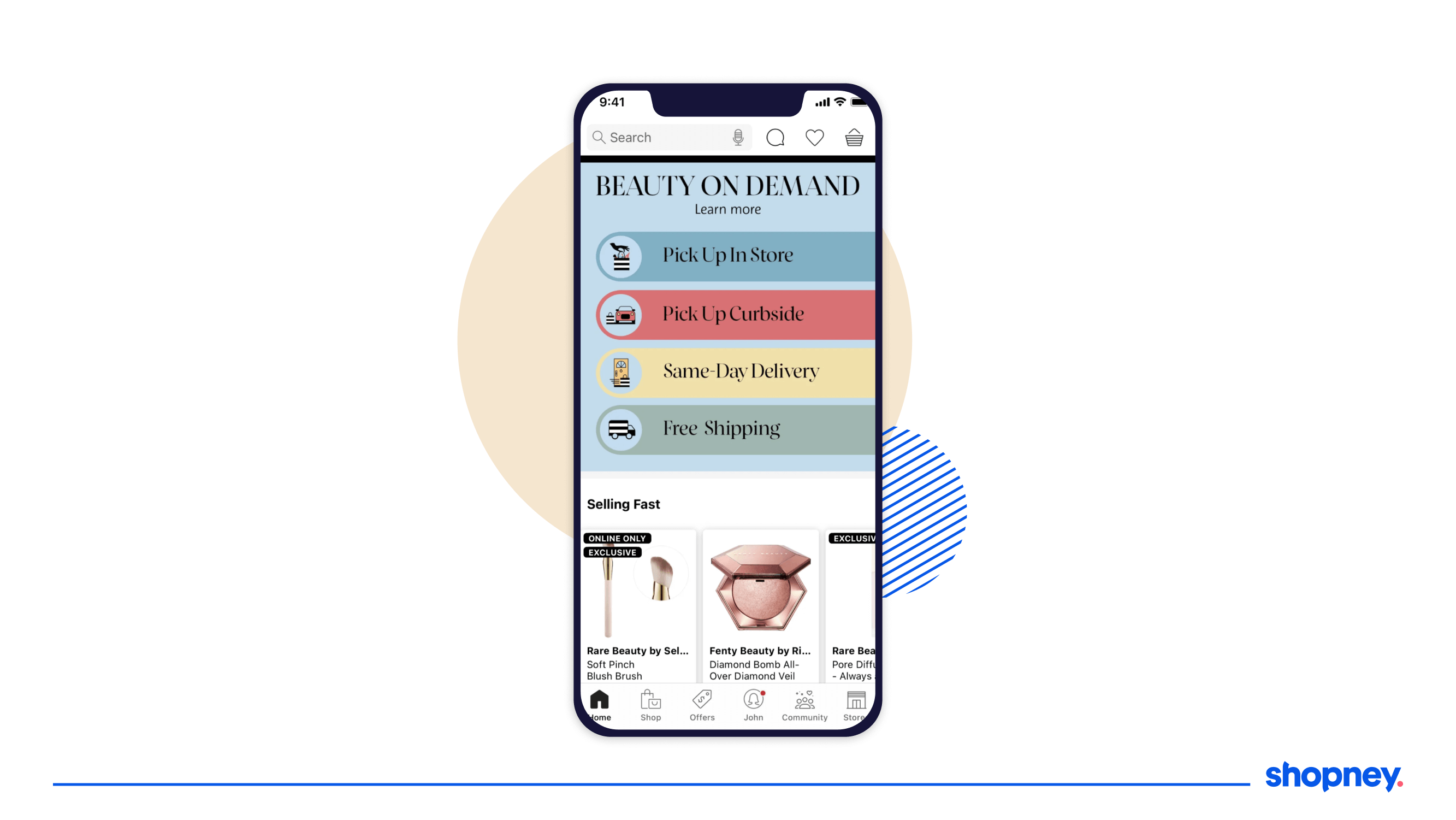
8. Beauty on Demand
Often, customers are hesitant to place an order as they don’t know when they will get the product.
This section on Sephora’s mobile app reminds customers of multiple options for delivery and shopping they can access- from pickups, same day delivery and free shipping.
Doing this encourages them to purchase without fear!
9. See it in Real Life
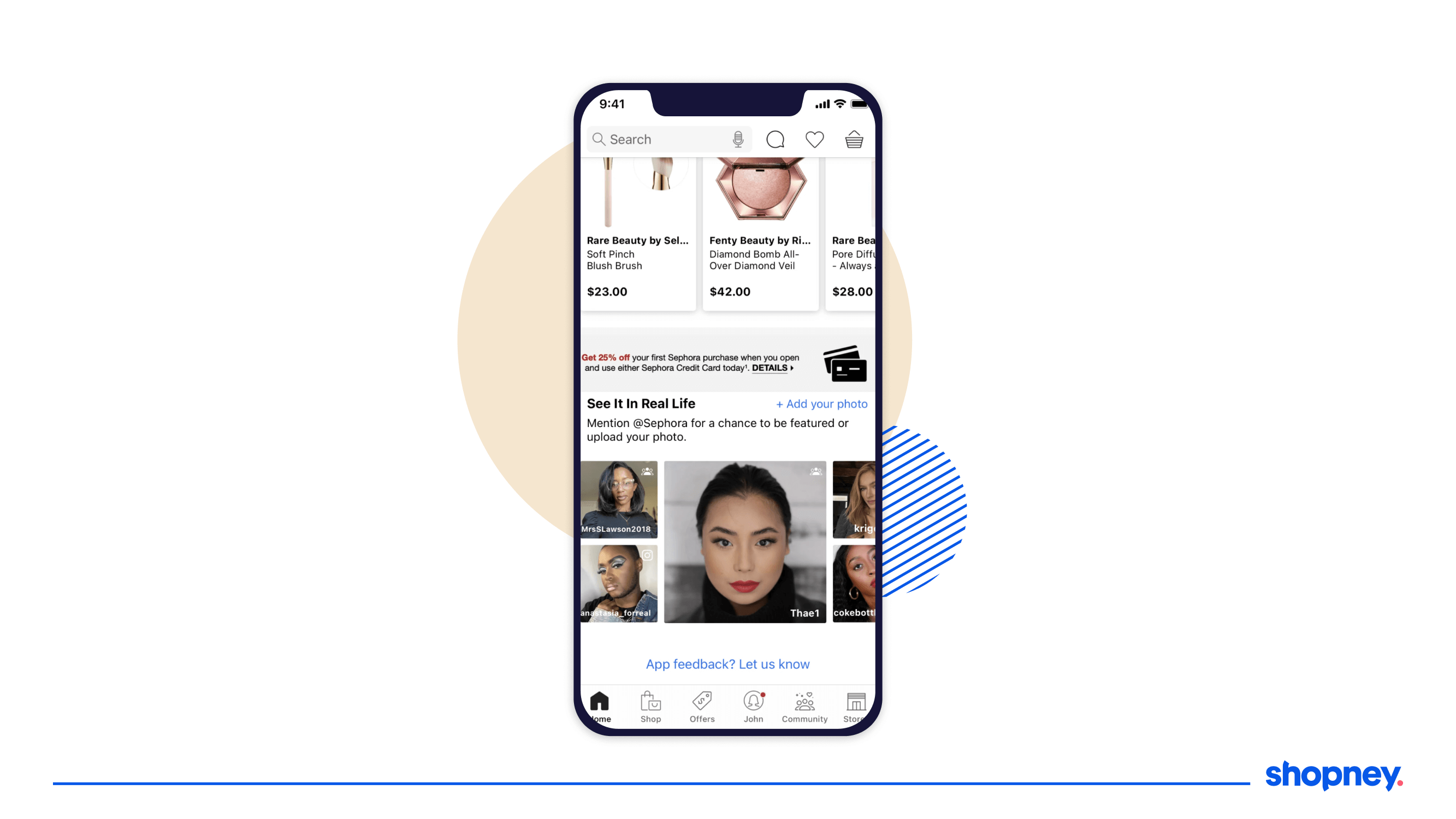
Social proof is powerful and Sephora recognizes that. By including this section at the very end, is a powerful end to the home screen, and in our opinion, highly persuasive.
With a nudge to encourage users to share their pictures, it also builds a consistent stream of user generated content.
By clicking on each picture of a user, which has details on different products from Sephora that are used, it can drive a potential user to become a customer much faster.
C. Search bar
We know the importance of the search bar and how it can transform or decimate any potential of your customers exploring and shopping from your app.
In this section, we’ll look into what you can try for you own store’s search mobile app design.
1. Sticky search bar
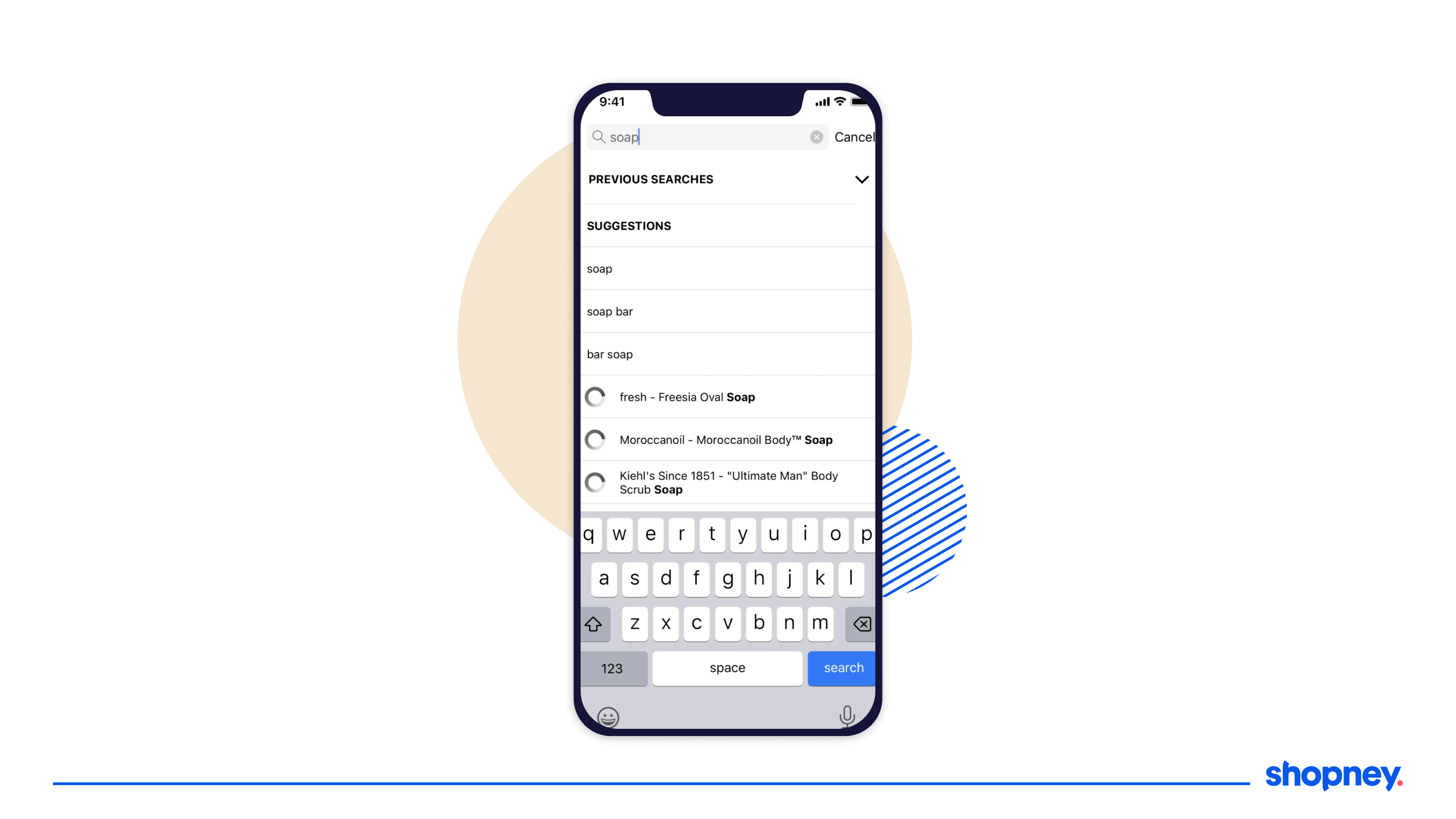
We discussed the different types of search bar and how to choose the right kind previously.
In Sephora’s mobile app, it occupies the top left screen, enabling immediate impression of the customer.
When you type your search query, the drop down has separate sections for:
- ‘Previous Searches’, excellent for returning customers to pick off from where they dropped off,
- ‘Suggestions’ for phrases or names it assumes matches your query, making it quicker and easier doe the user to choose an option without having to type it al
- Product listing section – that refreshes with each letter typed into the search box. Immediate feedback is always more reassuring to a browsing customer.
2. Voice search & barcode scanner
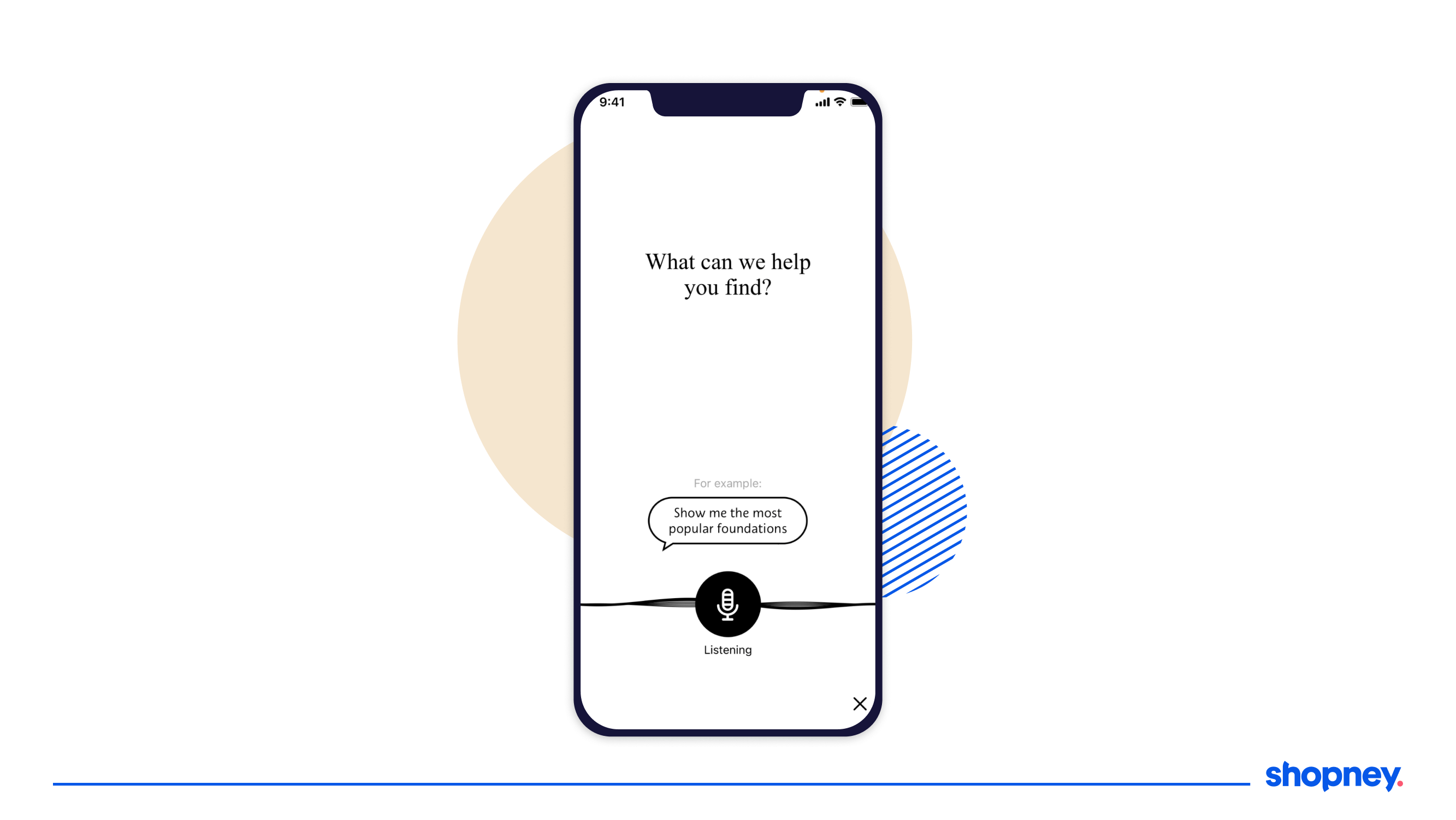
With the rise of voice search, like Alexa, it is important that shoppers have the ability to search by audio.
Additionally, the barcode scanner feature is great for when a customer is at a Sephora store, but a product is unavailable. By scanning its barcode, one could simply place an order through the app!
3. Filters in search
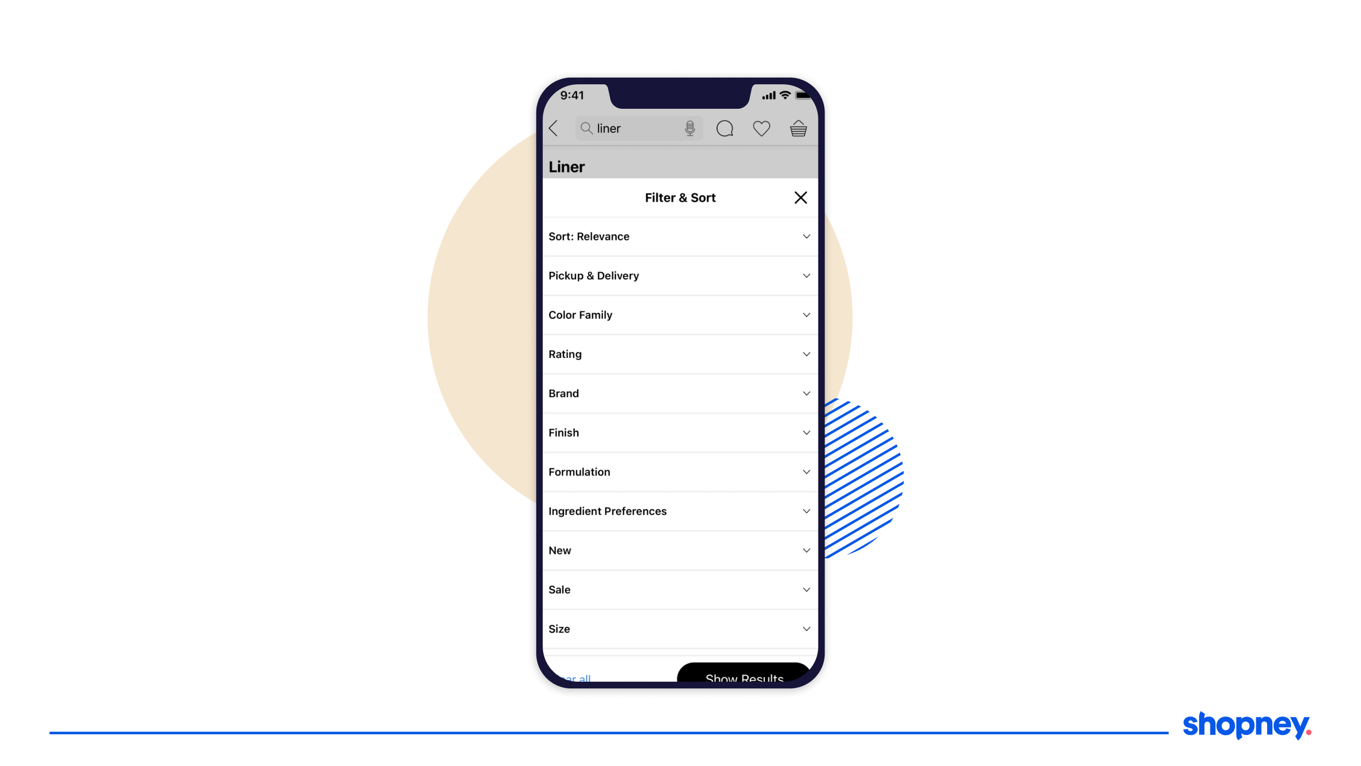
Designing the filters and sorting isn’t easy. But if you customize it according to your store’s product categories, and what your customers are looking for, you can make it an efficient browsing journey for your customers.
For example, ingredient preferences, pickup and delivery options, product benefits, fragrance notes, shades are all helpful for those looking for skin care or make up. When the filtering is optimized, higher the chances that the results are just what the customer is looking for.
D. Product listing page
Many customers find the product listing page overwhelming, cluttered and confusing – not great signs for an engaging and persuasive shopping journey.
But how does Sephora do it? Let’s dive in!
1. Social proof right under the product title
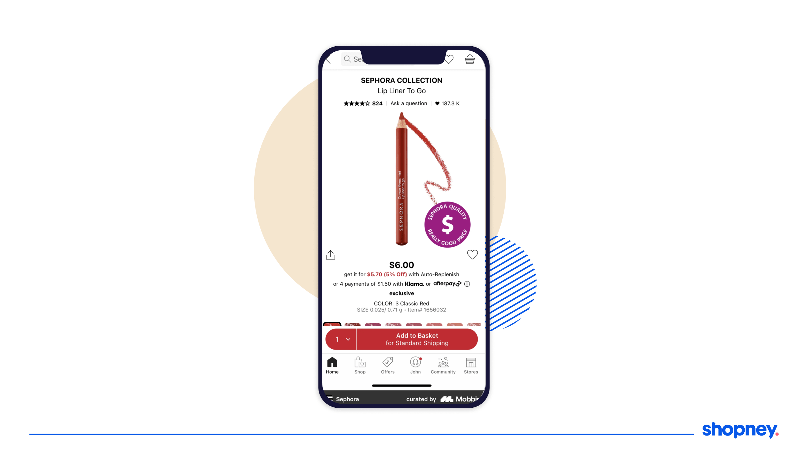
Before sharing product details that can quickly make their eyes glaze over, if a user sees the ratings and the number of users who have wishlisted the product, it can quickly create positive emotions and build confidence that their selection was a good one.
2. Shipping and self-delivery options
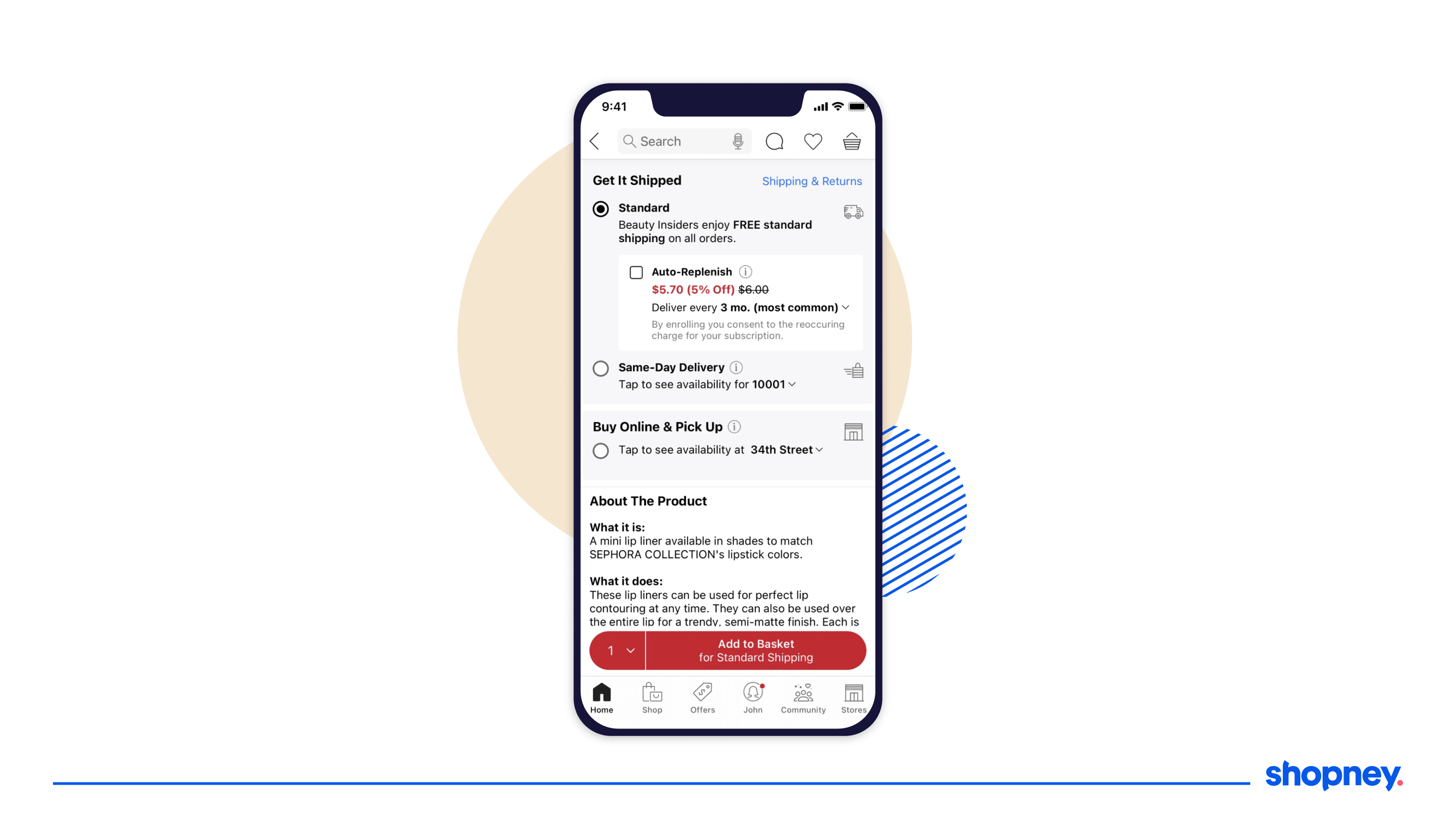
Right below the main product title images, the sections below aim to reassure the customer about their shipping options.
Besides that, a user can also select their auto-replenishment option to become a subscriber, increasing customer retention. They can also find if they can get the product within a day or the range of delivery promise, enabling customers to purchase.
Users also can check the store’s return policy- another strong nudge in purchasing without fear of dealing with hassles during a return.
3. Product information
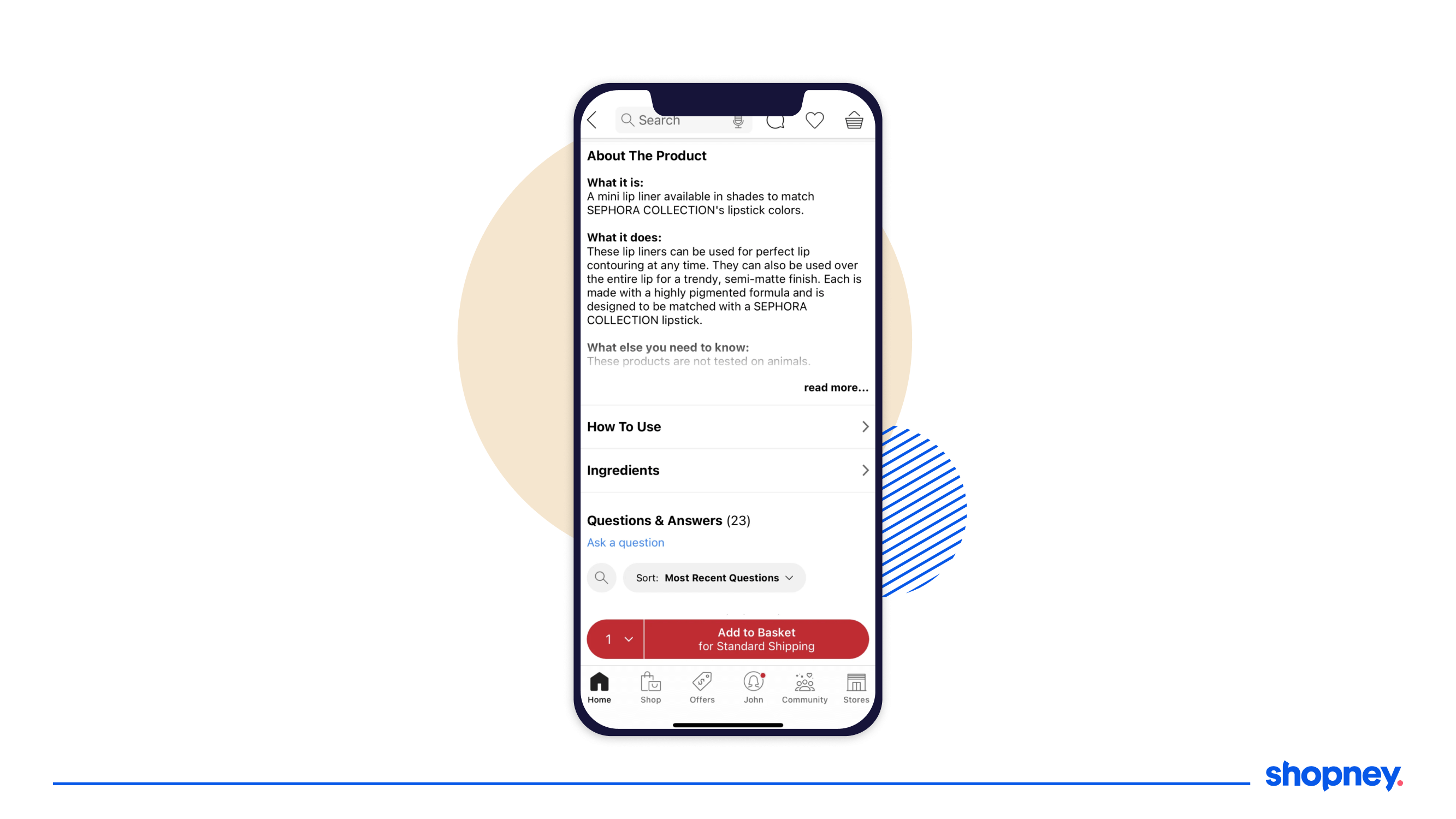
It’s easy to clutter the product description page and overwhelm the customer. We see it in many ecommerce apps.
However, Sephora has created space for two main sections- ‘How to Use’, which shows the user how to apply and reduce any feelings of confusion and intimidation, and ‘Ingredients Details’, as beauty users are specific about what they want to apply on their skin.
4. Clear and persuasive Add to Cart button

A strong visual design of the add-to-cart bar is important to move the customer down the buying funnel.
Make sure you make it easy to increase the quantity of any product as shown in Sephora’s mobile app.
5. Highly engaging Community section
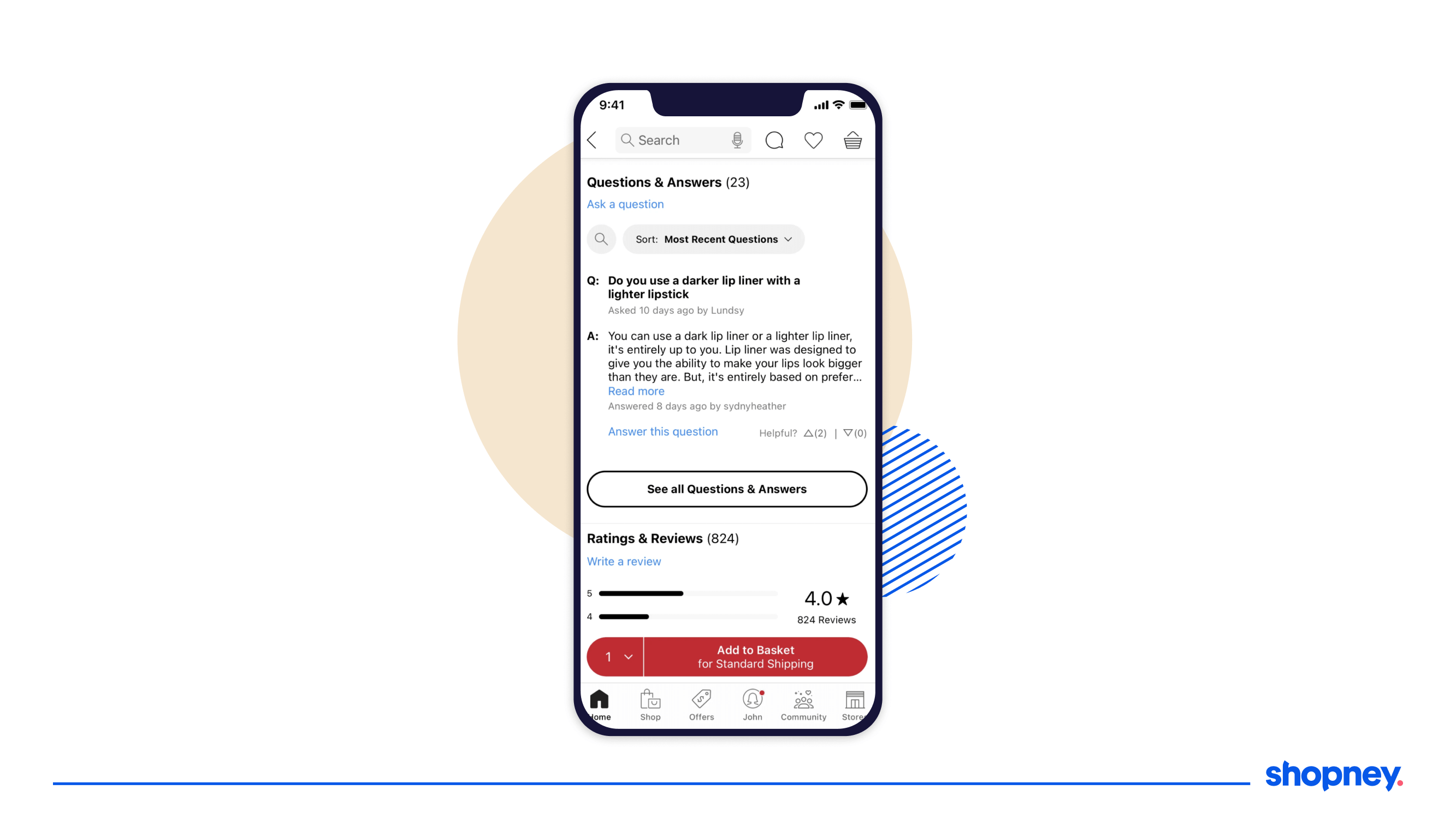
As we mentioned before, social proof is important and is one of the strongest ways you can increase conversions of your products.
Sephor’s section for ‘Reviews’, ‘Recent Questions’, etc., all lead to community-led, user-generated content where users can filter through ratings, can upvote comments, and even filter the reviews to find ones that will answer their questions and reduce pre-purchase anxiety.
All of this increases the credibility of the brand, and as a result, conversions!
E. Shopping cart page
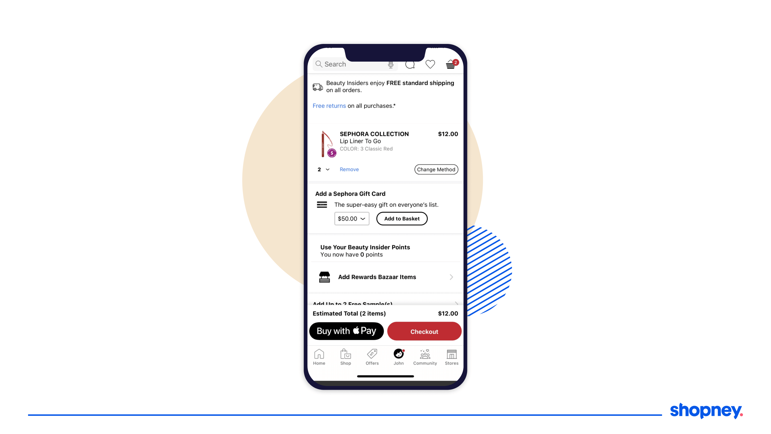
Okay so a user has added products to their cart.
They will want to check if the right variants and quantities have been added and will look for signs of whether they are making a good decision by purchasing.
Here’s how you should do it.
1. Free Returns on All Purchases
You must have noted how many times this has been mentioned across the app. But the most important of any app screen is the cart and checkout page to convince the user that even if they purchase a product, they can send it back if they don’t like it.
2. Sephora Gift Card Feature
Either it’s a nice way to ‘treat yourself’, or an excellent way to create a nice present for your loved ones.
3. Beauty Insiders Section
Another reminder to how many points you have can propel user with a cross-selling feature to add products to access rewards and points
4. Add Free Samples Section
Who doesn’t love a freebie? It acts as an added value to the customer.
And when you expand this section, you see the samples listed with captivating images that are bound to entice the user.
5. Your Loves – Wishlist Selection
This is great for upselling and cross-selling important products and increasing Average Order Value.
Customers who have reached the cart and checkout section are high-intent users and are more ready to try more products.
6. Strong Payment Nudge
With two clear payment options in the bottom bar- Apple Pay and Checkout (that will have all the other payment options), the user is clearly shown what the next step is, and land the user to the checkout page, and here is where the most important app screen comes into play.
F. Check out page
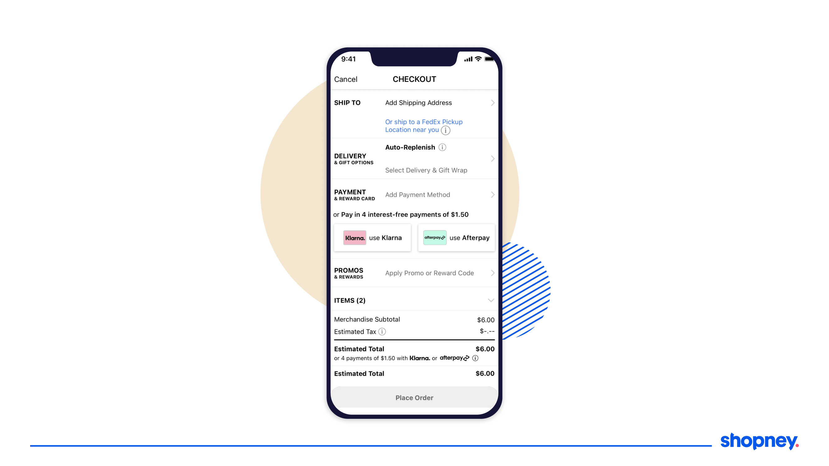
The checkout page needs to be the simplest, clear, and easy to navigate page. Let’s take a look at how Sephora achieves this.
It’s divided into four key sections – Shipping Address, Delivery and Gift Options, Payment options, Promos and Rewards section, a summary of the cart, and the final cost.
An important and unique option in choosing your address is the ‘Use Address from Contacts’ option. If you have that data stored already, it saves time and makes it more convenient for the customer!
G. Order confirmation page
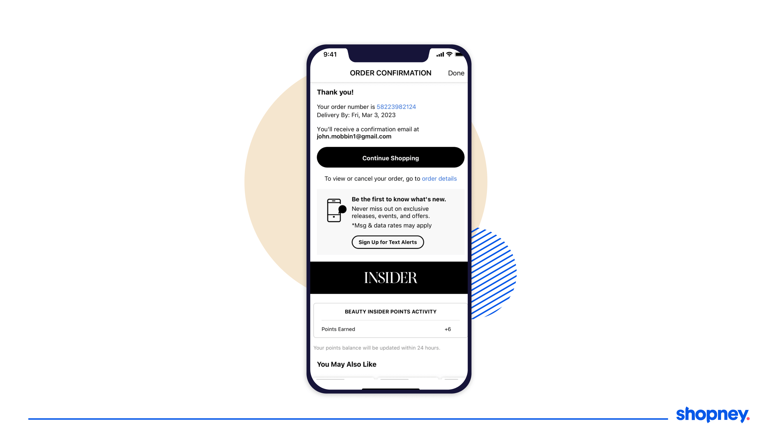
It’s interesting to note that your customers will feel anxious after the payment has gone through and will await any confirmation you can give them that their order has gone through.
This is why the order confirmation page needs to solidify the trust your customer has been nurturing since they started shopping.
Mention important shipping and delivery details, the medium of communication for delivery updates, and steps to view or cancel their order, as Sephora’s mobile app does.
You can also share how many points the user has earned, and try your luck to cross-sell again, as seen in the ‘You May also like’, where high-intent customers are more likely to explore and purchase more!
H. Beauty insider community program
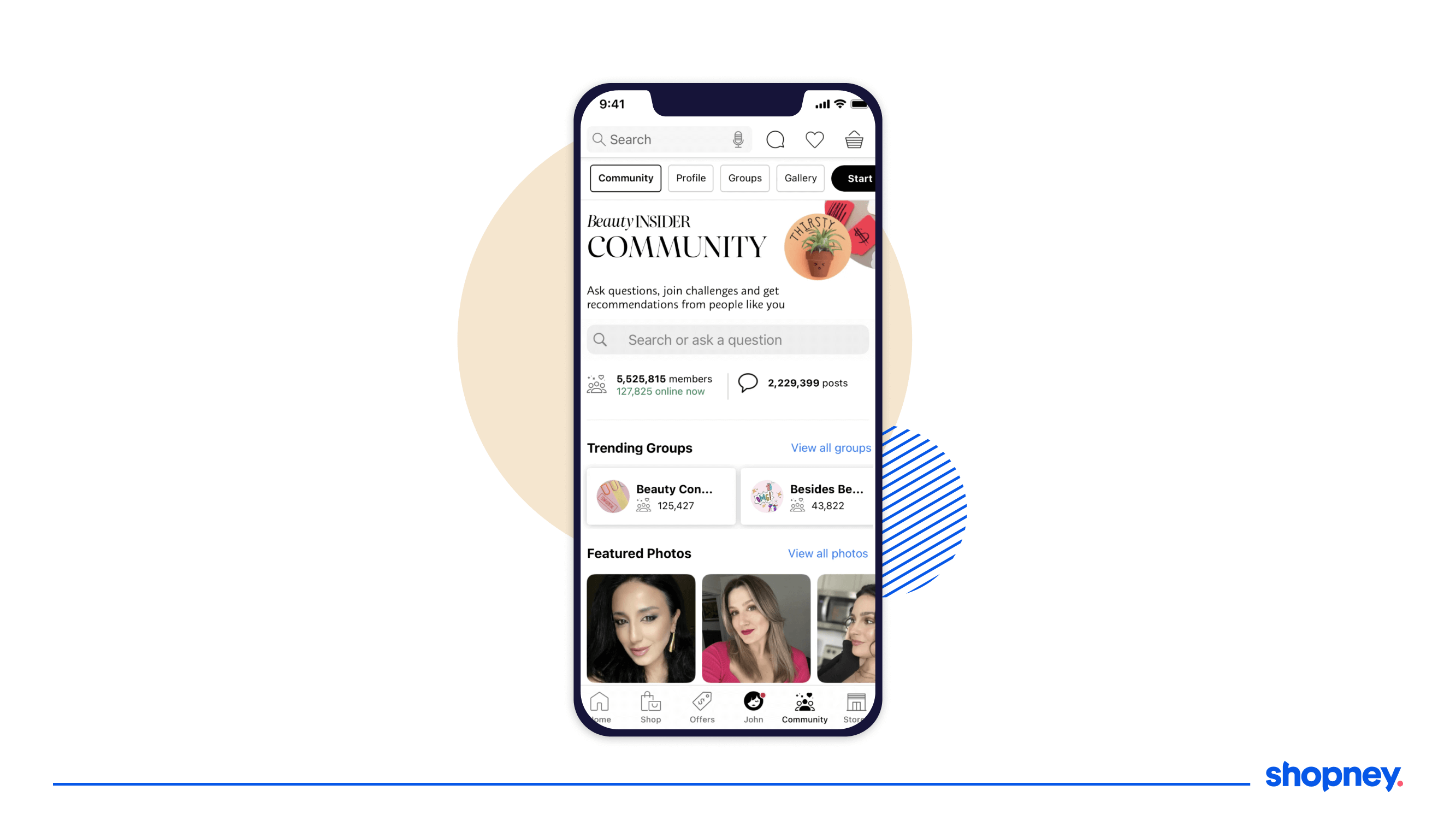
Sephora’s Community Page is a one-stop hub for beauty enthusiasts, resembling a Reddit forum tailored for the beauty world.
It offers real-time stats on active members, fostering a sense of community and trust.
A carousel of trending groups and verified user photos encourages active participation.
Users can upvote, comment, and find quick answers to their queries through smart suggestion drop-downs.
The platform also features public user profiles and allows for high customization, including multiple group memberships and detailed review filters based on eye color and skin tone.
This comprehensive yet user-friendly approach makes the community page a valuable resource for both newcomers and seasoned beauty aficionados.
Wrapping Up
At Shopney, we believe that a well-designed mobile app can be a game-changer for your eCommerce business.
Sephora’s mobile app is a prime example of how attention to detail in UX/UI design, personalization, and community engagement can lead to a successful and highly engaging shopping experience. Implementing similar strategies in your own app can help you boost in-app engagement and build stronger relationships with your customers.
From easy onboarding to a highly personalized home screen and a robust community page, there’s a lot to learn from Sephora’s approach.
If you’re looking to build or revamp your Shopify store’s mobile app, consider implementing some of these features to enhance user engagement and drive sales.
Best part- we can help you at each stage!
Reach out to us and we can help you create an experience that keeps your customers coming back for more!


Share this: