
Learn how to optimize your eCommerce mobile app checkout to turn user sessions into sales.
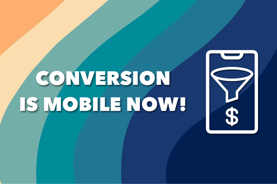
Statistics have found that more than half of the internet traffic comes from mobile devices. Everyone’s glued to their phones!
When we get up in the morning, our phones wake up with us, and have our attention as we go about the day – while cooking, eating, traveling for work, in between traffic signals – the phone goes wherever we do.
And that’s why we as consumers have also ended up shopping on mobile a lot more now!
In fact, surveys have shown that an average consumer has at least 4 shopping apps on their smartphone.
But can turning your Shopify store into a mobile app do the trick?
While it may help you embrace AppCommerce, you still have to take into account that even in a shopping app, the consumer goes through a series of steps to make a purchase – from product search, discovery, adding an item to the cart and then moving to checkout, there are various points at which they can drop off.
The most common one being the checkout process of your brand’s shopping app.
So in this blog, we’ve rounded up some of the best ecommerce mobile app checkout practices to increase your Shopify store’s conversion rates.
Remember- your brand is unique. Use these tips to experiment and analyze to find a mobile checkout process that works for YOU.
What is an eCommerce mobile app checkout process?
The mobile app checkout process refers to all the steps a user (online shopper) needs to complete to make a purchase from your brand using the shopping app.
It includes all the steps that come after a consumer has added a product to their shopping cart – reviewing the product details, quantity, providing shipping and payment details, applying any discounts or coupons, and finally, completing the transaction to place the order.
It is important to note that an eCommerce mobile app checkout process works differently from how your Shopify store’s website and mobile site checkout does. The process is more intuitive which helps reduce the lag time that typically occurs when a consumer needs to move back and forth to edit cart items on websites. But the intuitiveness needs to be naturally progressing forward!
Why is eCommerce mobile app checkout optimization important?
Smartphone users are more easily distracted.
Notifications from multiple apps can pop up, and a call or a message can have them exiting the shopping app and forgetting all about the products added in the cart.
While you can’t control the distractions surrounding a consumer, you can control the time between the snap decision they make to exit the app without completing the checkout process.
Think of it as giving much less time to distractions to take away a shopper from their buying journey. This is where eCommerce mobile app checkout optimization becomes important!
Here’s why eCommerce mobile app checkout optimization is important for Shopify stores to succeed in AppCommerce:
- Enhanced User Experience: A streamlined and user-friendly checkout process improves customer satisfaction, reduces friction, and encourages them to complete their purchase.
- Increased Conversions: By minimizing the barriers and simplifying the checkout process, you can significantly increase conversion rates and revenue.
- Competitive Advantage: Providing a seamless mobile app checkout experience sets your business apart from competitors and helps build trust and loyalty among your customers for being a consumer-first business.
- Mobile-First Approach: With the increasing number of mobile users, optimizing your app’s checkout process aligns with user preferences and behavior, driving more conversions.
What is a good mobile conversion rate?
Mobile conversion rate can be calculated by dividing the number of purchases on mobile by the total number of mobile sessions. This varies for mobile websites and shopping apps!
A good mobile conversion rate is considered to be anything above 2%. This means that for every 100 people who visit your mobile site, 2 or more will make a purchase.
On the other hand, Shopify stores that have built Shopify apps with Shopney easily see a 5X higher conversion rate. This is owing to the ease of shopping built into their brand’s shopping apps to encourage natural and impulse purchase behavior.
How to optimize your ecommerce mobile app checkout process for more conversions
While there is no one way to structure the customer journey you want to offer buyers, checkout is what makes or breaks your success. Here are some tips to ensure you’re making it simpler for mobile shoppers to get to the part of ‘buying’:
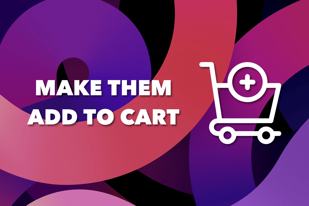
Optimize the steps to ‘add to cart’ (before checkout)
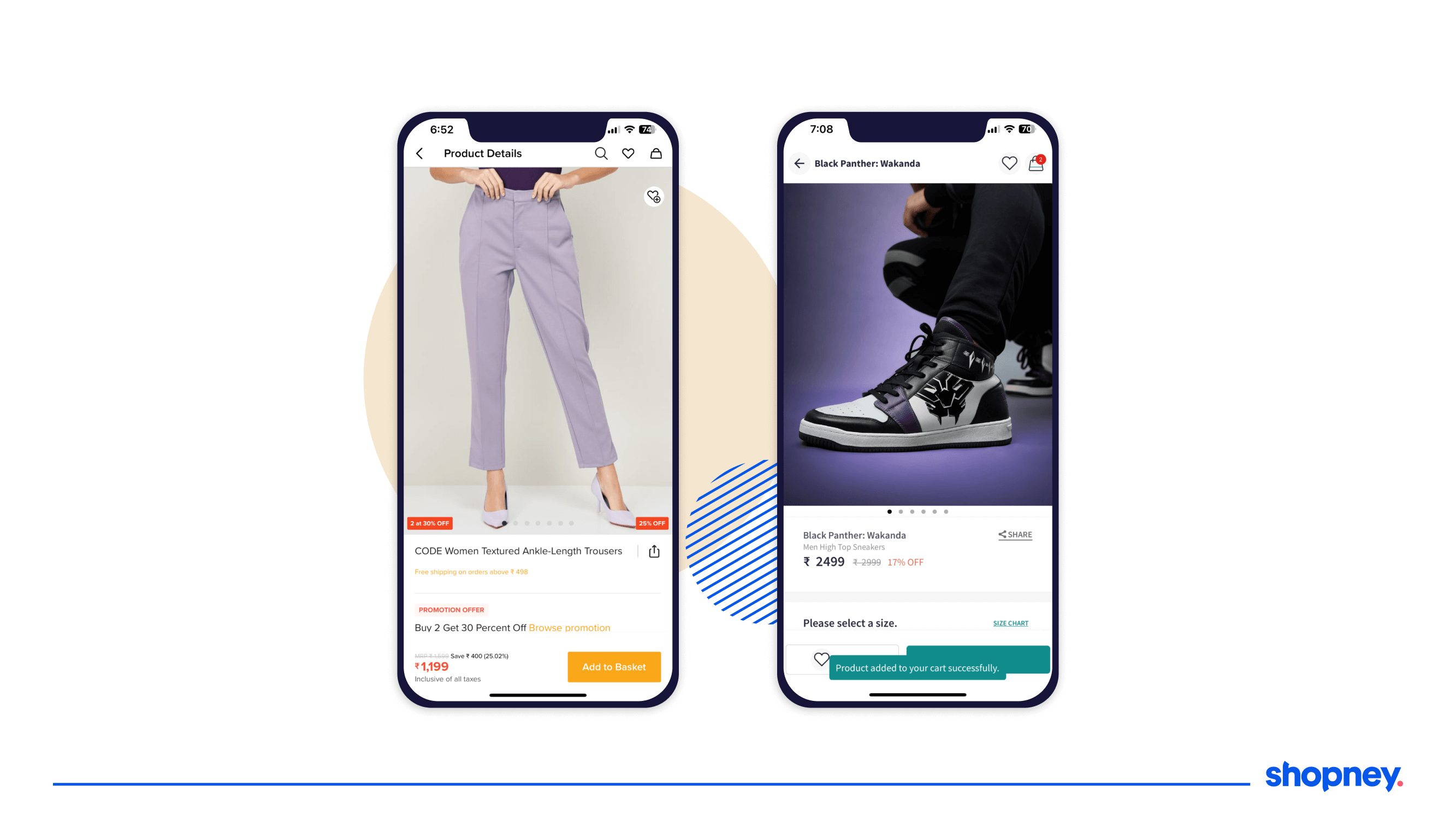
1. Make call to action buttons visible and intuitive
The Add to cart button should be easily visible in the first fold of the item’s product detail page. If a user clicks on it, use a transition or an animation or even a quick modal slide-up with text ‘Added to Cart’ that reassures your customer that the item has been added.
Some apps even permanently change the button copy of ‘Add to Cart’ to ‘Go to bag’! Take a look at how popular shopping apps Lifestyle India and Puma illustrate this tip well:
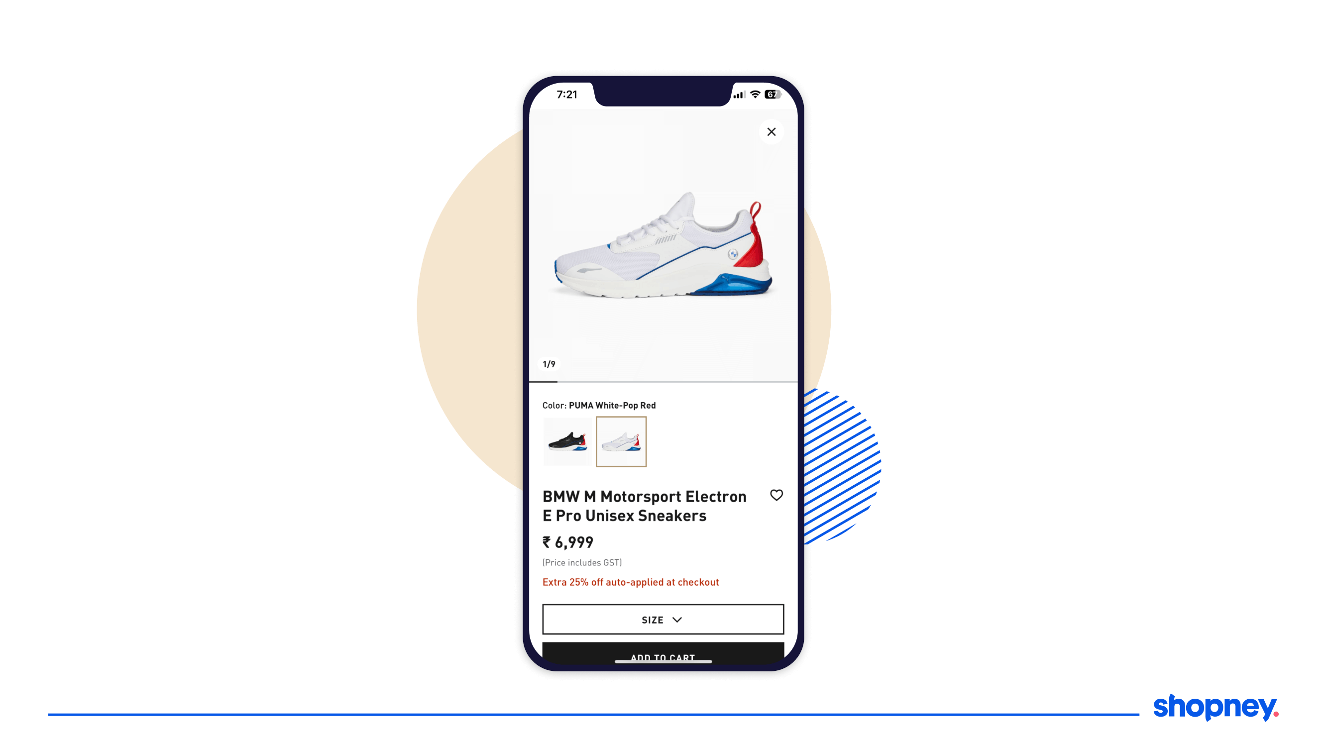
2. Keep the ‘thumb zone’ in mind
Most mobile users navigate their devices with a single hand, especially when on the go. Any app with buttons and fields that are not accessible with a swipe of a thumb will frustrate users. Make it a ‘rule of thumb’ (pun intended) to enable checkouts with a single hand. This is also aligned with the fat thumb design theory of user experience.
Marks and Spencer’s app, as shown below is a good example of making single hand nav easy.
3. Place important information above the fold
Mobile users are lazy. Ensure your first fold has all the important details to convince your buyer. If you have multiple folds, nudge the screen upwards through a quick animation to indicate there is more information available.
Look at Puma’s product page- it has all the important details one would need to consider purchasing.
In the shopping cart (during checkout)
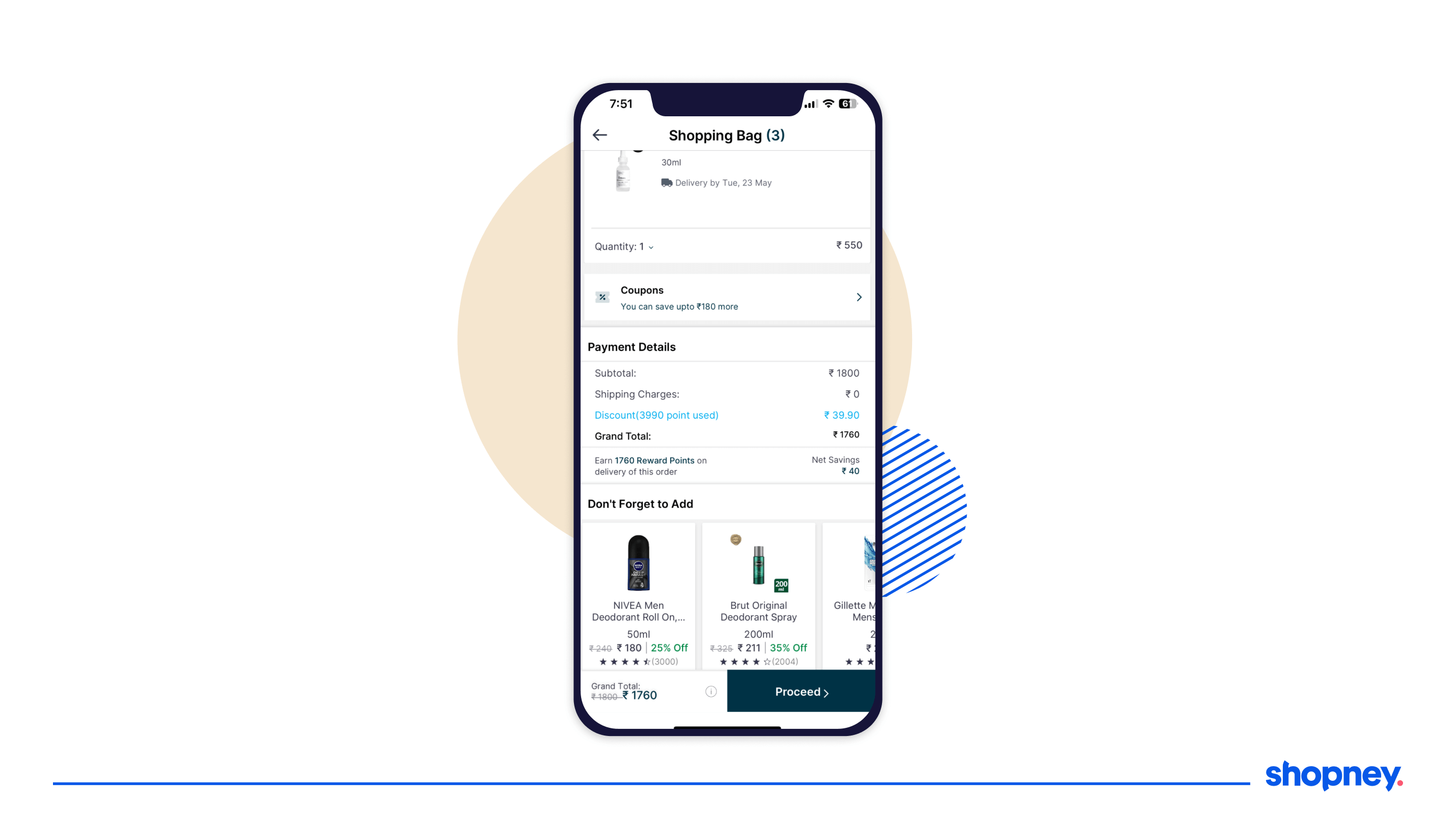
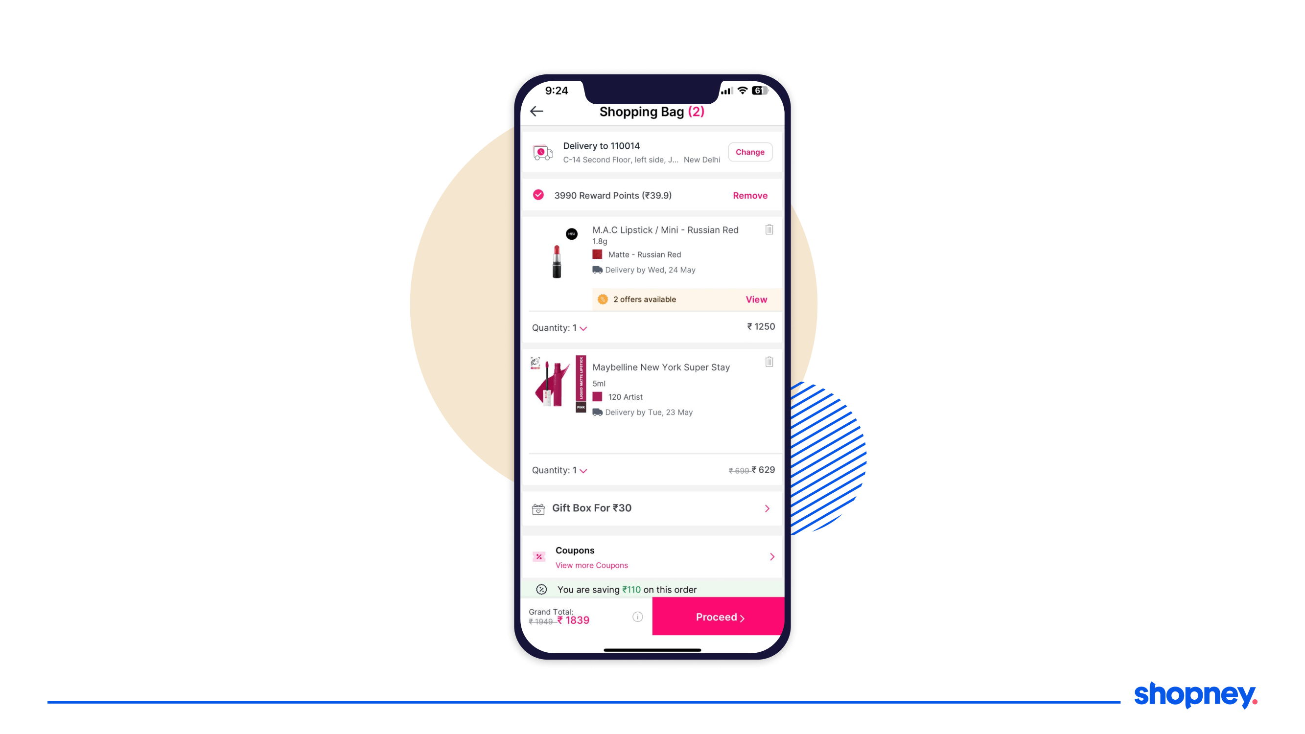
1. Show all applicable charges and delivery timelines
There is nothing more unpleasant for a shopper to find their cart value has risen (even by a small amount) by hidden surprise charges or their order will come later than expected. The more assured you leave them as they add to cart, the higher the chances that they’ll actually convert.
Look at how Nykaa Man shares delivery dates in its cart summary!
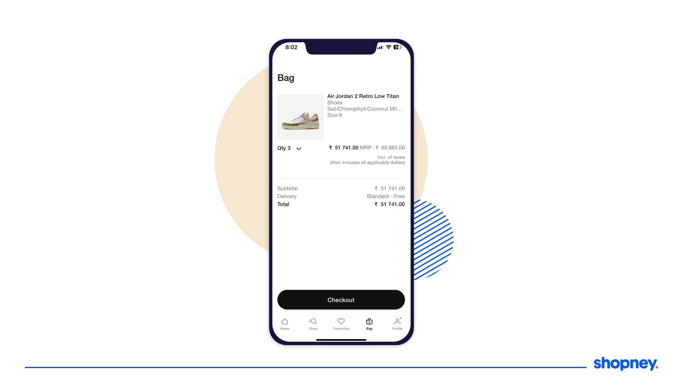
2. Keep the checkout button clearly visible
Don’t make your users ‘search’ for what should be obvious. Ensure your checkout button is impossible to miss and highlighted to prompt them to move to the next stage in the funnel. Also, make sure it’s easy to exit and continue shopping.
Adidas as you can see below has made it clear what the next step is for the user.
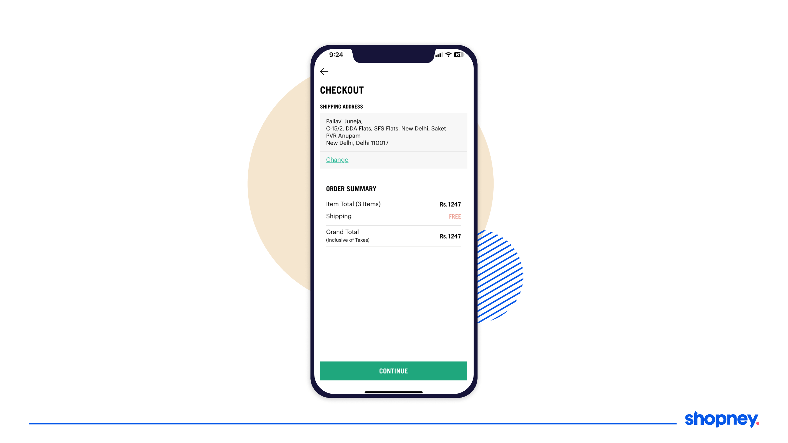
3. Keep your checkout page minimal
Have you noticed most checkout screens are very clean, big on negative space, and only use black and white fonts, with the exception of one color like green? The idea here is to tap into the purchase-ready mindset of the buyer without distracting them.
Remember to keep the CTA highlighted, like DailyObjects does with it’s simple checkout interface:
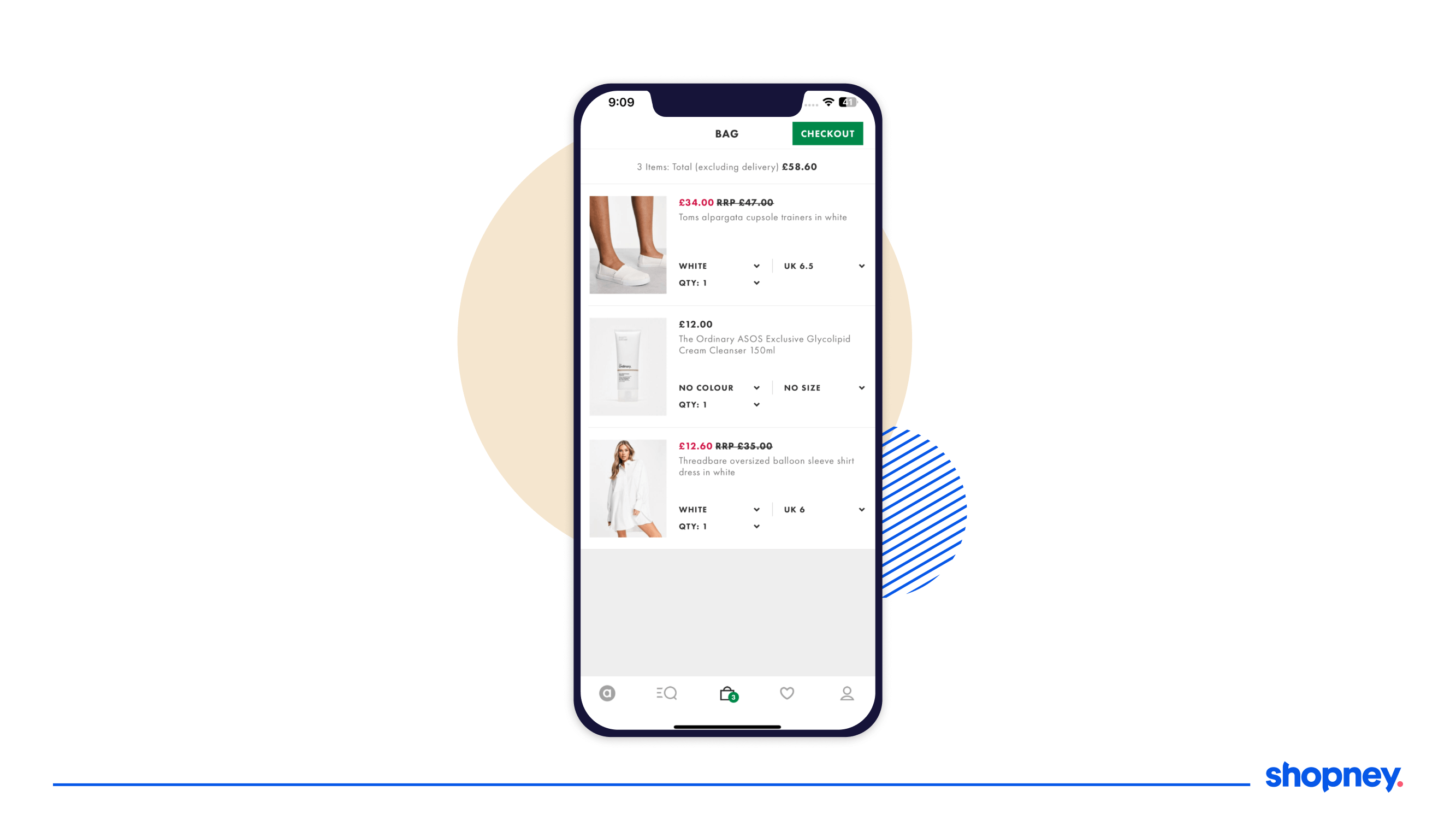
4. Include only essential information
Keep the product photo, name, size, quantity (summary of cart), total cart value with added or available discounts, and delivery time in your ecommerce mobile app checkout page. Anything else and you risk users dropping off with information overload!
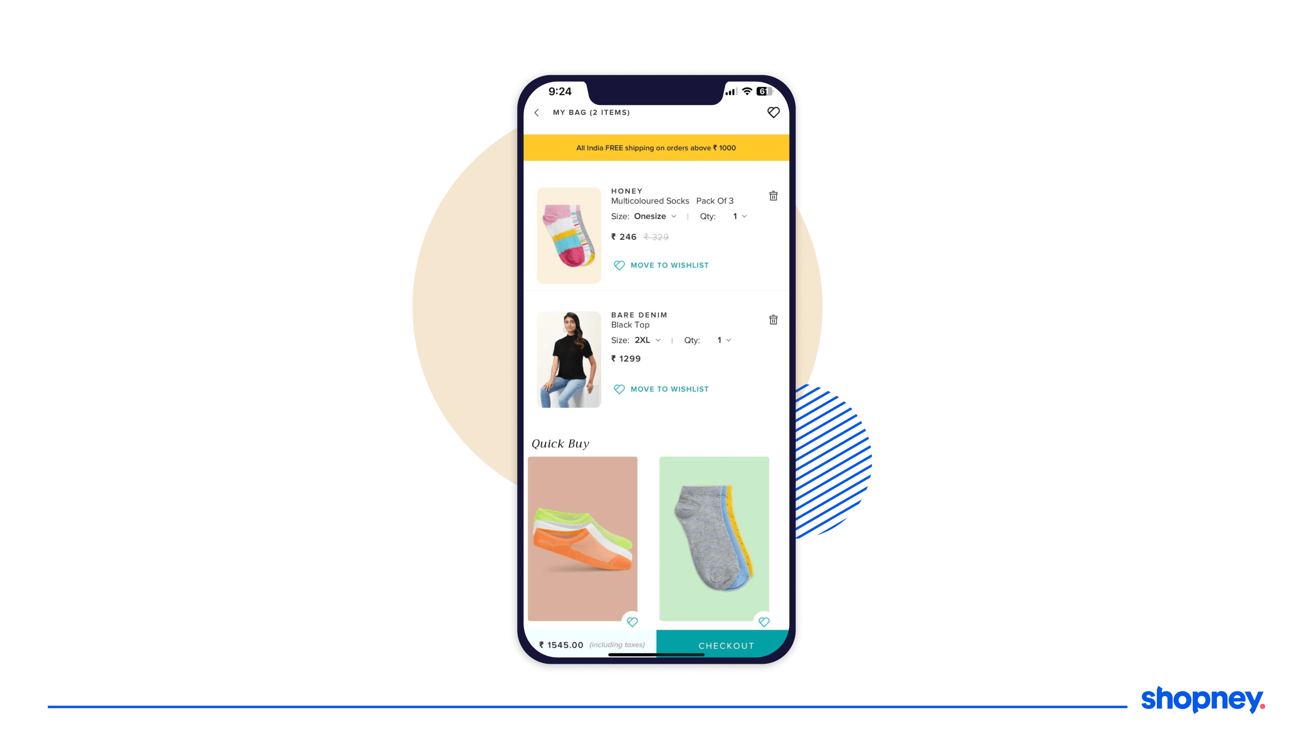
5. Enable easy cart edits
Quantity, size, color should be changeable on the checkout page itself, DO NOT make them go back. In addition, allow a ‘move to wishlist’ option so they can come back and complete the purchase later.
Pantaloons, a popular mobile shopping app for lifestyle fashion products does makes it very easy to edit on the cart page so users don’t leave and abandon cart.
6. Streamline the number of fields and steps
To optimize your mobile app checkout, minimize scrolling, reduce the number of form fields and break the checkout process into digestible steps. Lengthy forms can be overwhelming and time-consuming for users and no one likes to fill them when using smaller screens – no matter how well your Shopify store’s mobile app is designed!
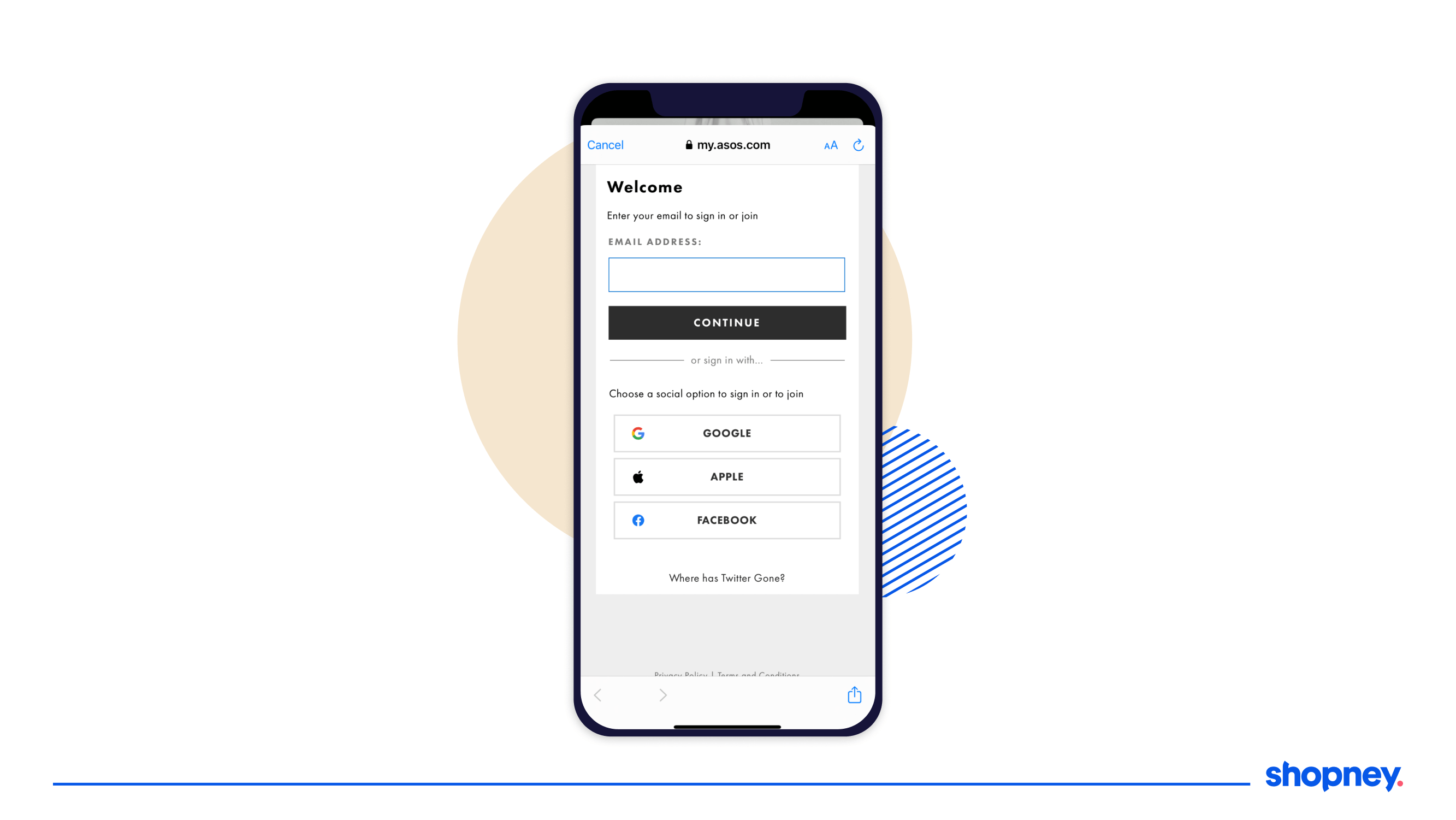
7. Enable quick checkouts
Users love one-click sign in through Facebook, Gmail and Apple, that move them towards completing the purchase faster. Look at how ASOS emphasizes SSO’s to speed up signing in and they can personalize the entire shopping journey with previous user data!
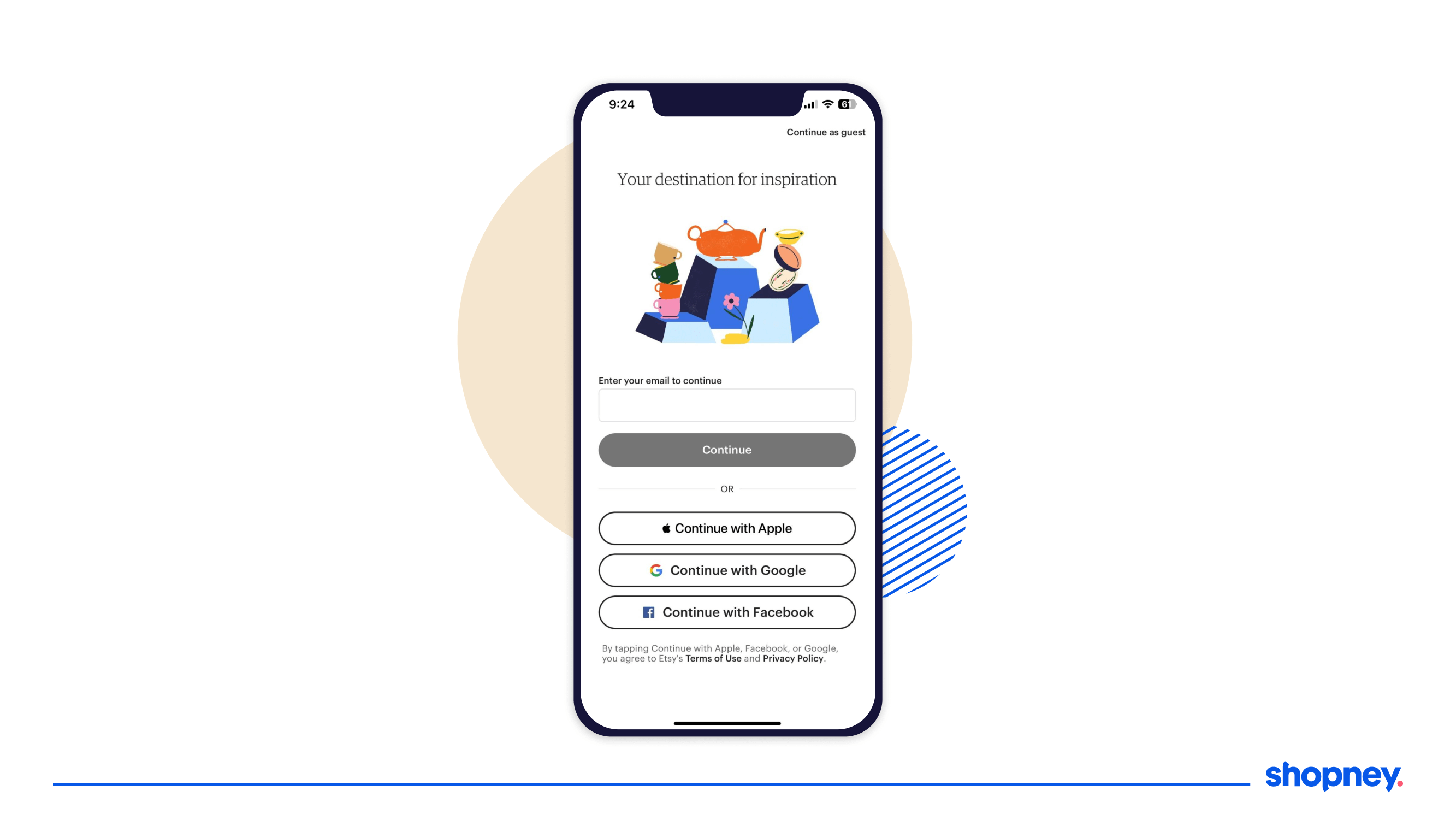
8. Allow guest checkout
Studies found that a whopping 35% of mobile users didn’t want to create an account. Guest checkout simplifies the process for first-time customers or those who prefer not to create an account and have pesky marketing emails bombard their inboxes. The same holds true for your eCommerce mobile app checkout too!
Take a look at Etsy’s guest sign in option that is highlighted in their sign in user interface.
9. Show a progress bar or breadcrumbs
Uncertainty is your enemy when it comes to a smooth eCommerce mobile app checkout process. By visually showing which stage they are in the checkout process provides users with a sense of control and allows users to estimate the time and effort required to finish the checkout.
Look at how Amazon (who’s checkout process ticks off many of these tips) show how many steps are left to successfully place an order.
10. Auto-complete checkout fields
This feature saves time for users and reduces the risk of errors when entering addresses and contact details. Filling in an address in particular can be annoying to do through a tiny screen so less friction in this regard, the better. For the credit card or contact number field, automatically display the numerical keyboard for faster input, or display an option to use the saved information from a previous purchase made using your brand’s shopping app.
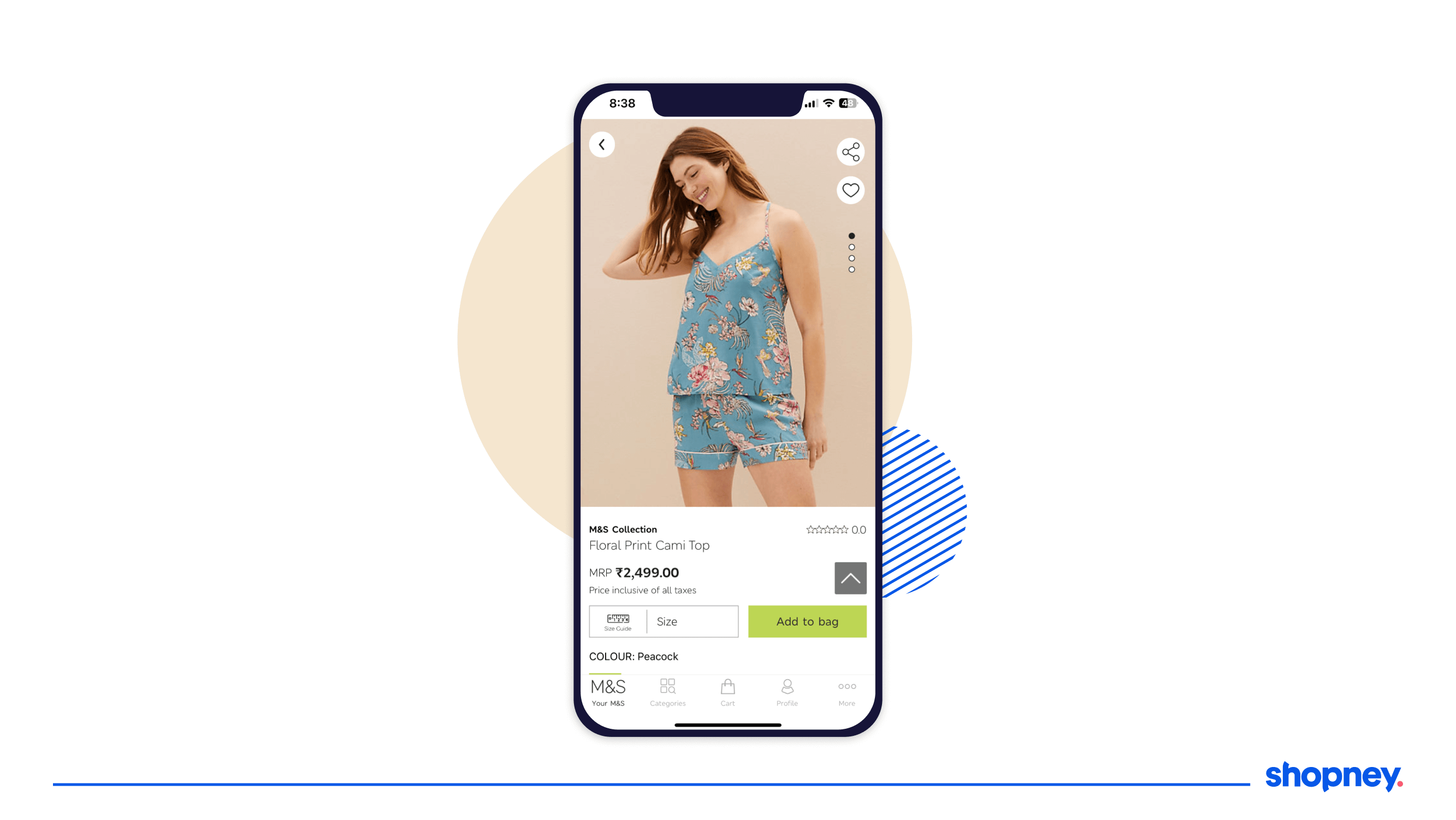
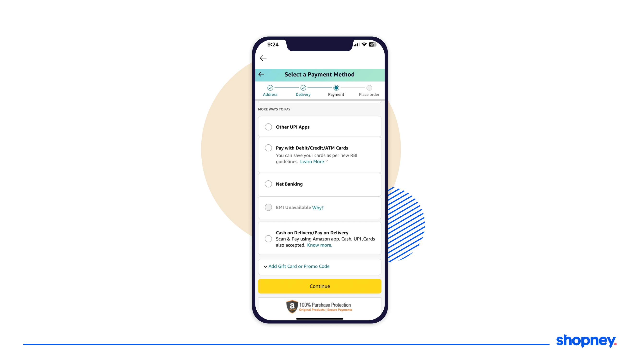
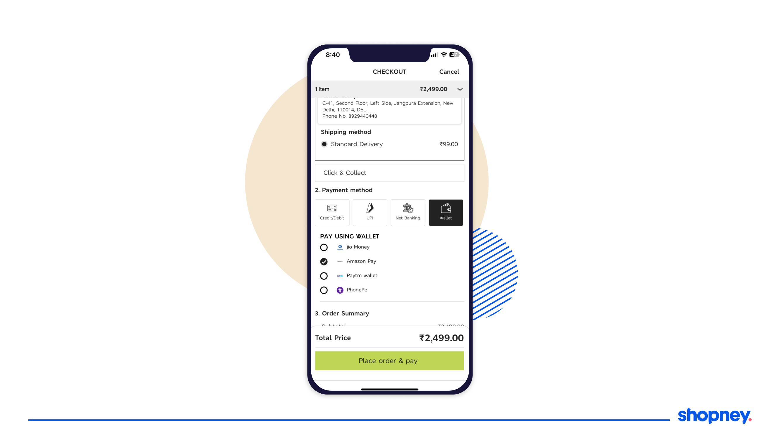
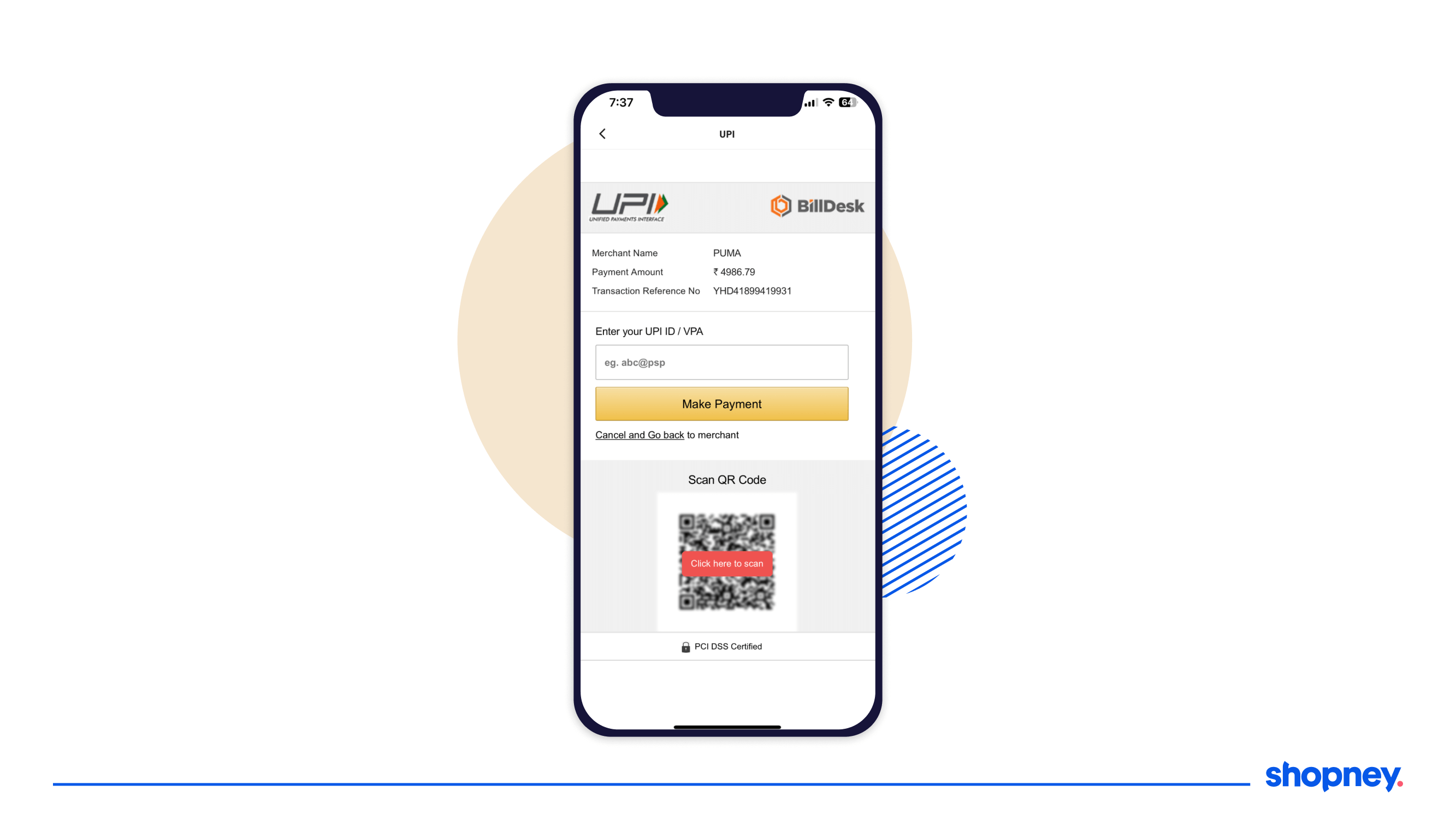
11. Integrate with mobile-first payment modes
Offer popular mobile payment options such as Apple Pay, Google Pay, and other digital wallets. These payment methods provide a faster and more convenient checkout experience on mobile apps. By integrating mobile-first payment modes, you cater to user preferences and reduce friction associated with entering credit card details manually. Take a look at multiple mobile first options M&S offers to encourage users to check out quickly.
12. Showcase trust signals
Increase your credibility by highlighting user ratings, secure payment options, or customer testimonials that will empower the user into thinking they are making the right decision. Despite your shopping app being branded, the number of frauds that consumers experience needs a little more reassurance.
Take a look at how PUMA signals trust by using a logo of a trusted payment platform featured clearly at the top and have PCI DSS Certified with a lock icon to further reassure their customers.
13. Offer discounts and offers
Incentivise registering, signing in, or making their first purchase with personalized or time-bound offers. Make the coupon code section visible and in the first fold, but collapse it, like how Nykaa does on their checkout page.
You don’t want them to leave the app looking for a code and not come back.
Offer discounts and app-exclusive offers to increase sales
14. Upsell and cross-sell to increase AOV
Show related items to increase revenue in a single conversion instead of spending more money to keep getting them back for the next purchase. Zara does this in two ways, on the product detail page after you add an item to cart and on the checkout page.
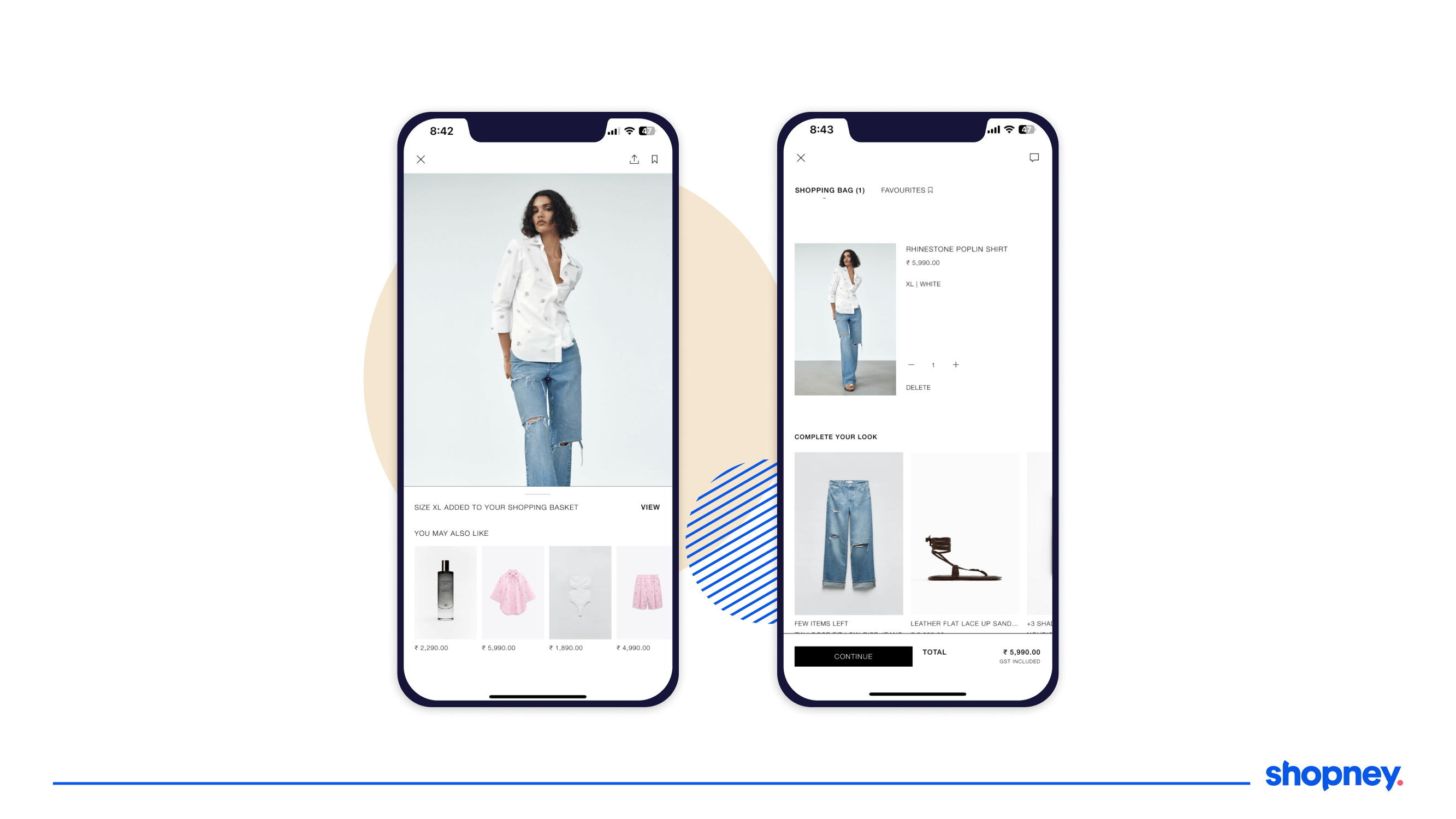
Showcase product suggestions to benefit from up-sell and cross-sell opportunities
15. Display savings on each item
Studies have found that users like knowing how much money they have saved on each item instead of the whole cart to justify their shopping. And that’s a conversion optimization hack we love using in the eCommerce mobile app checkout process!
ASOS does this really well by even changing the font color of the update price to show your savings.
Display savings based on the discount on your mobile app
On purchase completion (after checkout)
1. Display order confirmation message
Users will breathe a sigh of relief when they are 100% sure the process is completed from their end and confirmed. Use this step of the eCommerce mobile checkout to confirm the order, thank the customer, share tracking details or information about when they will be receiving them.
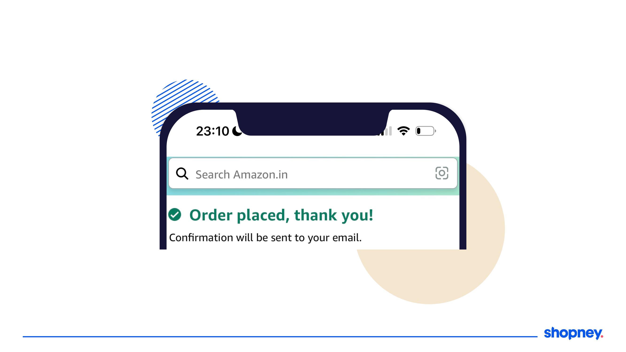
Display order confirmation message in your mobile app
You can also use this eCommerce mobile app checkout screen to recommend other similar products to encourage the buyer to explore more.
2. Do a eCommerce mobile app checkout funnel analysis
Measure your action cohorts, user cohorts, and heat touch maps to find out where users are finding friction and dropping off or if the app is crashing. Drill down to find the reason and optimize your funnel accordingly.
Keeping a close watch on your ecommerce mobile app checkout process performance can help you identify strengths, weaknesses and opportunities to get mobile shoppers to buy more from you.
Is your eCommerce mobile app checkout process optimized?
Optimizing the eCommerce mobile app checkout process is crucial for reducing drop-offs and increasing conversions.
At Shopney, we provide a quick and easy drag and drop editor for building ecommerce mobile apps that are optimized at each stage, including checkout. This has helped us uncover several consumer behavior and preference insights when using shopping apps, that enables our success team to create conversion strategies that work.
If your Shopify store’s mobile app has been experiencing high cart abandonment rates and drop-offs, your eCommerce mobile app checkout process could be the reason. To make your checkout even more seamless, it’s important to ensure your app works smoothly with the tools you already rely on — from payment gateways and subscription solutions to loyalty programs and personalization engines. The right integrations help you sync data in real time, automate workflows, and create a consistent shopping experience across your entire ecosystem.
Book a demo with us to learn more about eCommerce mobile app checkout optimization.


Share this: