The rule number one in commerce hasn't changed throughout history: If you want to sell something, it should be easy for your target audience to buy!
You need to optimize the entire customer journey from awareness to pricing and needed actions of purchase. Regardless of where you sell, when you sell and who the audience is. The same dynamics work in behind in traditional commerce and eCommerce.
The UI design is so much related to that rule. The ultimate purpose of a good UI design is to make the user's interaction as simple and efficient as possible. Every item in front of the user should play a role in driving him to the actual goal.
From that perspective, the interfaces and appealing designs are one of the most significant parts of the entire user experience in eCommerce. And they can dramatically impact the sales which are vital for any commerce business and sales channel.
Number 1 rule in commerce: If you want to sell something, make it easy to buy!
Therefore, great attention should be paid to the whole user interface and the customer journey for sales in the given online sales environment. Be it a website or a mobile app, no matter which device it is. But in the context of this blog post, we will focus on mobile shopping apps. Especially, for the Shopify stores.
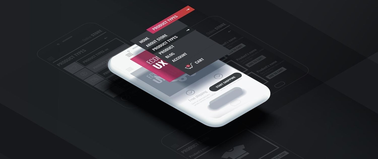
A good UI design will help you grow. (Image: Kitrum.com)
How To Design UI For Your Mobile Shopping App
There are a number of critical issues-goals you should consider and check in terms of the user interface in your mobile shopping app:
- Welcoming your customers with attractive visual content
- Creating an intuitive shopping environment
- Offering a pleasant and frictionless shopping mobile experience
- Providing seamless browse, search and add to cart functions
- Guiding your customers through the checkout
Satisfying all the above will result in a great mobile sales channel which will bring a lot of sales and decrease abandoned cart rate. However, to achieve that you should have a solid approach. A great UI design approach starts with customer behavior analysis.
Then, you should decide the desired actions in the mobile app. It can be a direct purchase, filtering the product or tracking the order, etc.

The next step is planning the whole journey through those actions. Finally, after completing the first three steps, you are set to go with designing your mobile app user interface.
Understanding The Mobile App User
Although they look so different, the customer's shopping behavior in online retail and brink-and-mortar stores are so much the same from many perspectives. Take a moment and visualize needs and behaviors in both environments... They are basically the same as we list below:
- A nice-looking shopping environment
- Accessible staff help when needed
- Easy navigation throughout the shop
- Personalized recommendations
- Frictionless payment and checkout processes.
Why we give both online and in-store behaviors are that the universal shopping tendency is pretty much the same in all shopping environments. So when you observe and understand the insights of the user in any given environment, you can make the right assumptions for one another.
Decide The Desired Shopping Action
Selling online is the main goal of a mobile shopping app. But not the only one! There are many different actions can be taken in the app. Sharing a product, tracking an order or creating a wishlist can be given as examples.
Therefore, you should visualize the entire action set that you want to be taken by your app user and optimize each one. This is not an easy task. However, it's so important for a good UI/UX design.
Plan The User Journey In The UI Design
If you feel scared about deciding the actions and planning the user journey, we have good news! You can benefit software like draw.io to create flow charts for the user's journey for a specific action. This will enable you to see the big picture and reduce the possibility of common mistakes.
Design The User Interface
Here is the trickiest part of the approach. If you made a good job in the previous three steps, this part will become easier. A skillful designer or a design team will craft your mobile app in an insightful manner. And the result can hardly be unsatisfying.
If you are using a mobile app builder to turn your Shopify store into a mobile app, you will not need to design the whole app with its every single page. Most parts of the user interface elements will already be designed for you. But you should still check if your mobile app designed according to the latest mobile commerce store design trends and global user tendencies.
For example, at Shopney, we design the fixed parts of your mobile commerce app considering the two key issues mentioned above. Besides, our world-class design and development team at Shopney created 6 different themes for different needs of various sectors and store types.
So you can display your products in mobile interface by keeping the beautiful look and feel of them. You just pick the best one and put a small touch of design like icing on the delicious cake!
Still, this part is really deep and should be broken down into pieces. Here are the key points of a UI design:
- User Experience
- Color
- Typography
- Layout
- Images
- Icons
- Animations
Let's go deeper into each one of them for a better understanding of mobile commerce store UI design.
User Experience
We cannot put UI design and UX design in an order of importance. They are both so important and should go hand to hand. However, user experience is your guide for user interface design.
So you should conceptualize the mobile shopping app experience of your users in mind. Then, you should go for a tangible execution with user interface design according to UX.
In a nutshell, perfect design is the result of the well-thought user experience process. Without having a solid UX concept, beautiful-looking images and icons will work only as art pieces. And your mobile store will fail.
Remember, the shopping experience should be seamless, easy to understand, fast and convenient. These are what a great UX design provides your customers with, in a mobile shopping app.
UI Color
Color is one of the most important elements of UI design. When you are designing a mobile shopping app, the color selection and how to use them has great importance.
You should always keep in mind that your mobile store is a sales channel for your brand identity. And it should have consistency with your other sales channels like web store and social stores.
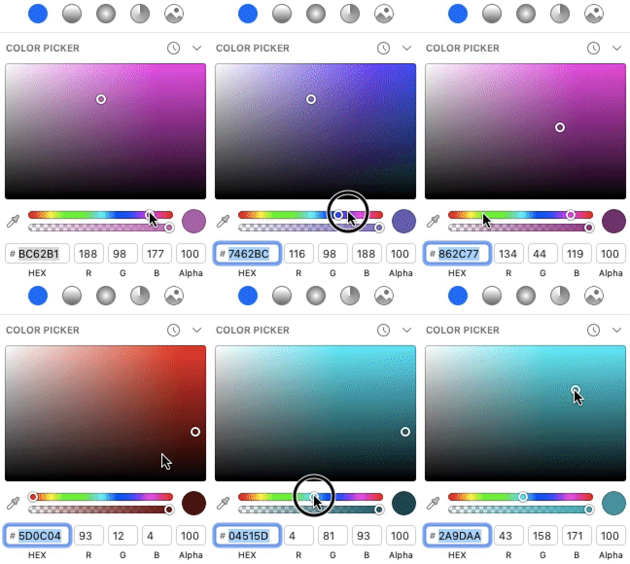
Color picker of Sketch App
When it comes to color, it's mostly related to your taste besides brand identity. However, there are some useful tips color weighing when using multiple colors in your design. One of the most common ones, especially in mobile shopping app interface design is 60-30-10 rule.
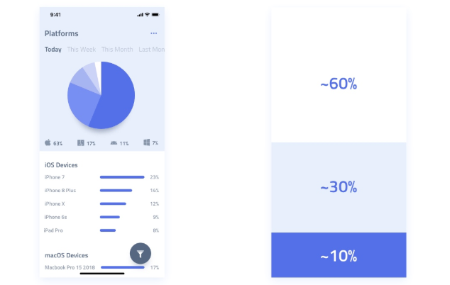
If you stick with this rule, you will make sure you use your colors in an effective way. And it will result in a nice-looking design regardless of the color taste of your customers.
Typography
Typography is also a very important element of branding and UI design. You can easily see that every single font (family) has its own soul and tells a different story about your brand.
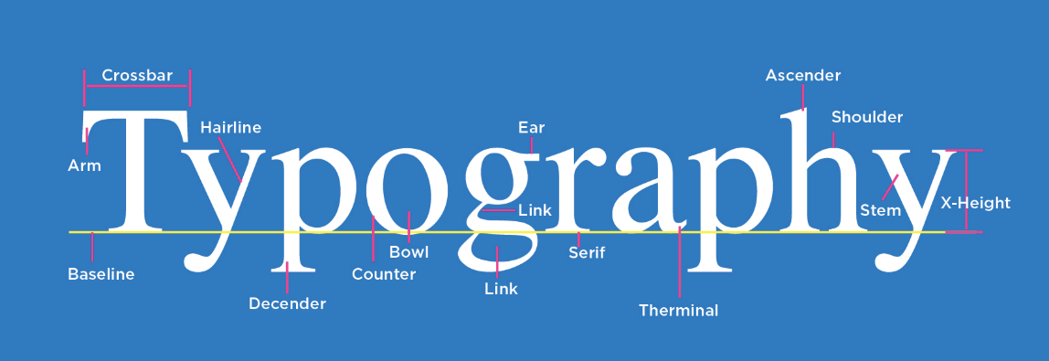
Typography elements. (image: WLM Digital)
We recommend clean and modern typography for your mobile app as the users got used to it in all around the world. Also, you should use one type of font family with its Bold, Italic, Regular and other versions. Using more than one font family will result in a confusion about your branding.
At Shopney, you can craft the mobile app of your Shopify store with custom fonts. If you want to learn more about it, you can visit us in Shopify app store.
UI Design Layout
UI design is so much related to UX design and understanding. While planning the interactions and regarding elements in your mobile shopping app, you should think of thumb-friendly layouts. Because the thumb is the most functioning finger while we use our mobile devices.
If you keep the important and frequently used elements far from the thumb, they will not be user-friendly and, will have a negative effect on overall mobile shopping experience.
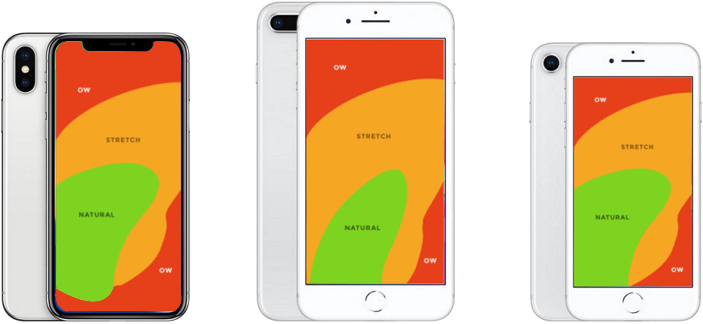
In the image above, the green areas indicate the most thumb-friendly areas on the screen. As goes with orange and red, the thumb-friendliness decreases respectively.
Images
If you are using them in your design, images are the most important part of visual language. A striking image can play a huge role in the conversions. However, you should use them in a proper way in your mobile shopping app.
Nick Babich, a UI/UX master, tells about the importance the images in design and common mistakes about it in his blog. One of the most important points that he emphasizes is the distortion. Most of the time, it's related to the proportions of your image and the supported image layout in the website theme or mobile app theme.

Image Distortion (image: Nick Babich)
If you want to convert your Shopify store into a mobile app without no image distortion, Shopney is the best solution for you with 6 different theme options.

Each theme provides a different image layout and proportion. So you can pick the best suit for your store inventory and product photography.
Icons
Icons can be considered as a universal language just like emojis. And it's the oldest way of indicating something since cave-men. The styles changed throughout history, however, the basics remained the same in icons. Stay simple, and empower the communication.
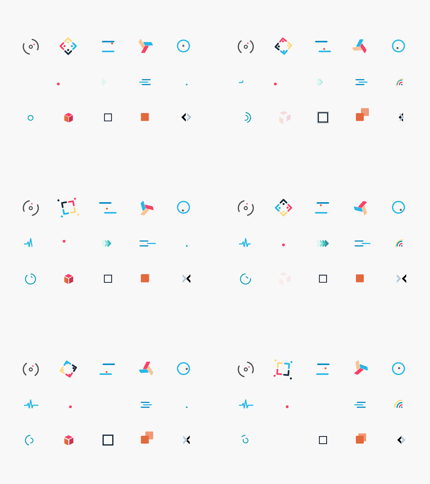
Using popular iconography would make your app a lot more intuitive and help you rank higher in your mobile app UI design. Because they are so useful for crafting your design in detail. As the quality lays in the detail, you should pay attention to your Shopify web store and mobile app design.
Animations
One of the biggest trends in online commerce design including mobile is micro-animations. Why? There is a logic behind it! Keep in mind that every design element and animated object should serve some function. Because of the limits of a mobile screen, it makes sense to use animated design objects served some dual functions.
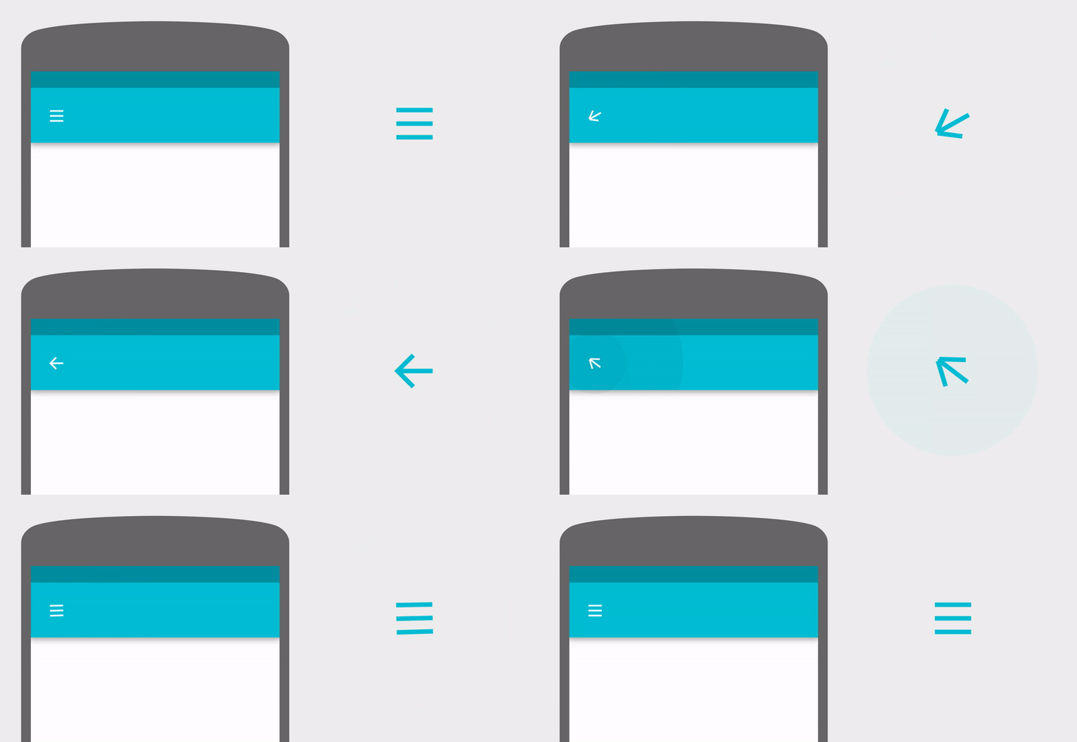
A micro-animated mobile app menu icon (image: Softermii)
In that way, you can actually accomplish two important tasks in one certain area. See the example above for a clever solution to merge the menu icon & back arrow in one given area. On the other hand, motion brings emotion! So you can create better interaction and stronger bonds with your mobile app users with such animations.
Conclusion
Possible UI/UX design tips for eCommerce mobile apps are not limited by some number. So we could share the most vital ones that consider before you design your Shopify mobile store.
Keep in mind that improving the overall mobile shopping app experience will result in substantial benefits for your business if it’s done properly. Let's make a quick bullet list of them.
- Increase in the number of users
- Increase users’ engagement and users’ retention
- Higher conversion rates
- Decrease in cart abandonment rates
- Higher customer loyalty
- Better brand image in mobile commerce
Conclusively, there is no one general solution on what the perfect UI/UX for the mobile retail app is. But there are major guidelines for finding the uniquely perfect design for your Shopify powered mobile retail app construct.
If you want to build a mobile shopping app for your Shopify store, it's never been easier before. Today, it's so easy and sustainable with Shopney. You can design your app in minutes and start to sell from your iOS and Android native shopping apps in just 5 workdays!
Bonus
For further insights on online commerce UI/UX, you can check Shopify's new store design experience presentation from the last UNITE event.
We wish you great success with your online business!
For more on UI, check out this UI Design guide. You can also check some great examples of Shopify mobile app designs here:


