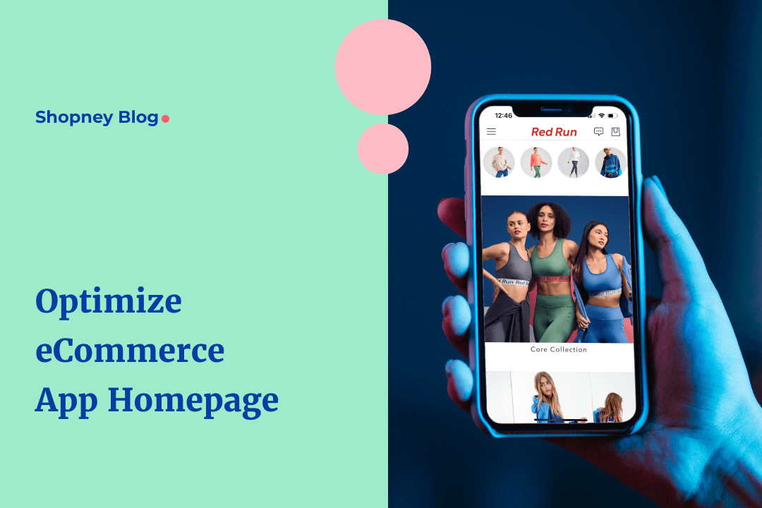
From using email marketing, social media campaigns, SMS and other channels to get online shoppers to download your eCommerce mobile app, there is a lot of effort that brands need to put in. Now imagine being successful at getting a new user, onboarding them right and then losing their interest just as soon as they land on the eCommerce app homepage - that’s not a winning situation.
In our previous blog, we covered how to design a branded shopping experience for your mobile app users. But in this post, we’re focusing on the one page that can make or break the impression on a user and impact how they engage with your brand’s app going forward - tldr; impacts your mobile app conversion rate - your eCommerce app homepage.
What is an eCommerce app homepage?
An eCommerce app homepage refers to the very first screen of the app that a user typically sees after completing the onboarding and logging in. It is the app equivalent of what the homepage of your Shopify store website is and the purpose it solves.
Why is the eCommerce app homepage important?
While everyone starts talking about conversion rate optimization from the product and checkout pages, we are starting our series of tips from the homepage. Here’s why:
- Makes the first impression - It’s the first thing the user sees on downloading the app. A poorly designed homepage can confuse the online shopper and even negate your brand’s credibility.
- Reinforces your brand message - It carries forward the context you are promoting across marketing channels and is responsible for delivering what you promise, and the value you have to offer.
- Builds value recall - Whether it was ease of shopping or discounts, if your homepage is not able to instantly build recall, the short attention span of us humans could result in instant app switching.
- Opportunity to gather customer intent - Even if you know nothing about the buyer yet, the homepage can be the starting point to gather interest and intent data. The elements you include on your homepage have an impact on the direction a consumer takes.
- Enables personalization - And combining all the above factors, the homepage is what equips you with the data you need to personalize the shopping experience during repeat app sessions; the higher the personalization, the better are the conversions.
How to design your eCommerce app homepage for more conversions?
While the eCommerce app homepage design for your brand should vary based on your branding guidelines, target audience, products you sell, what you want to promote and other aspects, there are a few things that we recommend to Shopify stores that use our mobile app builder.
1. App exclusive deals
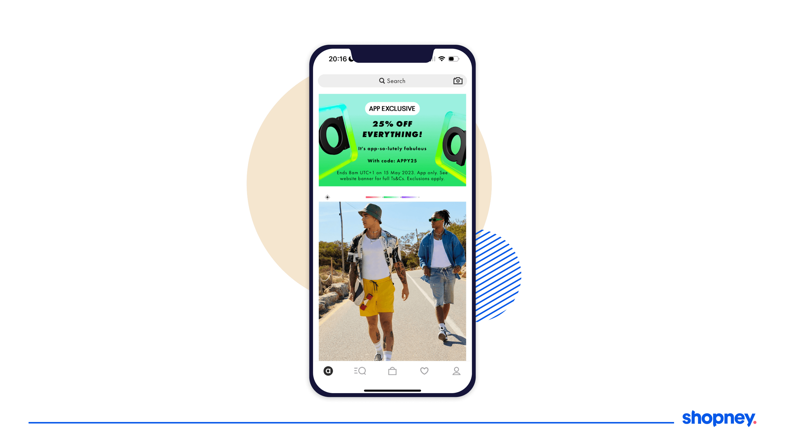
There is a high chance that you enticed an online shopper to download your eCommerce mobile app by offering exclusive deals and discounts. Remember to carry forward that context for them so that the value of your mobile app gets reinforced as soon as they install or login to the app.
Here’s how ASOS, a lifestyle brand, does it. They keep the banner image promoting their app-exclusive deals highlighted with a static banner image designed in a bright color to highlight it!
2. Best-selling or trending products
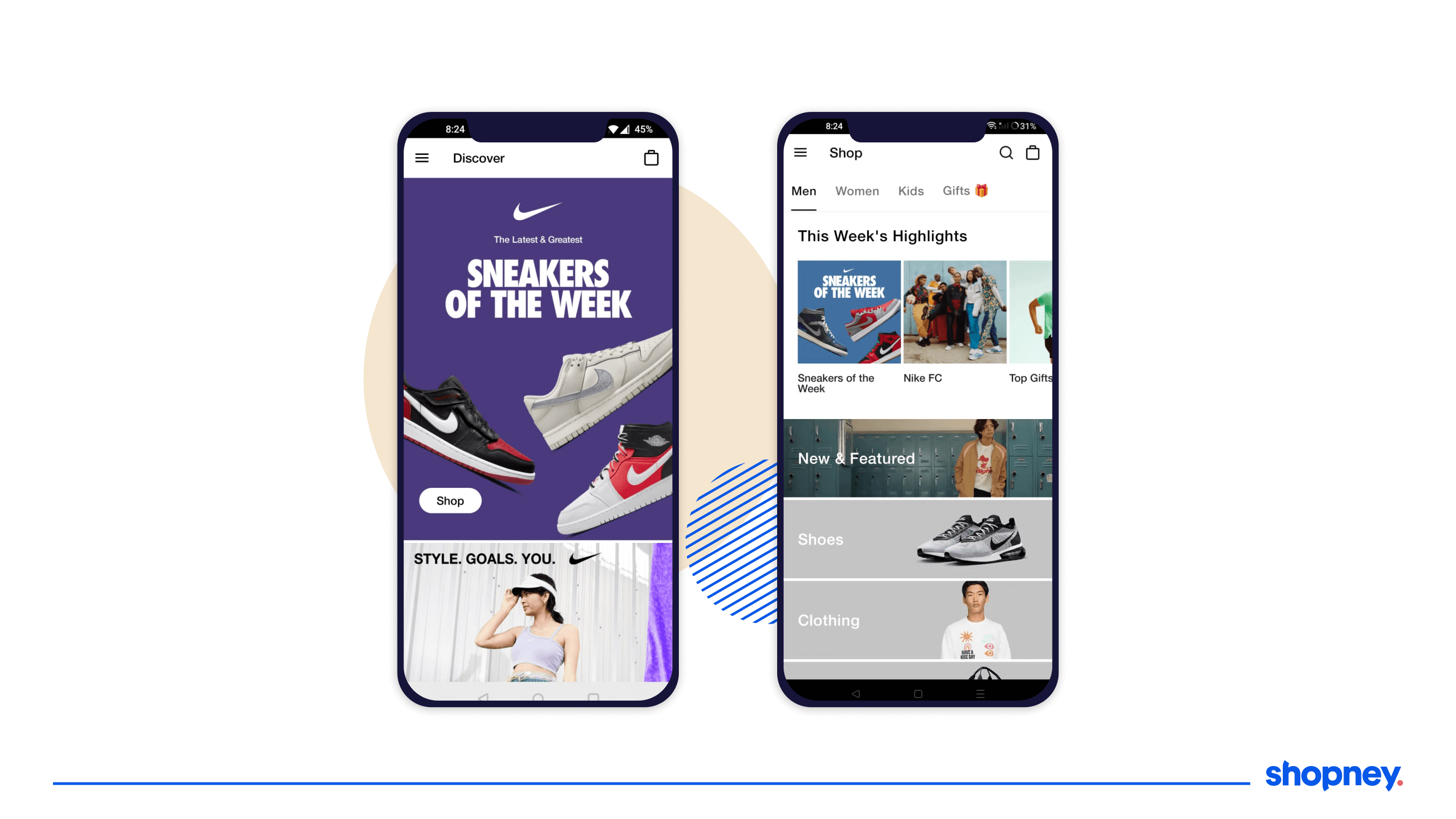
Deals are great, but if a shopper has installed the app just for them - they may not have clarity on what they want to buy. Use customer data to identify your best-selling or trending products and display them on your eCommerce app homepage to nudge an interaction. Social influence always encourages an action and this can help you understand what this new user may be looking for.
Here’s a glimpse of how Nike, a sportswear brand promotes their sneakers of the week on the eCommerce app homepage. This is also a great way to influence a user into checking out the collection that is being promoted across the screen.
3. Product categories and brands
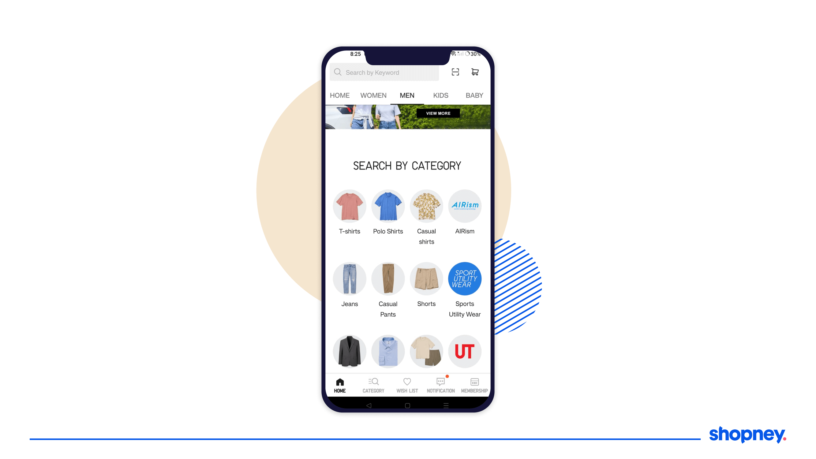
The eCommerce app homepage is the starting point of a buyer’s journey with your brand. At this point, it’s important to showcase the different types of products and collections available with you. A section dedicated to displaying product categories can help capture intent!
Here’s how Uniqlo, a lifestyle brand displays all its key categories for the different audience segments on their eCommerce app homepage:
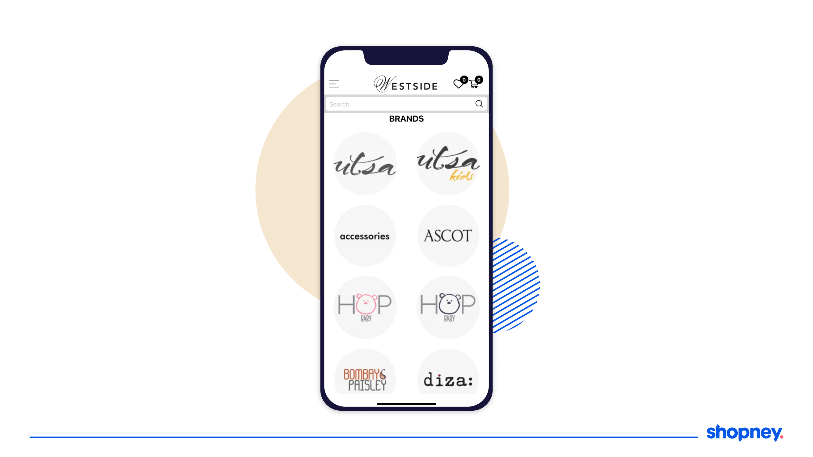
Similarly, if your online store sells products from different brands, showcasing them on the homepage can help users easily navigate to their respective collections. Here’s an example of the same from Westside, an online lifestyle brand:
4. Offers on payment modes
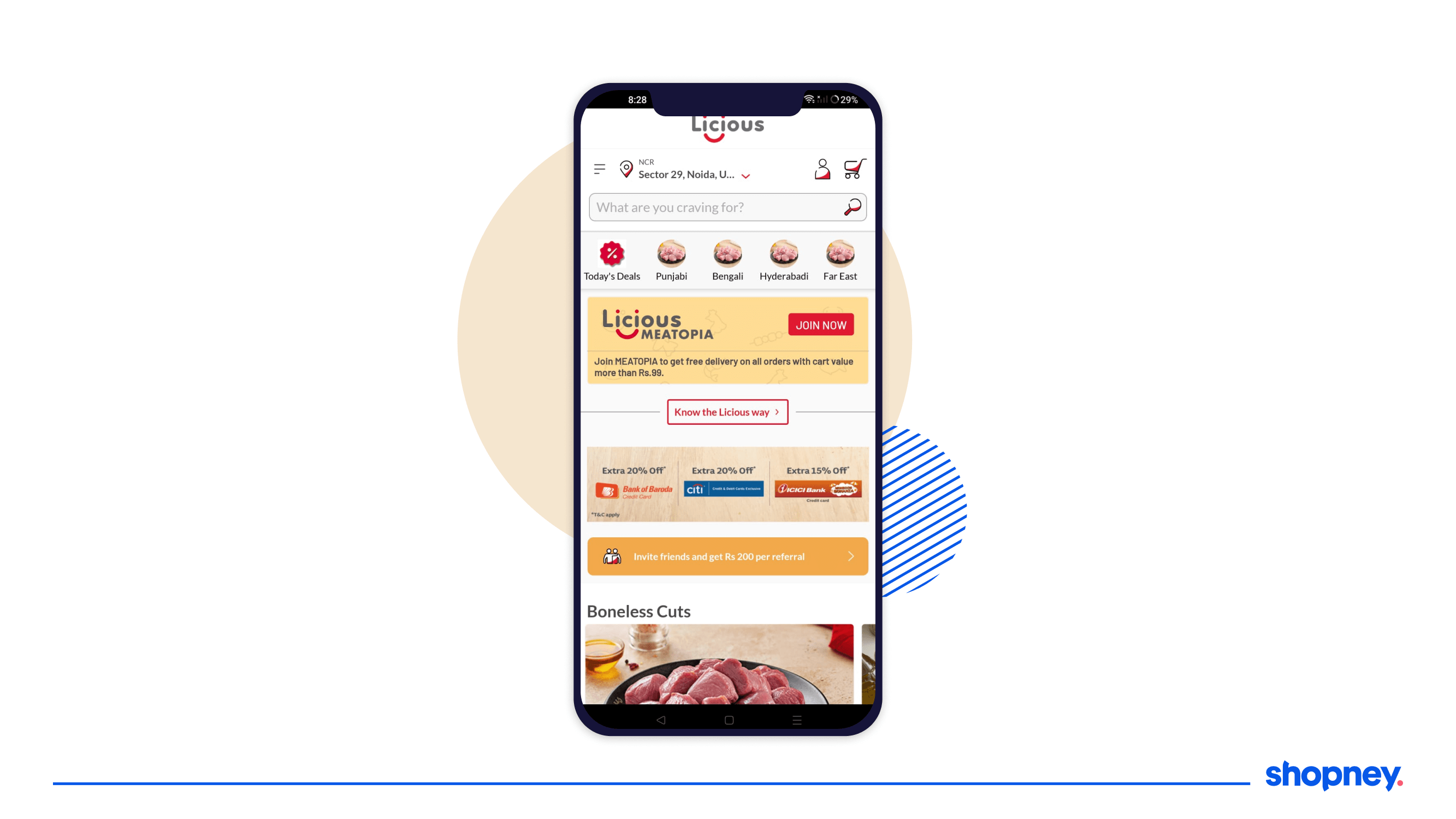
Another smart way to customize your eCommerce app homepage is to make purchases look friendly. Most online purchases are delayed depending on the cart total, the discounts available and the resources with the consumer. This is where showing what offers you have on credit cards, debit cards, wallets and more can encourage buyers to continue shopping.
Here’s how Licious, a food brand, showcases the deals available on different payment modes. This is also a great way to showcase the availability of different payment methods for customers.
5. Occasion-specific promotions
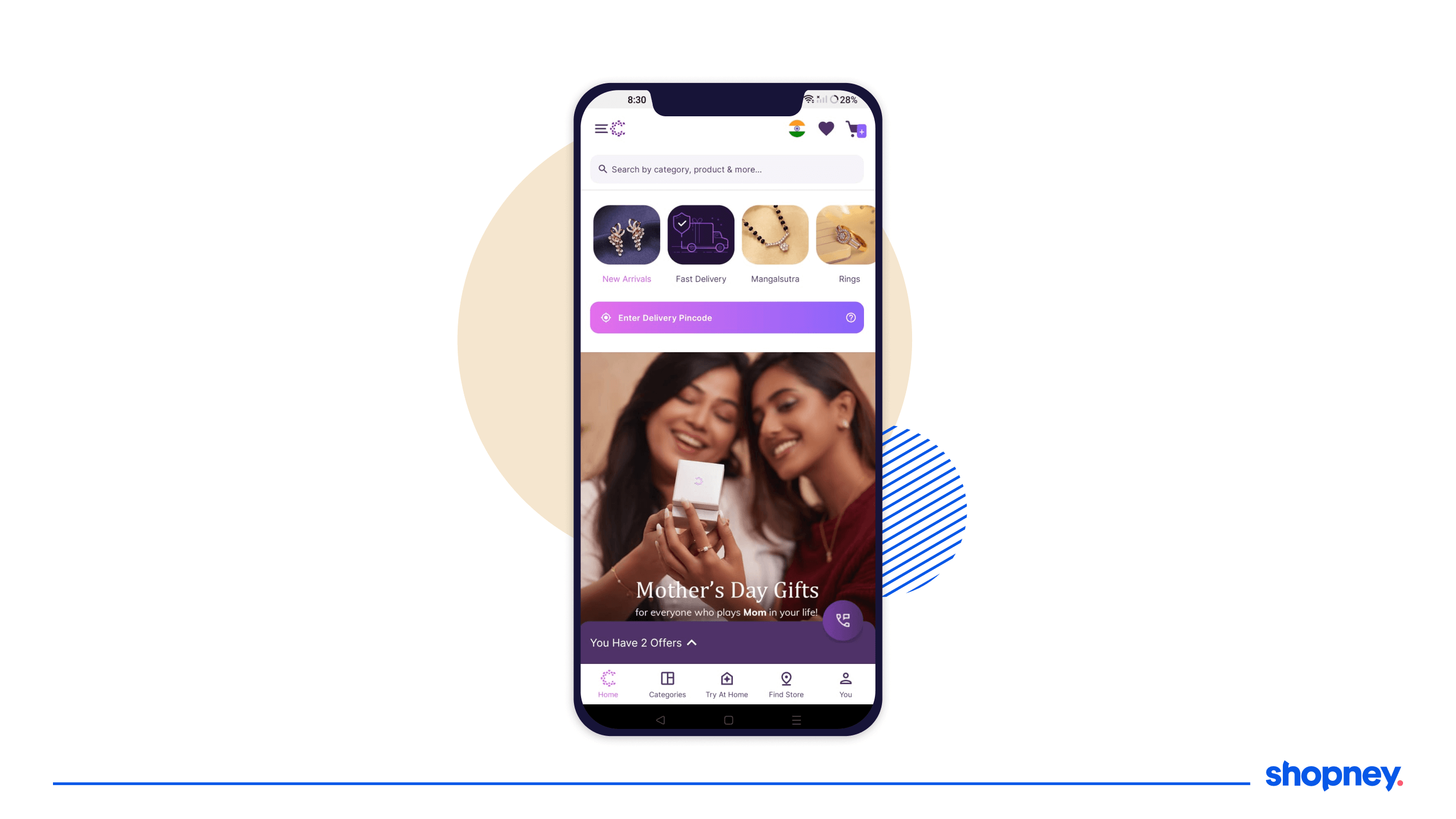
If you’re using a no-code mobile app builder like Shopney for your Shopify store, you can change the look and feel of the eCommerce mobile app homepage to suit seasons, festivals and key occasions - especially if you’re going to run discounts or sales around it.
Here’s an example from Caratlane, a jewelry brand that retains its broad categories at the top of the eCommerce app homepage but adds a banner to promote the collection specific to the occasion - in this case, Mother’s Day.
6. Ongoing brand sales
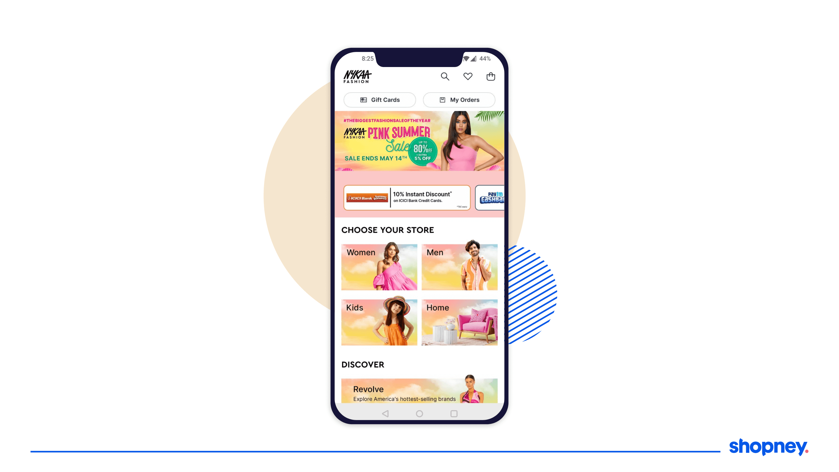
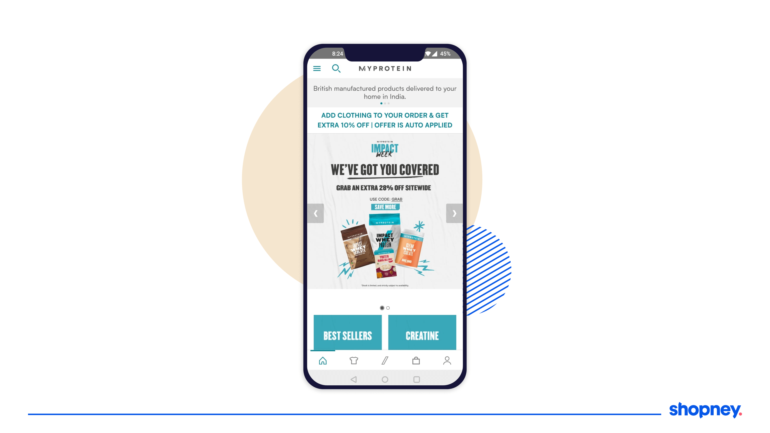
Remember, your eCommerce mobile app is an extension of your online store. So it’s only obvious for online shoppers to seek access to the sale deals, discounts and sales on your mobile app. Remember to promote your ongoing sale in sync with your online store website in the app homepage as well!
Here’s an example of how Nykaa has tailored the eCommerce app homepage to sync with the promotions running on their website. They have also branded and customized the banner images across all collections to match the guidelines for the campaign.
And here’s an example from MyProtein, a health and wellness brand that displays its ongoing sale with big banners on the homepage of the app.
7. Display featured products
Want to bring a specific set of products or a collection to the attention of online shoppers? Your eCommerce app homepage is the perfect place to display them. Since these products could be pulled in from different categories, their ‘feature’ on the homepage looks more natural and also aids towards showing the variety of products available on the app.
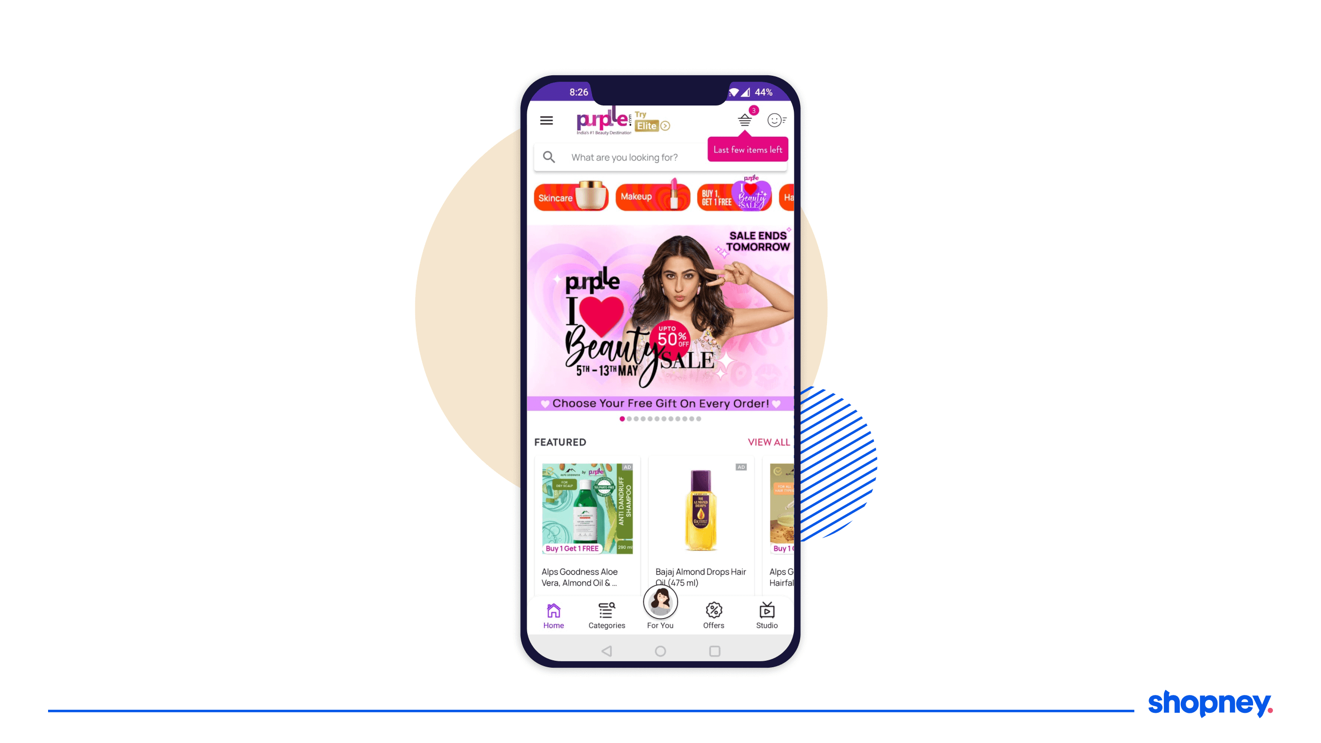
Purplle, a popular online store for cosmetics products includes a featured products scroller on their homepage.
8. Countdown timer
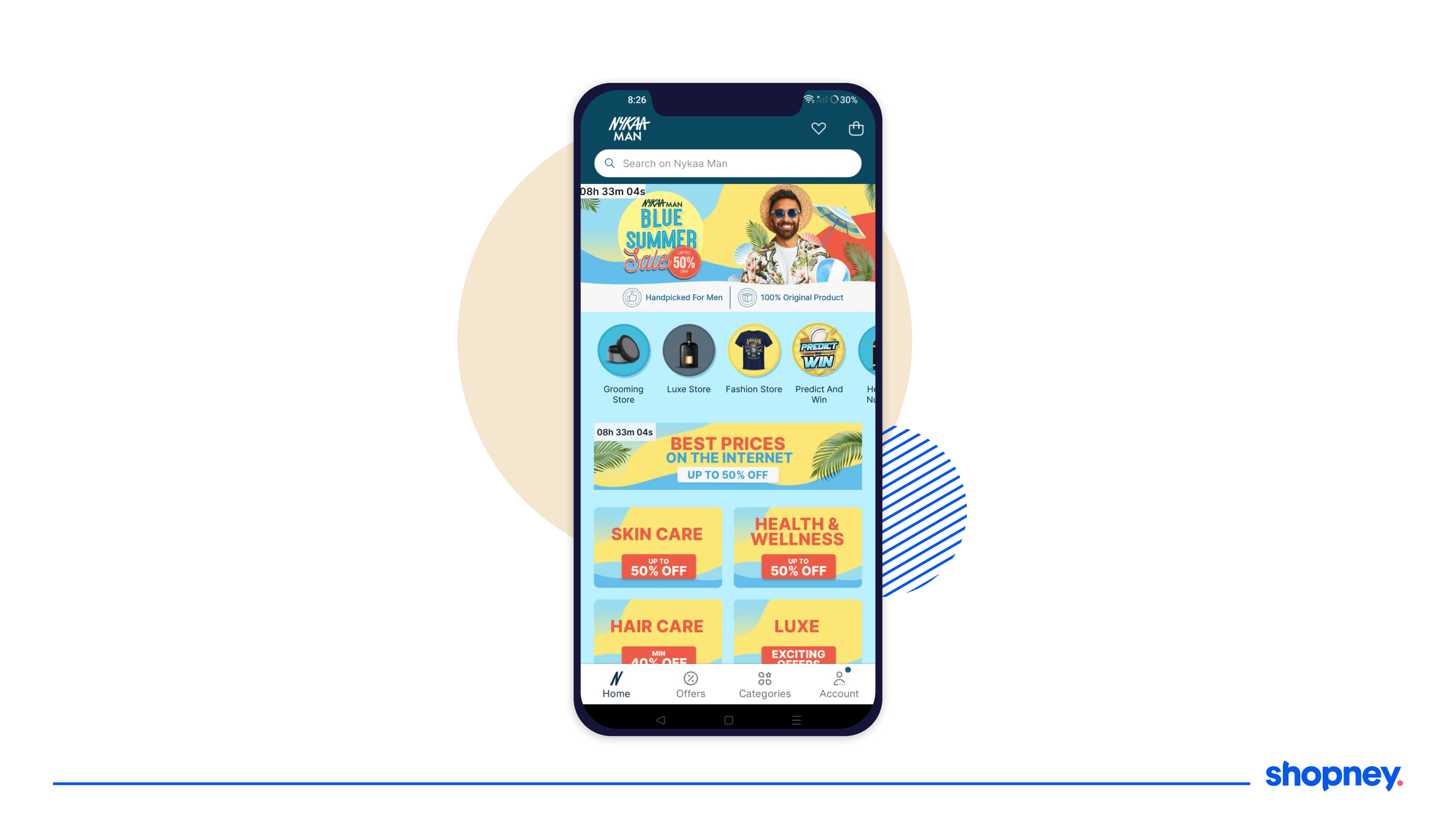
Do you have a discount that is running only for a specific period of time or a flash sale? Remember to carry forward the FOMO from your online store to your eCommerce mobile app homepage as well. It’s a good idea to include a countdown timer on top of the banner promoting this particular discount or sale.
Nykaa Man, a beauty brand for men includes the live countdown timer on their app homepage banner and on the collection tab. This ensures that the deal is not missed by anyone who launches the app.
9. Recently viewed products
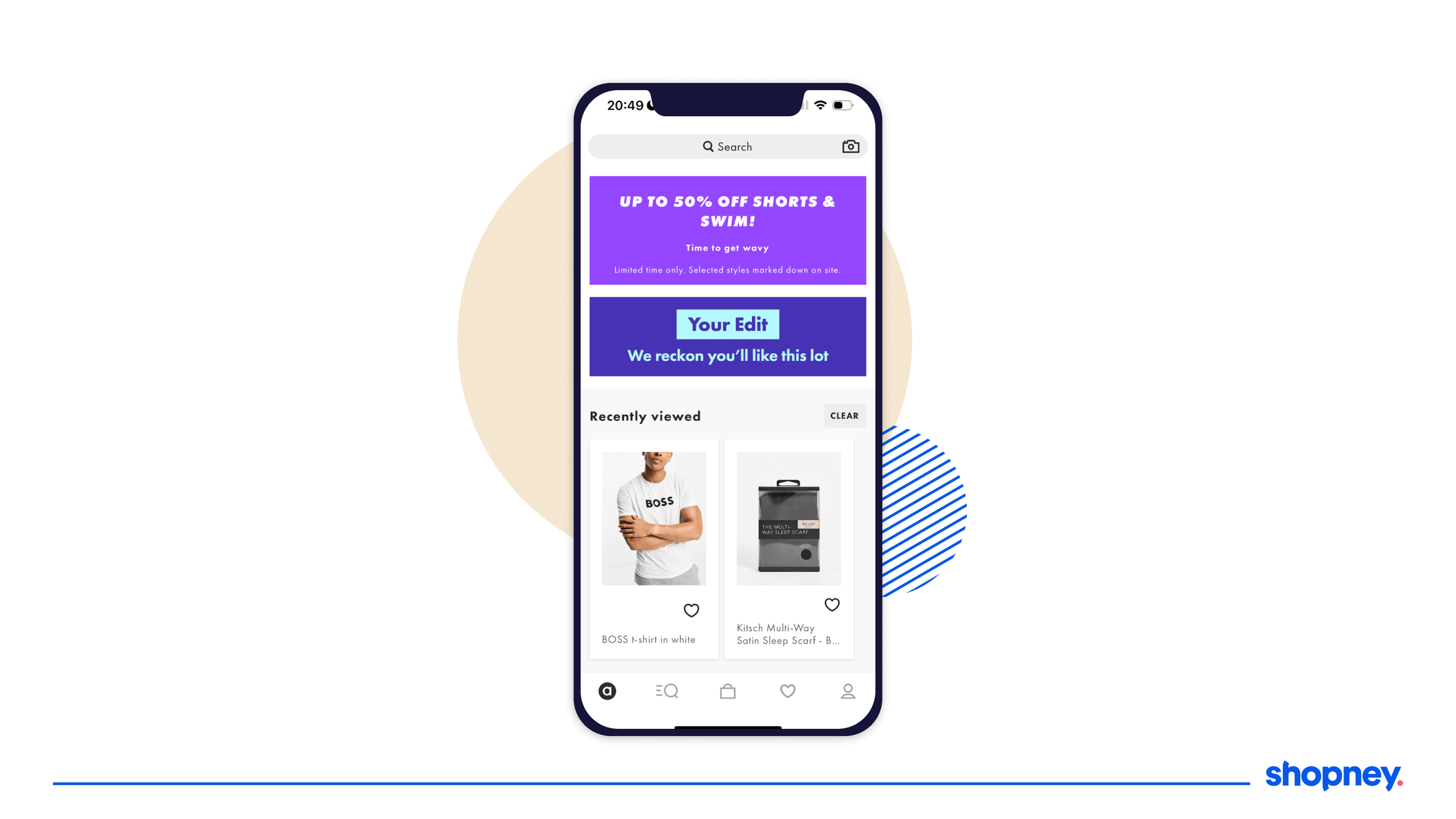
As a user continues to explore products on your mobile app, you want to make it simpler for them to pick up where they left off at every session. This is where we recommend adding a section for displaying their last viewed products. It helps jog their memory and help them pick the products they like faster.
ASOS does this really well. Based on how you interact with the app and what products you view, it pulls them all together and displays them in a similar fashion as product recommendations. There is also an option to clear all the products viewed if the customer chooses to shop with a different intent.
10. Time-sensitive deals
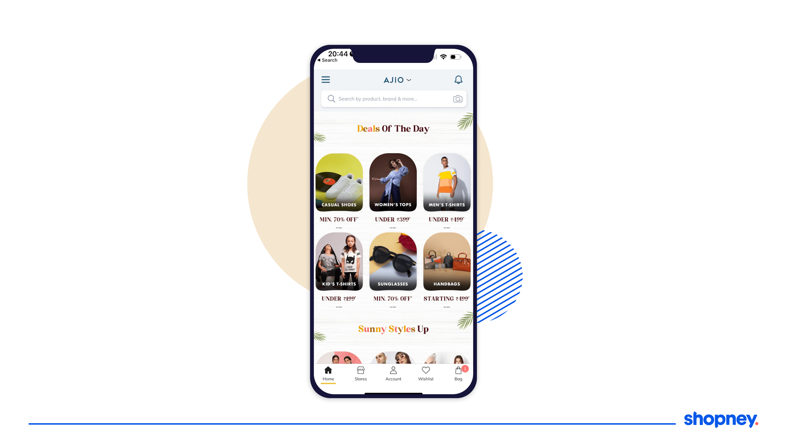
Downloading a brand’s mobile app means being able to quickly access their deals of the day on impulse. And that’s exactly what your eCommerce app homepage needs to enable. If you run deals of the day or lighting deals like Amazon, ensure you display the categories and the products the discounts are available on clearly.
Here’s how Ajio, a fashion and apparel brand displays deals of the day. They use pricing as their key parameter to highlight budget friendly shopping for their mobile app users.
Customize your eCommerce app homepage your way!
While the brands shown above are great examples of what an eCommerce app homepage needs to look like, it is important to know that every brand is different - and so are its customers.
That is why it’s important to continually monitor how your new and existing app users interact with the homepage elements. This gives you an indication towards what more they’d like to see as they open your app and what really helps them move to checkout faster.
To make this simpler, Shopney has built a no-code, drag and drop design editor that you can use to make tweaks to your eCommerce app homepage with ease.
Be it the promotional banner you want to swap or the collection that you’re displaying, or the overall layout of the eCommerce app homepage, the drag and drop editor also comes with a bunch of pre-made modules that you can simply pull in, customize, preview and launch on your mobile app.
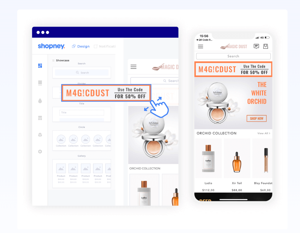
As of today, leading brands on Shopify and Shopify Plus are using Shopney to build customized eCommerce app homepages designed to meet their conversion and sales goals.
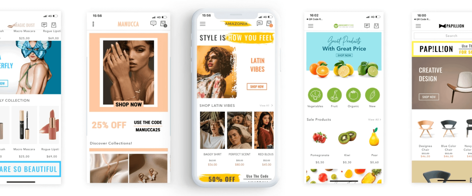
Do you think your eCommerce app home page is helping you drive more sales?


