
As a Shopify store owner, you certainly think about how to win this audience and what mobile strategy to apply: you may think to build a mobile friendly website and a mobile application. Right? So you are on the right way then! 🙂
As the world is becoming increasingly mobile, it would be wise if you’re planning to establish a mobile presence for your eCommerce store. One of the first actions that should be taken is to optimize your website for mobile and then build a mobile app for Shopify.
You should have a website which is mobile friendly. According to a study over one year, desktop internet usage has decreased from 55% to 49% whereas mobile users have seen an increase from 37% to 48% in 2021.
Although many people claim that there’s no need for a mobile app; just a site is enough, which appears to be engaging on mobile devices, most online shoppers say that the mobile apps hold various benefits that a site can’t offer.
That is why you should attack from all sides and take your place in the first place in the e-commerce world. You would not want to leave your work to your chance right?
Let’s have a look at the differences between mobile apps and mobile websites and why your mobile-friendly website is not enough to grow in 2023.
1. What Are The Differences Between Mobile-Friendly Websites & Mobile Apps?

Although you need a mobile-friendly website to be available for all of your customers, only having this is not enough to grow your Shopify store.
In this section, let’s see the differences of both terms.
1. What Is A Mobile-Friendly Website?
Mobile website means a website designed for the small screens of smartphones. It does not need to be downloaded but it is something the user can access using a browser to view the content of a brand online.
A mobile-friendly website is basically your usual website -that people access via desktops- but the design is adapted so that the user can easily navigate the website using their mobile phones and all elements would be of adequate size on a smaller screen.
2. What Is A Mobile App?
A mobile application, is a type of application software designed to run on a mobile device, such as a smartphone or tablet computer. Mobile applications frequently serve to provide users with similar services to those accessed on PCs. Apps are generally small, individual software units.
A mobile app is available to the users through a downloadable file either from various Android app stores or the IOS store. Once downloaded, the app installs on the user’s device automatically and doesn’t need the use of a mobile browser to access the content of the brand.
3. What Are The Differences?
Let’s see the basic differences below on the table.
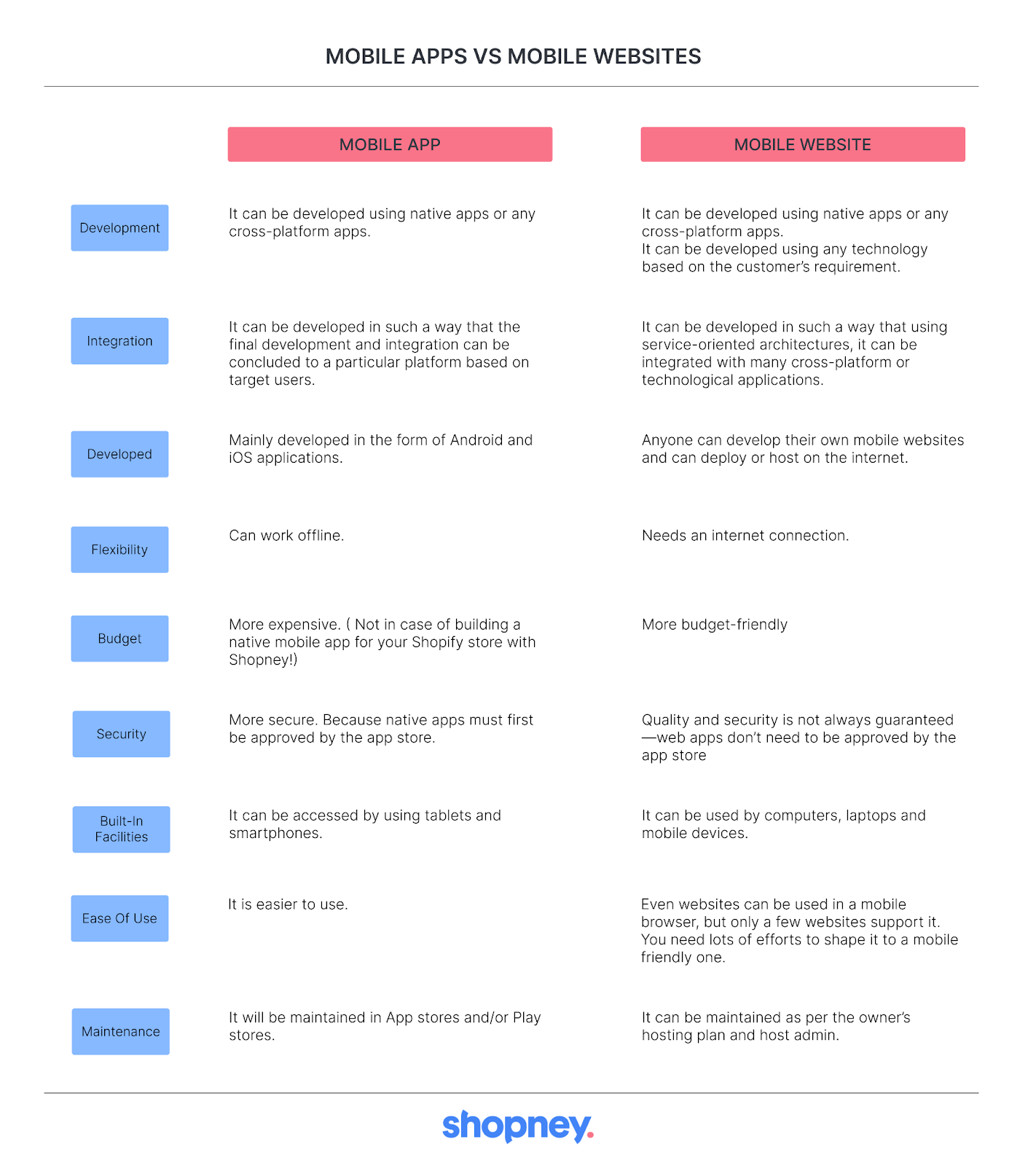
After seeing the basic differences, let’s move into the reasons why having only a mobile-friendly website is not enough to grow your eCommerce store.
2. Providing Better User Experience Is Vital For Your Shopify Store
1. Interactive Methods For Customer Engagement: A mobile app allows you to offer your customers better user experience through a new channel for engagement.
Instead of looking at the same text and images in a website, mobile apps can integrate features that allow online shoppers to interact with the app’s specific components.
For example, with Shopney, you can personalize your customers’ conversations by offering them special offers & deals, with the in-app chat feature.
With a mobile app, it is easier to navigate for your customers among your products. It will provide a better engagement rate for sure.
You have to give importance to your customer engagement because in today’s world, customers leave immediately a platform which is not entertaining & engaging enough.
2. A Chance For Having Detailed Data & Serving Personally: Apps can also track & keep customer engagement, & you use this data to offer personalized recommendations and updates, making the app more efficient for them.
Apps also provide businesses to send developed communication to customers based on their interests, location, usage behavior, & so on.
According to a study, sending customized notifications to your customers has a positive impact on engagement, open-rate, and conversion rates. Serving your customers in a personalized way allows the customer to get the most out of the app.

3. Having The Useful Interface: Mobile apps offer your customers a more useful user interface, making it easy to complete their actions.
This unique interface makes customers able to become more accustomed to the mobile experience which will lead to more loyal customers & increase your conversion rate.
Although responsive websites can’t always guarantee a standard of functionality that online shoppers prefer, having it is also necessary to be able to reach your customers from everywhere & making their purchases easier.
After seeing the advantages of having a mobile app over mobile websites, let’s see the features of a mobile-friendly website & the reasons below why your mobile-friendly website is not enough to grow your business.
3. What Are The Features Of A Mobile-Friendly Website?

As you may know, Google has announced that it would deprioritize non-responsive mobile websites in organic mobile search results, since visiting a non-mobile site from a smartphone could deliver poor user experience.
In March of 2020, Google expanded its use of mobile-friendliness as a parameter for providing even better search rankings by switching to mobile-first indexing for all websites.
This means Google is first looking to see if your site is mobile-friendly when it comes to ranking your site for searches.
This might also be the reason that your mobile website is not growing your business. That is why we compiled a list of important mobile-friendly features your website should have if you want to win mobile shoppers.
1. Responsive Website Design
Your eCommerce store’s website is not only being visited by a variety of devices and screen sizes, but also the same shoppers return back to your website using multiple devices. Meaning that your website needs to provide the same level of user experience no matter the device it is being looked through.
Responsive design is a web design approach guaranteeing that website pages are able to automatically reformat themselves depending on the device they are being opened on.
So, desktop, tablet or phone, it really does not matter, the content will be displayed in a way which is easy to browse.
2. Provides Brand Continuity
Responsive websites should have a responsive design which was explained right above.
You should not design something you think looks cool for your mobile website. You should design something that looks like your brand.
Logos, colors and fonts are all elements that shouldn’t be changed too much just because you’re on a different screen. Responsive design makes this easy since it’s literally the same website appearing on a different screen.

3. Having Clear Call-to-Action
Call-to-action button helps your eCommerce website visitors to understand what action you want them to take during their journey and makes it easy for them to do so.
Most mobile devices, like smartphones, have limited screen space meaning these buttons should be adjusted to account for this limitation. One of the best practices is to use attractive design & navigation and place the button in it.
“You can always tell a website’s age by the look of its mobile site.”
4. Simple Mobile Navigation
The navigation is the tool with which your online shoppers will browse on your website. Taking into account the limited space of mobile devices, it should be simplified and always visible.
The navigation for mobile screens should be vertical and the space between the navigational elements should be large enough to avoid miss-actions.

5. Simple And Shorter Forms
Your online customers are much more inclined to fill forms on a desktop, as the screen is bigger and it’s easier to type with a keyboard.
On mobile phones, forms should be shorter, with spacious text fields and buttons. For example, if you request your visitors to sign up for your mailing list, you should not ask for details other than their first name and email address.
4. How Can A Mobile-Friendly Website Impact Business Growth?
- Most of the people have chosen a mobile to browse. Already in 2020, about two-thirds of all internet users, which is around 4.4 billion people, accessed a website from their mobile device.
Many people have already been using smartphones and tablets for years, while seniors and young students are just starting to learn how useful they can be.
Either way, you should make sure your online presence on every platform is functional and attractive for the increasing number of people who will be accessing your website through their phones, tablets and laptops.
So if you provide a mobile-friendly website to your online customers, you can increase your conversion rate while contributing to your brand image!
2. Most of a site’s web traffic comes from a mobile device. Let’s admit, desktop computers are no longer flying off store shelves like they used to. Mobile devices now account for more than half of all e-commerce traffic.
In the first quarter of 2021, 54.8% of website traffic globally was from a mobile device.
At this rate, the next generation of online consumers might not ever see a traditional desktop website because they won’t have a machine to access it on!
This means that their first introduction to your store will likely be with their mobile device, so it’s critical to make a good impression at this stage.
So that, you will be growing your business even if you don’t have a mobile app. But remember! Having a mobile app is getting a “must” rather than being a “should” thing.
3. Mobile users behave differently. Mobile users aren’t using their phones to search for long periods of time to write the product they want to buy.
They are more likely to use it for a few seconds at a time while they are waiting in line at the grocery store, or in a toilet! 🙂 They are using their devices frequently but at shorter intervals.
So if you provide a responsive mobile website, it will drive them to make purchases. Otherwise they will leave your mobile website as the functionality is worse than they expect.
4. Mobile users are bigger buyers. Mobile users buy more than people who primarily use desktop computers. We believe this is because mobile devices give people the power to be informed consumers.
They can use their phones to instantly read product reviews and compare brands, which removes suspicions for their purchases.
Mobile consumers also use their phones to research sales, find coupons, and seek out clearance items. In fact, 93 percent of people who use their mobile device to research a product will eventually make a purchase.
Meaning if you provide a good mobile website experience, eventually they will buy your product either on mobile or desktop.
5. Having a good mobile site makes you more memorable. In other words, a good mobile site makes your brand stand out in a crowded market, making it more likely that a visitor will take the time to place an order and keep coming back.
A good example of this is multimedia websites like online magazines and newspapers. The sites that provide a better user experience will always come out on top.

5. What Are The Common Issues With Mobile Websites?
Let’s see a few problems that website owners may face when launching a mobile website. We have also provided some tips on how to resolve these problems to help you create a responsive & mobile-friendly website.
1. Non-Responsive Website Design:
When your website does not work on mobile devices, this means one thing: It is not mobile responsive because your website isn’t designed to fit on different screen sizes.
You should make sure that your mobile website fits on multiple devices. Otherwise your conversion rate will drop down drastically.
2. Slow Pages:
You will be suffering a lot if you don’t work on your mobile website page load times.
Because as stated above, your online visitors won’t wait until your page is fully loaded if it takes more than 3 seconds. You should check here to have an idea to optimize your website maximum speed.
3. Bad User Experience:
Confusing Navigation, Annoying Pop-Ups, Slow Pages, Non-Responsive Website Design and so on. All of them cause bad user experience which will decrease your sells & brand image.
You should work on all the elements above to improve your mobile website.

4. Clickable Elements Not Touch-Optimized & Low Readability
You should remember that the touch gestures are what will make your online visitors really interact with your mobile website. Your web forms, media players, menus, and other buttons must be optimized for touch to convert potential customers.
If space is smaller, ensure that you do not squeeze in too many touch elements as people may just end up hitting the wrong button. It’s important that the visitors are still able to read the content when they see a pop up on the screen.
6. Why Does Your Business Need A Mobile-Friendly Website?
Mobile-friendly websites are designed to be easily accessible on mobile devices. The website should be similar in appearance as well as give the user the same experience on all devices be it desktop or mobile devices.
1. To Capture the huge market: The easy accessibility and connectivity offered by these devices offer many advantages to us. The smartphone market is also one of the most rapidly growing markets.
For online stores, this means that to increase the reach it is imperative to make their websites mobile-friendly. Hence, widening their audience can result in driving more traffic and increasing revenue.
2. Rank your site higher: SEO is a key aspect of digital marketing strategy. Having a business website that is functional is not enough if the website is not ranking high on the search results.
It is the ranking on the search engine results page that helps to drive traffic to the website. The higher a website ranks, the higher the traffic and reach. And to rank on the search engine every website needs to optimize as per SEO.
3. Increases shareability: A mobile-friendly website is more shareable on social media. This is because these sites are often faster to load on all the devices. Since almost everyone uses phones more frequently than computers, mobile to mobile sharing becomes easy.
Desktop to mobile sharing or opposite become less convenient when compared to mobile to mobile.
It helps to spread the information faster; this makes contacting the websites easier. The prospective shareholders including suppliers and customers can easily contact your website.

7. To Sum Up
It’s important to keep in mind that a mobile/responsive website and a native app are not necessarily mutually exclusive. Plenty of organizations have both a mobile-friendly public website for their general mobile presence, as well as a downloadable native app to accommodate more specific requirements.
In the end, it’s all about choosing the right tool for the job.
However, as the number of people using smartphones is also expected to grow and cover more than half of the world population in a short span of time, your mobile presence should be perfect & accessible from every platform.
That is why you should have a mobile app alongside a mobile friendly website. Furthermore, you should take care of the elements mentioned above to grow your business on your mobile website.
Even if you get everything right today, the way mobile devices look and work will continually change and today’s mobile-friendly website may not still do the job tomorrow.
That is why you should keep testing, keep tweaking where needed, and continue to think about your mobile users as a priority and you will be fine more than ever! 🙂
After reading this article, if you are thinking of building a mobile app for your Shopify store, try Shopney for free today to launch your mobile app in less than 10 days!


Share this: