One of the biggest fallacies out there about the drag-n-drop design editors is that they limit your freedom. This is not correct! At least, I can assure you of Shopney's mobile app design editor.
Despite you customize the certain type of blocks to design your mobile app UI, it doesn't necessarily limit your imagination. Because all the block types created upon global eCommerce user and UI/UX trends to enable you to come with an eye-catching design that perfectly satisfies your mobile app users.
Another bias about the drag-n-drop design processes is that you cannot design an app that is unique to your brand and reflects the identity on your website design. Again, maybe some of the drag-n-drop design editors have limited customization capacity and deliver mobile apps that are very similar to each other as mass production units.
But when it comes to Shopney, it is otherwise. Its online design features enable you to create real magic. No need for app developers or designers at all. Let us prove that with 15 high-quality mobile apps designed on our solution. Check them out and decide whether each one is unique to their brand or not!
As a bonus, you will soak up some design inspiration for your Shopify store during your tour on the list! As you know, good design sells on any platform. The same applies to your mobile app.
1. EARTH ROASTERY
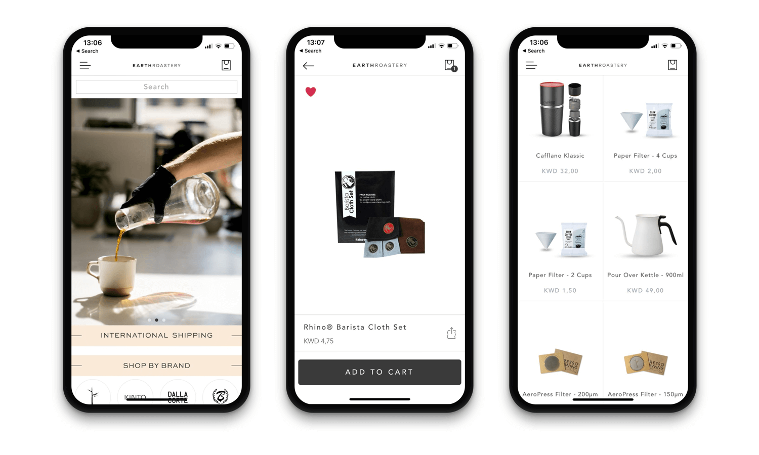
Earth Roastery is a brand from Kuwait which offers a great coffee experience to its customers both on e-commerce store and in their coffee shop. The company built this beautiful and clean looking app for their Shopify store in late 2019. Their mobile app design is simply consistent with their website design. Clean and elegant!
SEE THEIR ANDROID APP IN ACTION
2. MADA IN CHINA
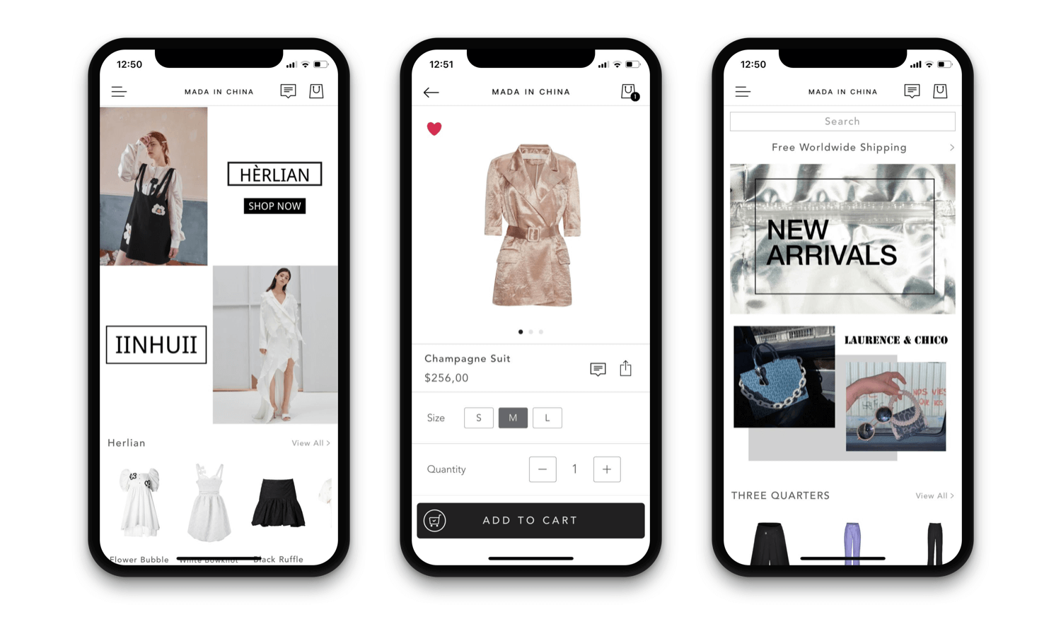
Mada In China is a high-end street fashion brand from China that curates amazing designs. for their online retail store. Their mobile app reflects the brand's clean and cool identity with sharp design lines.
The luxury brand features the items on a monochrome layout color palette. Their theme makes the products shine both on listing and product pages. A very good example of brand consistency while converting the Shopify store into a mobile app.
SEE THEIR ANDROID APP IN ACTION
3. KIDZOYA
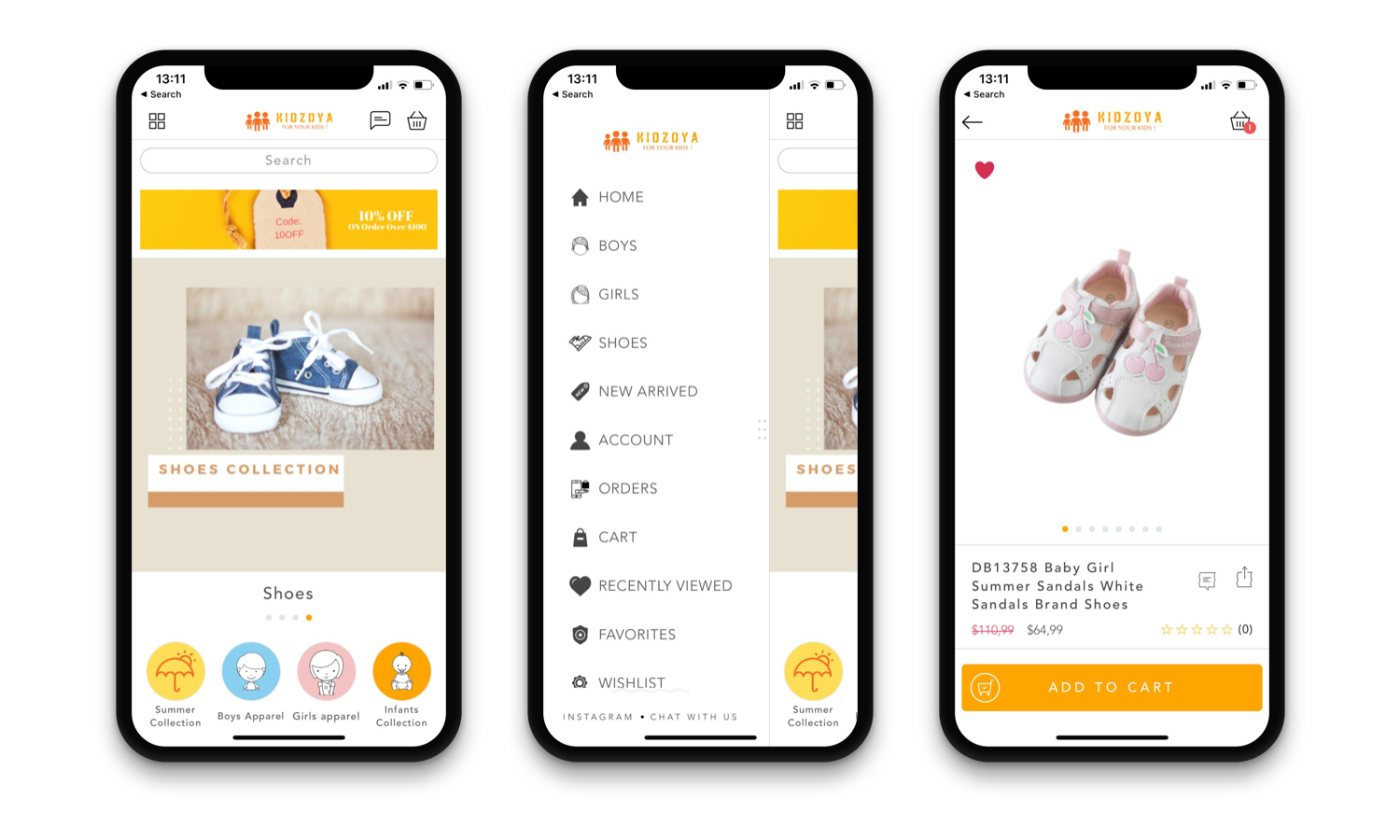
Kidzoya is a kids fashion brand from Kuwait. The brand's UI color palette enhances the sweet, kid's atmosphere in the app and features the products perfectly. Especially, the icons they use for the collections in the home page design looks fantastic with the illustrative lines and background colors.
SEE THEIR iOS APP IN ACTION
SEE THEIR ANDROID APP ACTION
4. LAVINIA LINGERIE
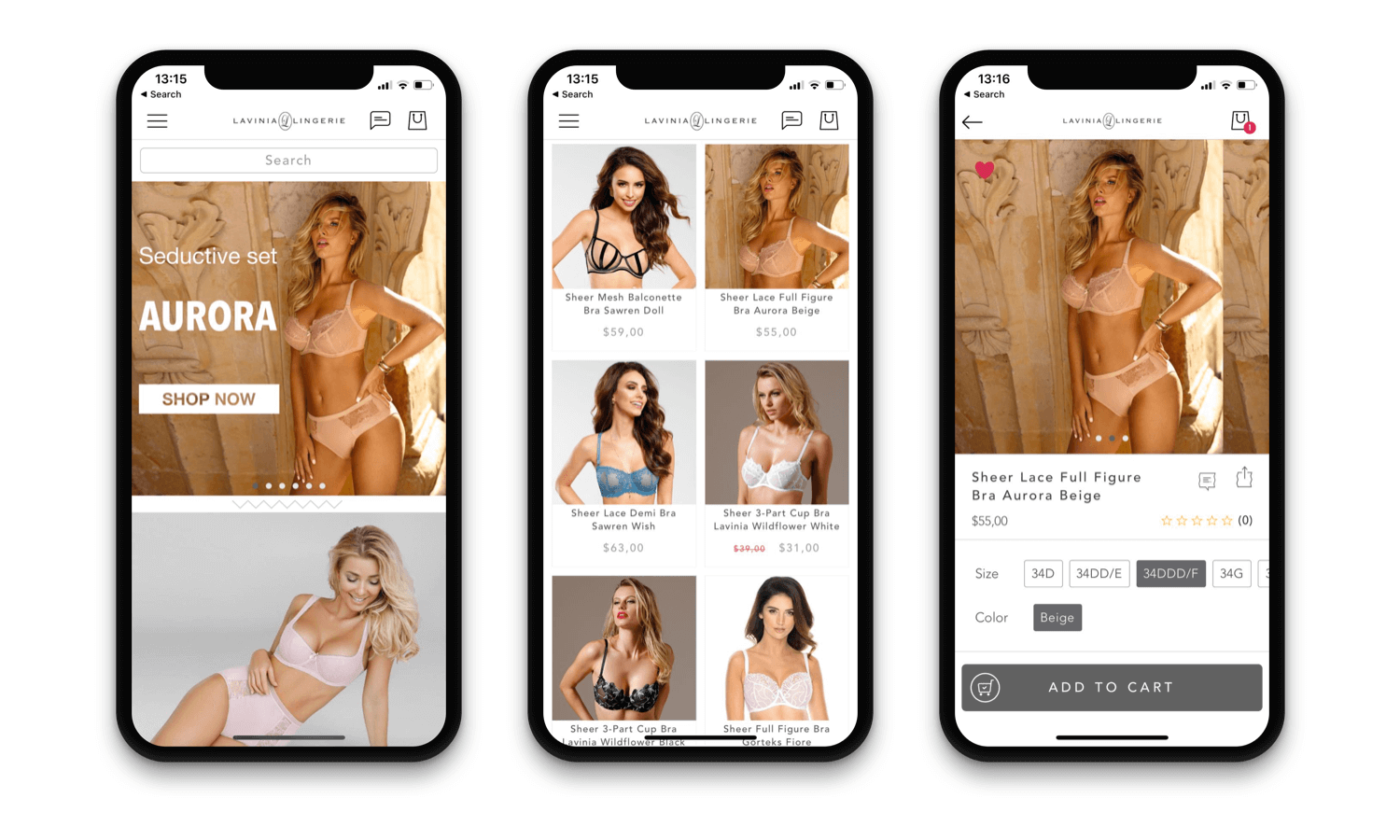
The US-based luxury brand Lavinia Lingerie's mobile app is a great example of what you need to do with design when you have great product photography. They keep it simple and let the photos craft the entire mobile app UI.
The brand applies the number one rule of online commerce: produce great product pictures. Alongside selling easily online, they don't need to put so much time to create a great app design. Many birds with one stone.
5. LOOTBANA
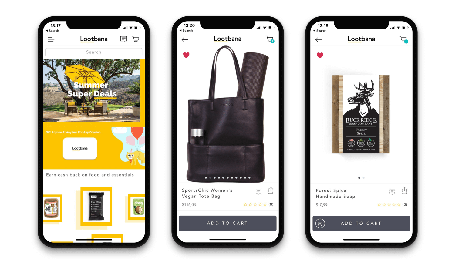
One of the oldest clients of Shopney, Lootbana is a retailer that sells only online with its website and mobile app. This brand's website and especially mobile app is an excellent example of how should you bring along the brand identity to your mobile app.
It's so remarkable how their signature yellow line takes place in the mobile app UI design. They welcome their app users with a vibrant image set on the home page. The product photos are plain and awesome.
6. BEAUTY STRIKE
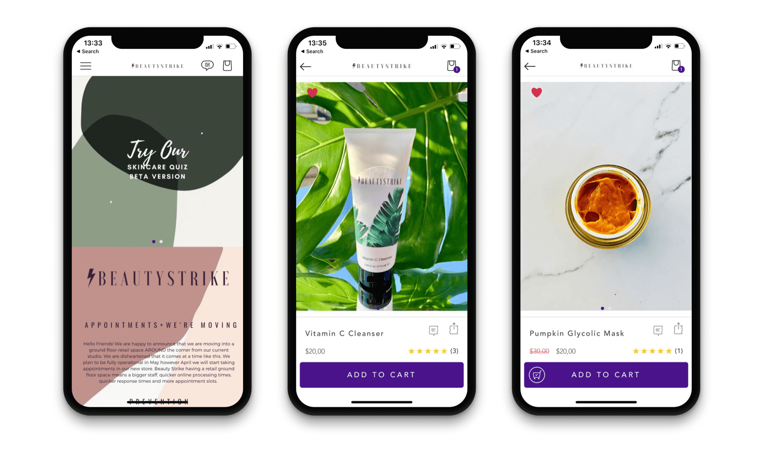
The New York-based brand's mobile app is the tangible reflection of their name. A total beauty strike indeed. The pastel color palette and abstract design elements make the app's user interface shine in its own way.
When it comes to product listing and product detail pages, Beauty Strike's amazing product pictures make the work done in the best way. And when you consider that almost all of the photos taken by mobile phone, the level of the work gets more clear.
7. WINES ONLINE
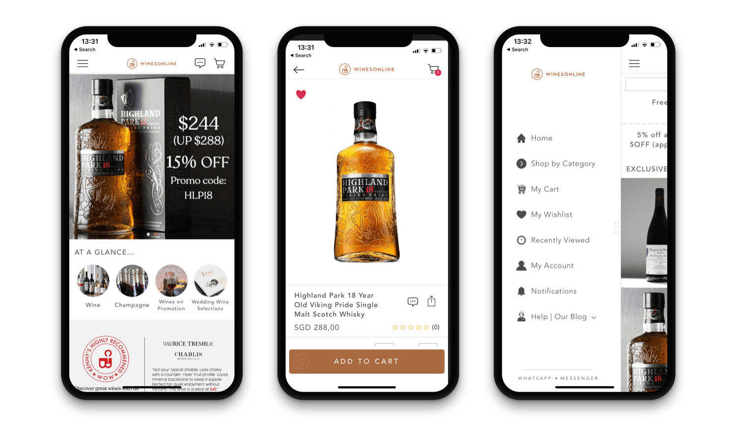
Wines Online is an online-only brand from Singapore selling thousands of different alcoholic drinks. Frankly, the beauty of their product bottles makes the design process very easy. They use the same photography in their social media, online store, and mobile app. But they fit any platform perfectly.
The home page design is consisting of generally the product key-visuals merged with descriptive banners. Another thing that they do great is reflecting the drink brand's identity to their home-page images. For example, check the image on the home page (left-hand side). The whiskey brand's character is very well-implemented.
8. GEFLE CHOCOLATERIE
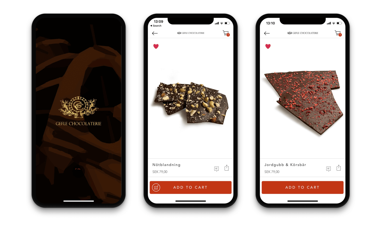
Gefle is a chocolate brand from Sweden which creates the magic with a 100-year-old traditional recipe for their signature Cognac truffle. The brand lately discovered the power of e-commerce and started their online store. In addition to that, they have decided to partner with Shopney to build their native iOS and Android mobile app and off the best mobile shopping experience to their selective clients.
SEE THEIR ANDROID APP IN ACTION
9. TOI ART GALLERY
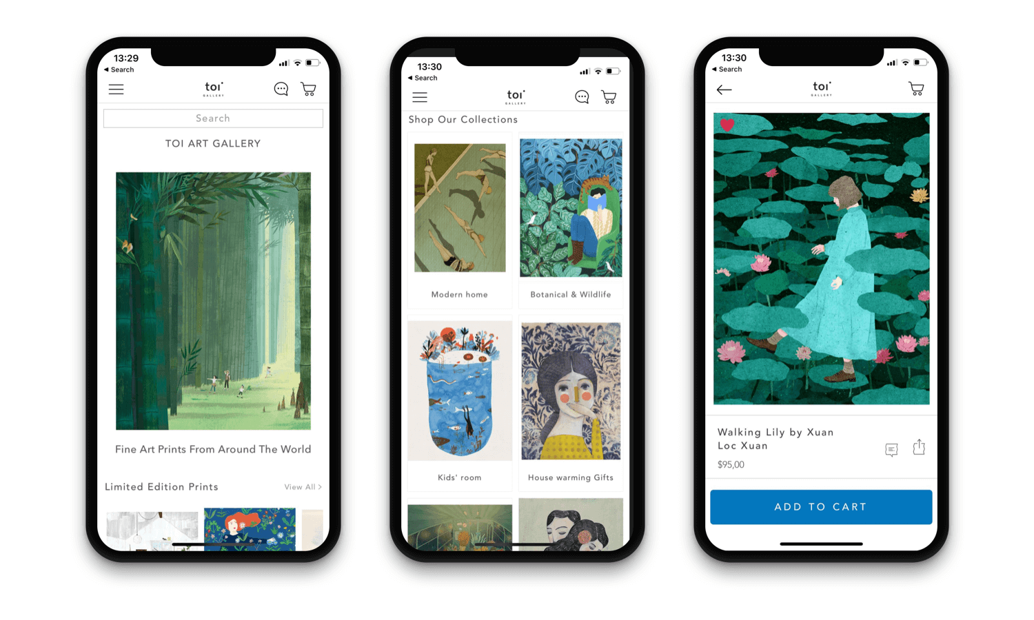
When you are using real pieces-of-art for your design, things are getting so easy :) You can see this in Toi Art Gallery's mobile app design. The New York-based art gallery selling pieces of international artists online.
The mobile app has an electronic art exhibition vibe rather than a mobile store. It gives you unsubstantiated happiness while browsing. The success of this design lies in not only the art piece advantage but also a certain approach: show the pieces, keep the rest simple.
SEE THEIR ANDROID APP IN ACTION
10. OHLALA SELLERIE
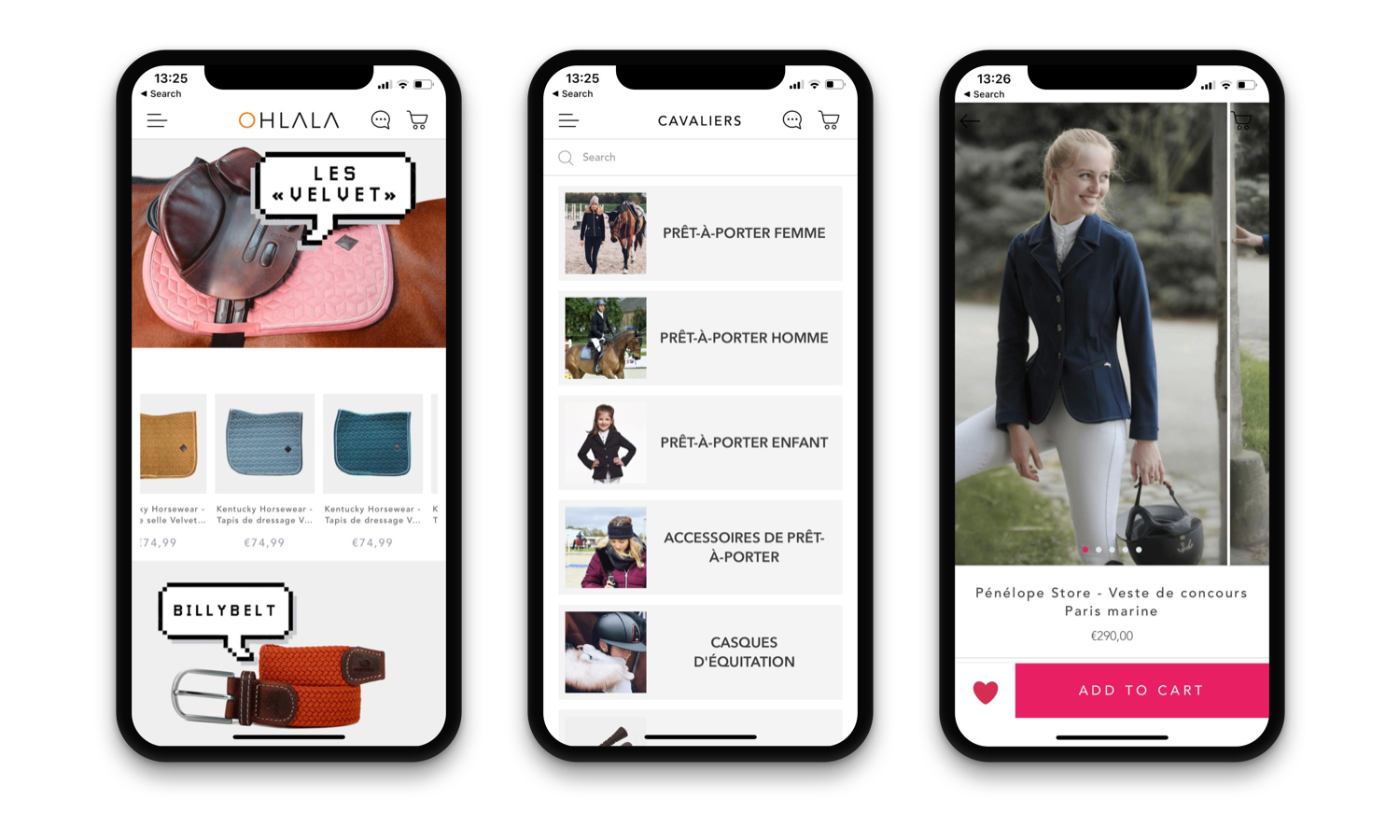
Ohlala Sellerie is a French fashion brand in a very specific niche, horsemanship. From the equipment for horses to classy apparel for men and women, the brand offers all you need for an elegant riding day in their online stores.
Their mobile is a great example of custom design. They use the signature 'conversation bubble' element a lot in their home page design. This style makes its elegant product photography truly integrate with the brand and constitute a visual delicacy from header to the footer.
SEE THEIR ANDROID APP IN ACTION
BOTTOM LINE
As you can see from the examples above, the sky is the limit with Shopney's super-easy drag and drop design editor. With that freedom, you can create mobile apps that perfectly fit your brand and stands out.
All you need is a well-made design flow plan through the entire home page and beautiful images produced accordingly. If you handle these wisely, then you will see that everyone is asking about your mobile app designer!
I hope that you find the great app design examples helpful and inspiring. You can visit our Pinterest board for more examples.

As the last but not least, when you start to design your app with Shopney, our design experts will help you out for it. So we make sure you launch your native app with a great design.


