Taking tips from the Allbirds mobile app to increase Shopify sales from mobile devices.
In UX and UI, there is a term called Jakob’s Law, also called Law of familiarity.
This law states that users prefer that your site, or in this case, your app, works the same way as all other sites they already know.
This is great because this means brands can spend less time wondering how to design their app from scratch, and instead get inspired and implement what they like quickly from the best eCommerce mobile shopping apps that already exist.
And in this blog post, we’re going to do just that.
From tips on onboarding your customers to creating an engaging homepage, easy navigation menus, efficient filter and sorting screens to high-converting checkout screens, you’re going to love the tips we’ve curated for you after studying one of the most popular sneaker brands out there currently competing against market giants like Adidas and Nike.
Take a look at our deep dive below into how Allbirds mobile app, which boasts (and is validated by thousands of reviewers) of having ‘the world’s most comfiest shoes’ can teach and inspire you to create a beautiful and successful mobile shopping app!
About the brand and Allbirds mobile app
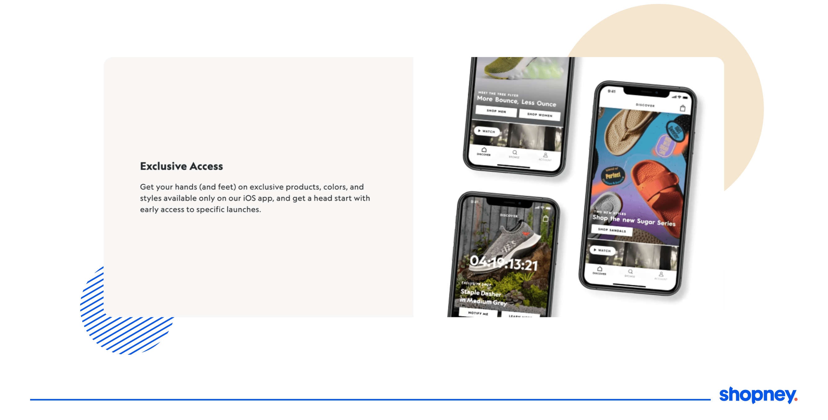
Allbirds, Inc. is a New Zealand and American company founded by Tim Brown, a former footballer, and Joey Zwillinger, a biotech engineer and renewable materials expert.
Tim, a native of New Zealand, got inspired by the eco-friendly properties of merino wool and set out to craft a revolutionary wool fabric made specifically for footwear. After a wildly popular run on kickstarter, they launched with just one shoe and slowly added more to their catalog.
Allbirds operates on a direct-to-consumer model, selling its products through its website, app, and retail stores. It is a certified B Corporation, making sustainability and protecting the environment its key pillar.
Allbirds is known for its simplicity in design, with no flashy logos or senseless details, guaranteed comfort, and versatility in usage.

Allbirds Mobile App Review: Breakdown of the shopping experience
An Allbirds fan who spoke to us for this blog post said that most people who shop online in the sneaker community know what they want.
Because of this reason, he likes the Allbirds mobile app because it takes him to the product he was looking for quickly and efficiently.
Let’s take a look at how they achieve this.
1. Personalized shopping experience from the get-go
A key step in their onboarding experience is their survey. All Birds takes you through relevant questions before you even explore the app to guide the user through a personalized shopping experience.
By zeroing in on, for example, your user’s desire to find a shoe for women that is perfect for work and play - the home feed pulls up women’s shoe options on its search results page, listing page, etc to speed up conversions.
2. Find your perfect shoe with quiz
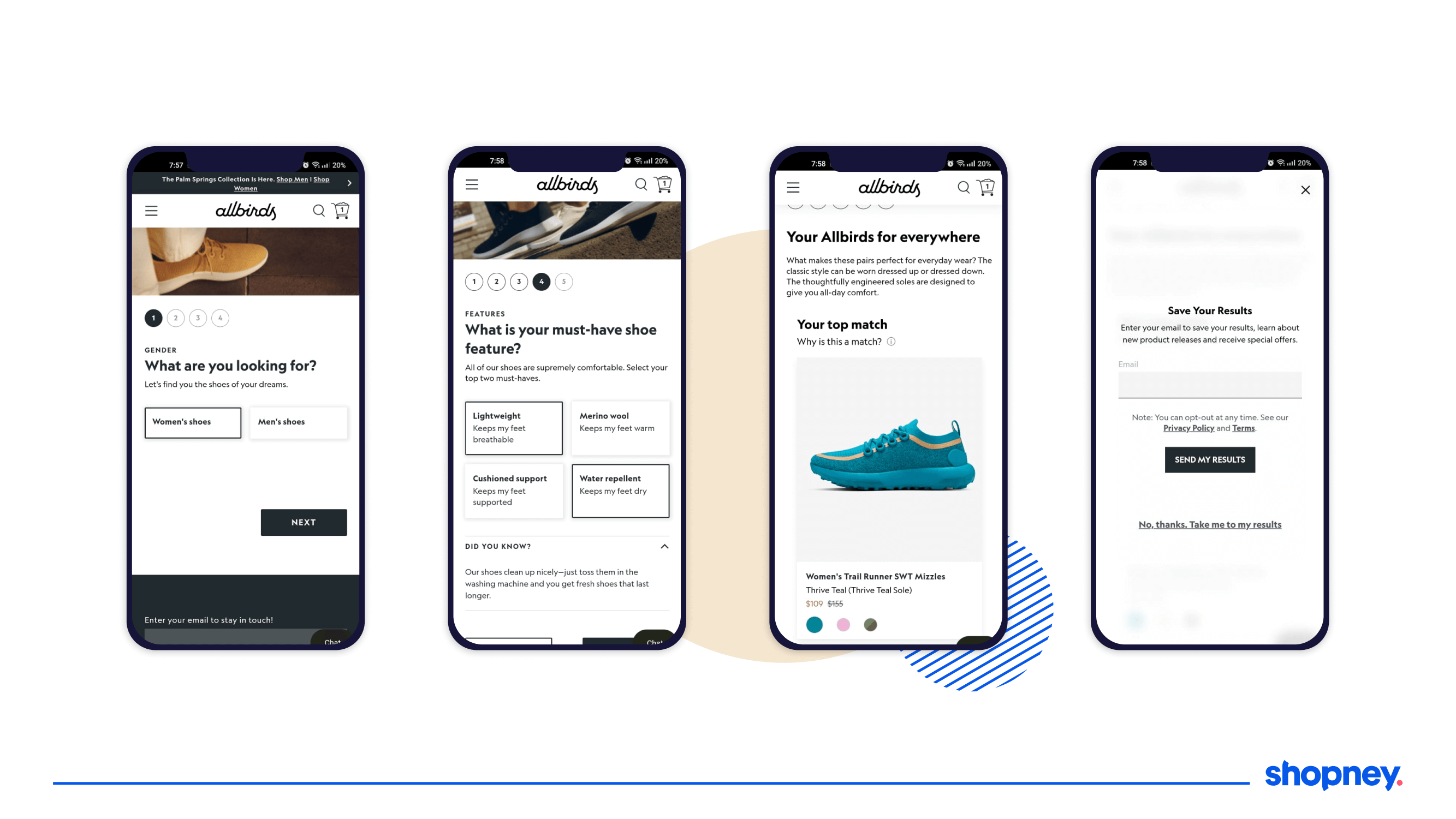
Their ‘Discover Your Perfect Pair’ is a quick and engaging quiz that personalizes their feed and size availability while users explore the Allbirds shopify app.
After selecting your preferred gender, the type of shoe you’re looking for, size and fit, and creating enough desire and curiosity about the results, they also plug in their newsletter subscription which is a great way to build a community and get more subscribers.
The best part- they allow you to circumvent that completely by allowing you to see your results immediately as well AND reassure you of your selections by reminding you on the screen how well their recommended shoes match your needs.
3. Virtual try on feature
One of the biggest hurdles in shopping online is not being able to see how it will look on you on a regular day.
This is where their virtual AR filter comes in handy and does a great job of showing you how the pair will look on your feet as you walk and move!
Several of their customers have spoken about how convenient they find this feature instead of looking for a physical store to try out the shoe.
4. Guided shopping experience
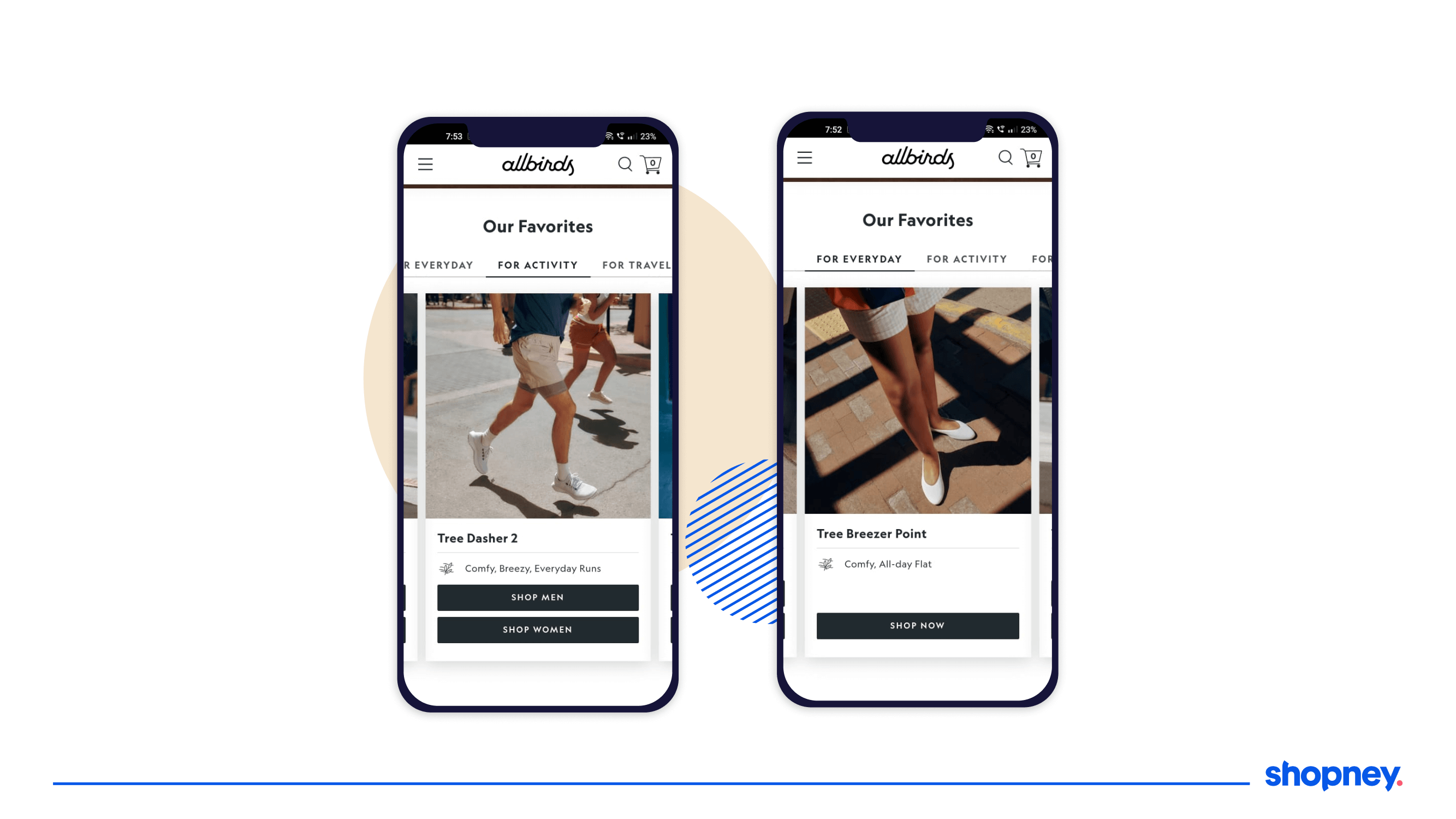
After selecting why you are looking for a particular type of shoe during your onboarding, they also reinforce what each product in their catalog would be good for, helping you refine and select your perfect pair faster.
They do this by sharing the preferred terrain, season, and activity that will work best for each product.
5. Showcasing images in search result options
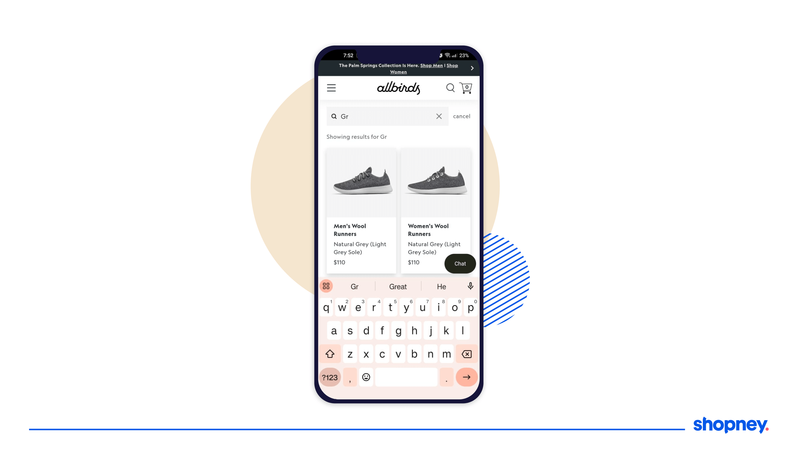
We learned in our post on the best practices for designing your search experience that showing images are more likely to engage your user and nudge them along to the next part of the funnel.
Take a look at how Allbirds mobile app does this for multiple categories with attractive product images that entices you to check them out.
6. Minimal filter overlay screen
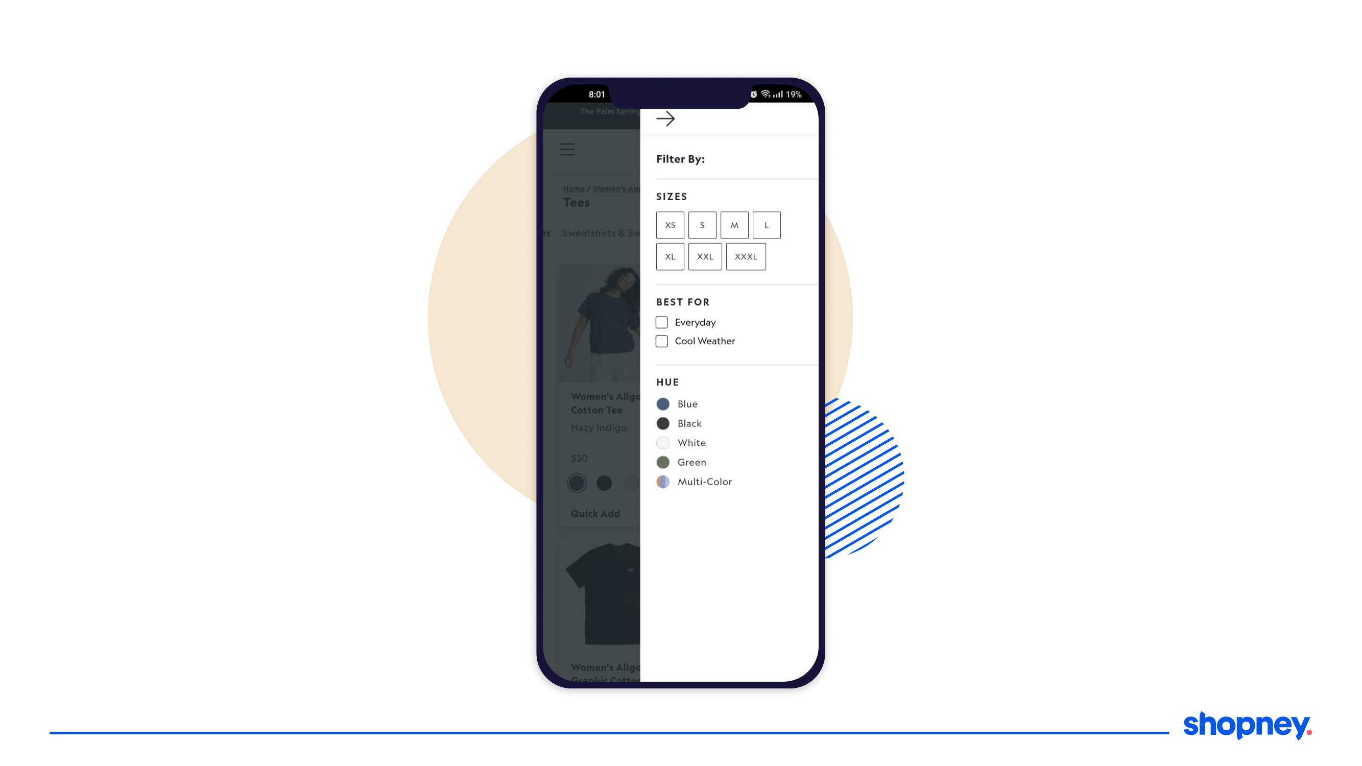
Filters can get overwhelming for users if they are too extensive, colorful, or crowded.
Allbirds’s mobile shopping app has options to sort by size, purpose, material, and color - just enough to narrow down their search without confusing the user.
7. Recently viewed section
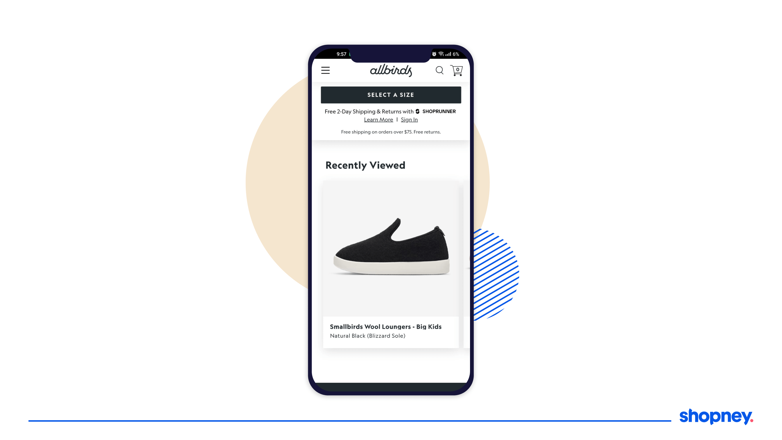
A great idea to implement in your mobile shopping app is to help users quickly jump to their previous searches.
Make sure you include a ‘Recently Viewed’ section to prompt an interested user to explore your app better and convert faster.
8. Optimized product description page
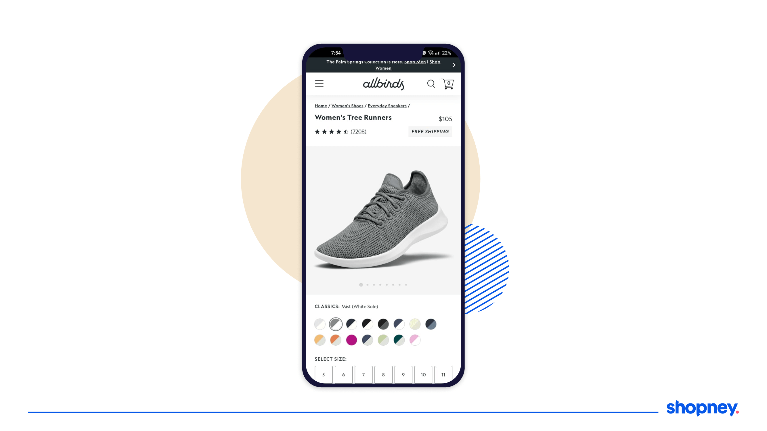
Product pages are notorious for being overwhelming, by having too many details making it difficult to skim- and shoppers have seconds to scroll and scan your PDP and look for cues that reassure them that their choice is a good one.
Allbirds capitalizes on this by ensuring their product pages have just the right amount of information to convince a user, like color, size, and product ‘highlights’ which list the best things about the shoe in terms of material, level of comfort you can expect, and washing instructions.
9. Generous social proof with user reviews
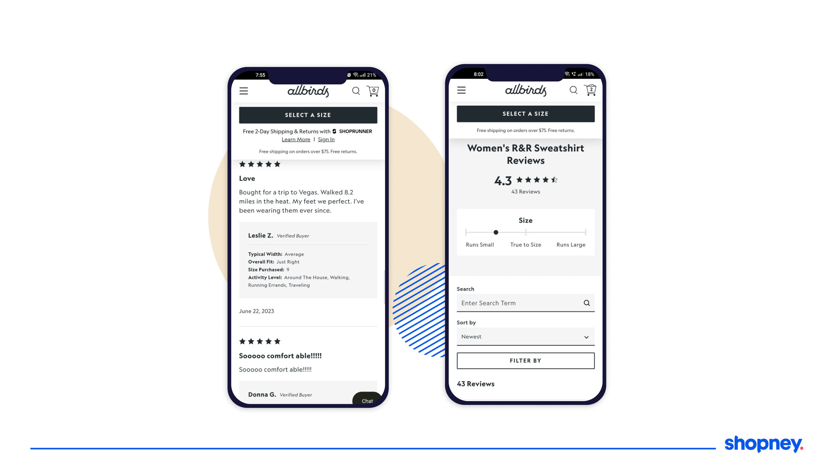
Allbirds isn’t shying away from sharing verified reviews from hundreds of customers and even allows you to search them by having a second search bar under the product details.
If they want to look for all reviews that mention what they are concerned about, they can quickly find it and feel encouraged to buy the sneakers.
Don’t have time to read the reviews? Then their handy visual range meter will tell you the average opinion on sizing most customers shared.
10. Upselling and cross-selling at key points in the funnel
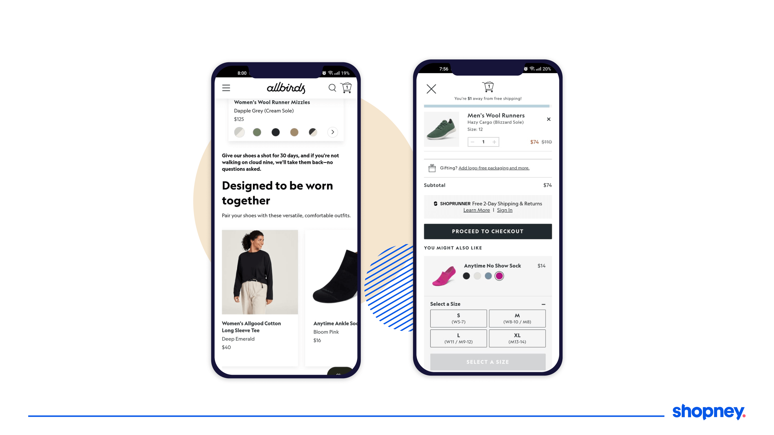
When poorly attempted, cross-selling and upselling can come across too salesy. Allbirds’ mobile shopping app navigates this well by including sections like ‘Also Consider’, ‘Designed to be worn together’, and ‘You might also like’ in its product listing and cart screens.
11. Clean, minimal product shots
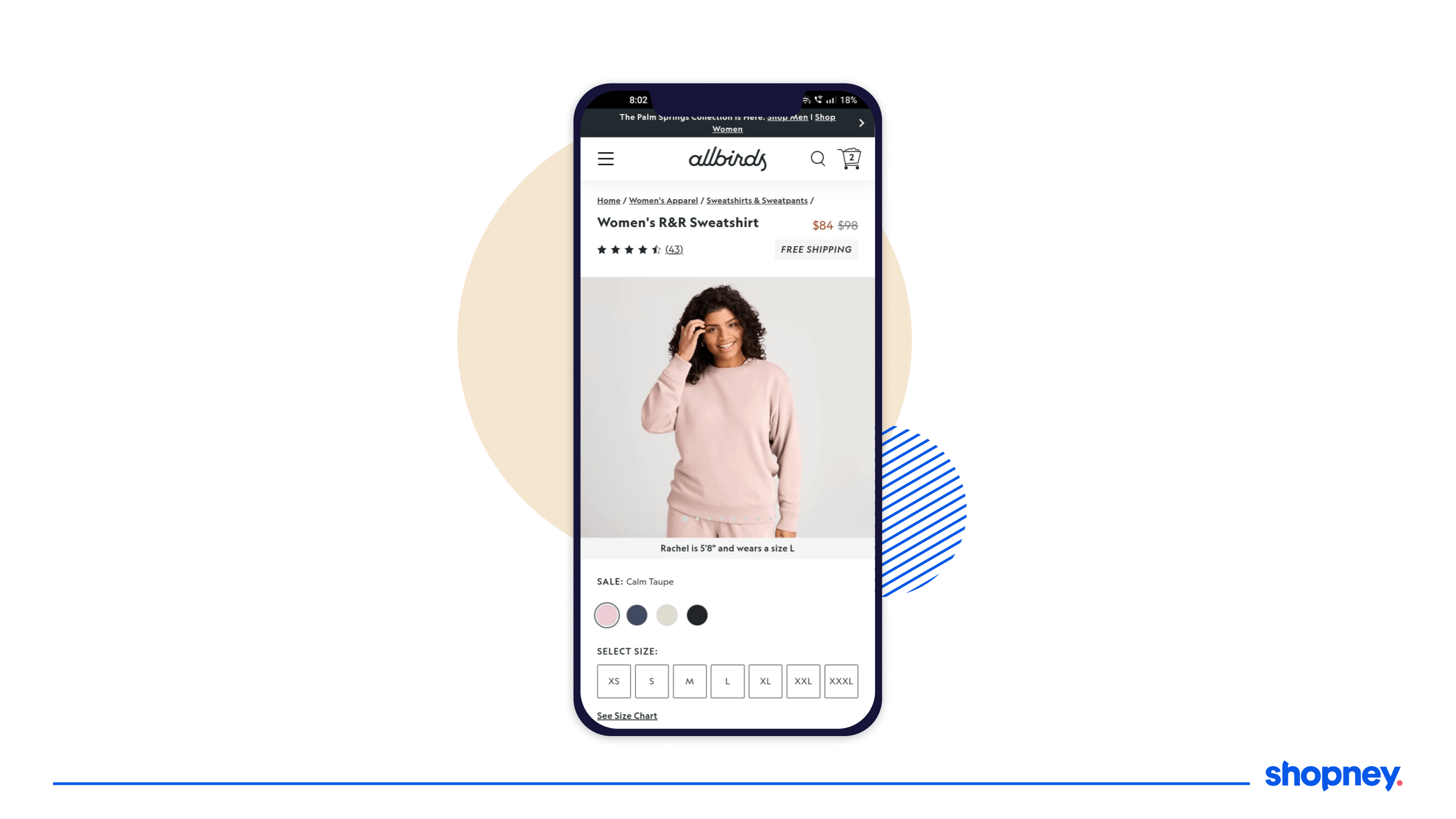
Their home screen sure fires up your dopamine as you scroll and explore with its beautiful and simple shots of their shoes that emphasize their material and comfort.
Even their products that have model photographs reassure the user by stating what their size is and what size of their product is on display, which can help your user imagine how it might look on them.
12. Quick add & change color options on listing page
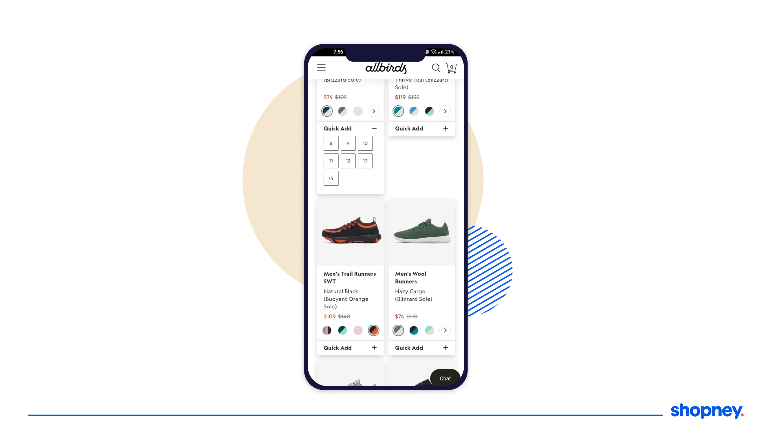
Allbirds wants its users to be quickly able to find what they want, add to their cart and checkout, and design their listing page accordingly.
You can select a different color of your selected shoe and choose your size from its collapsible menu in their ‘Quick Add’ feature, reducing the time and effort to purchase.
13. Simple and minimal cart screen
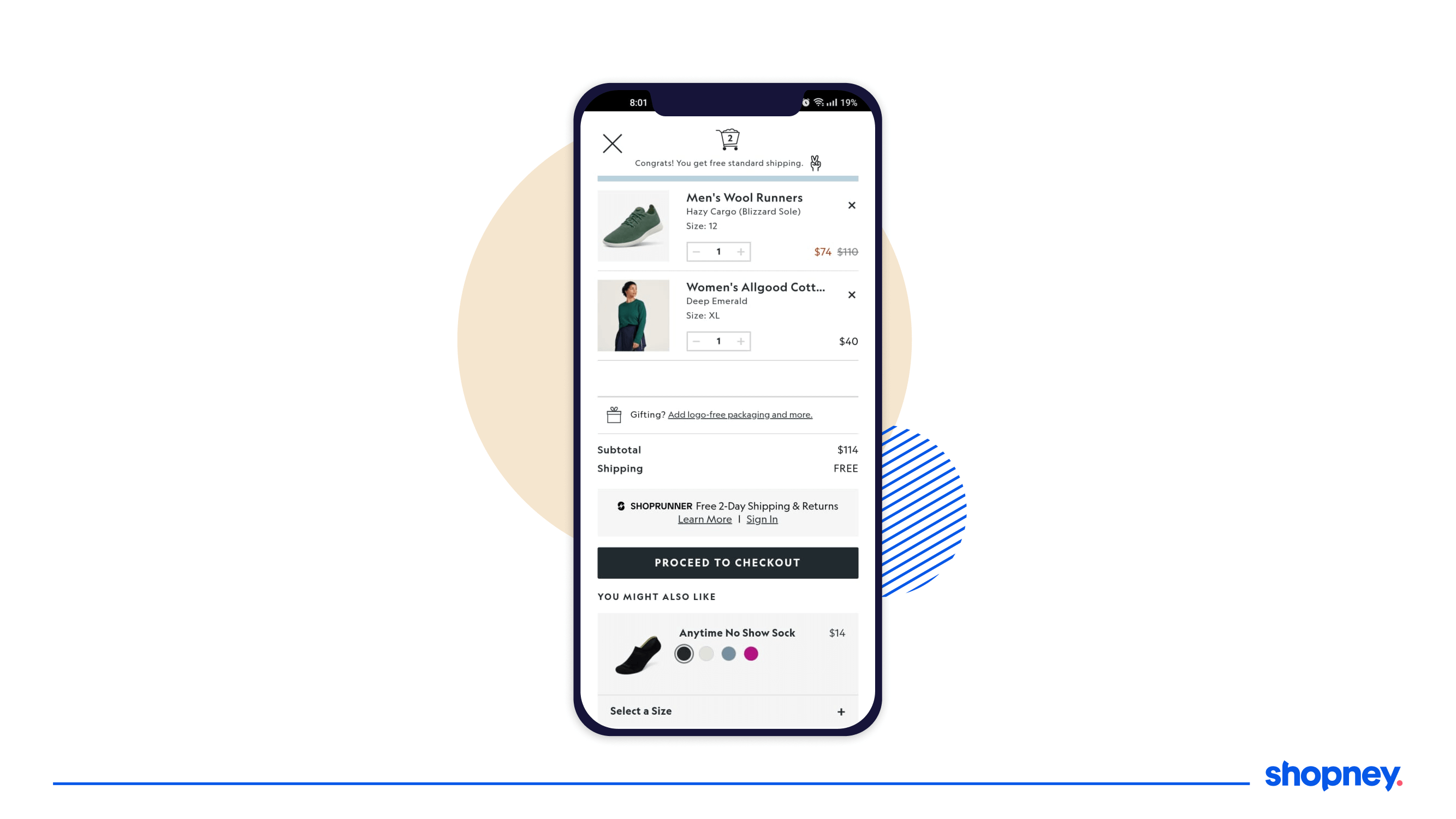
It’s important to remember that your cart and checkout screens are NOT the time to design something visually stimulating.
You want to assure the user their selected items are added to the cart, what would be the shipping charges and how long they can expect their delivery.
Take a look at how Allbirds achieves this through their clean cart UI!
14. Discounted rates in different font colors
Having a sale?
You want to show how much they are saving instantly when they skim.
All birds change the new price font color after the discount, in red, to emphasize savings on their checkout screen which is an excellent design tip to implement in your mobile shopping app.
15. Free shipping eligibility bar
You can simply write what cart value will give the user free shipping- or you can make them want it.
Try out a progress bar on top of your cart page to show the user visually if they’ve met the cart value for free shipping or tempt them to do so by adding another item.
This is why having an up-sell or cross-selling section here would be perfect!
16. Express checkout
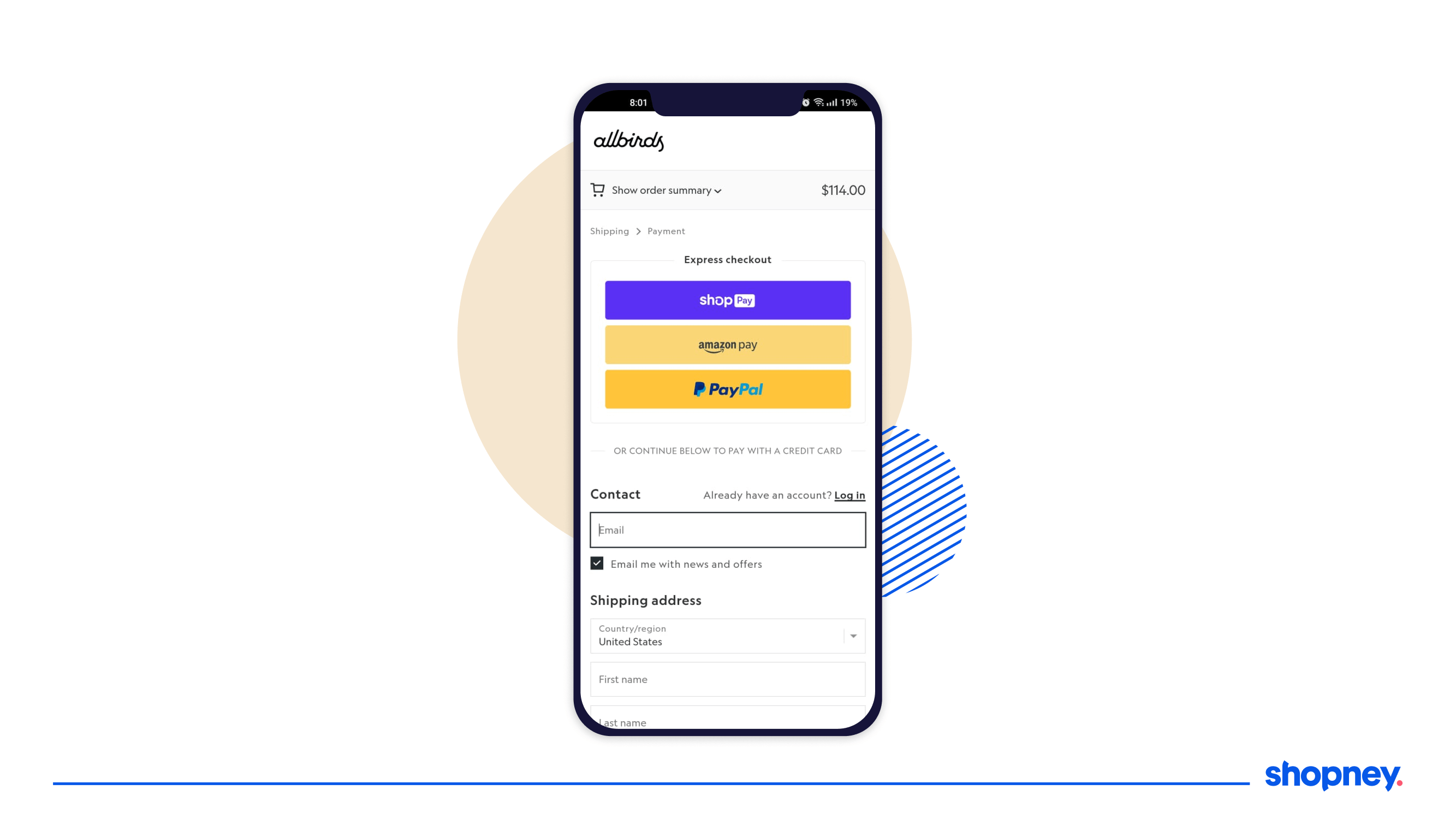
Having a simple checkout flow is essential to increase conversions, Allbirds encourages Apple Pay, Amazon Pay, and Paypal as their primary payment options, making it easy to purchase, while giving the option to select other payment options like debit or credit card.
17. Multiple sections emphasizing sustainability
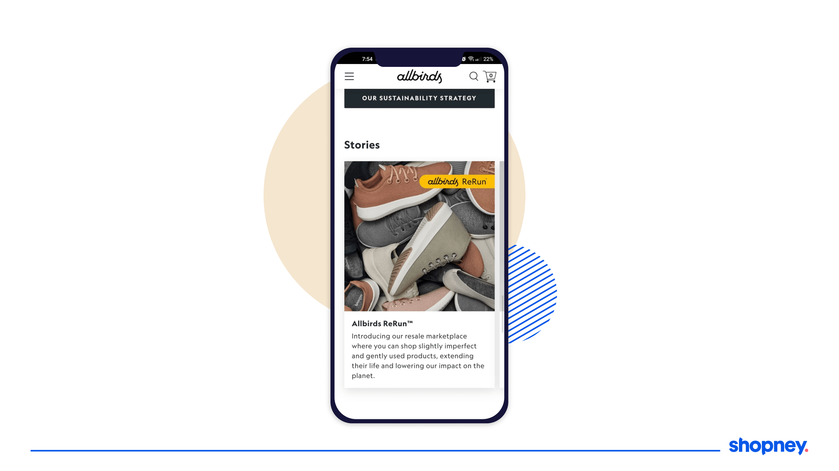
Want more people to explore your app and spend time reading about your branding and policies?
Take inspiration from the Allbirds eCommerce mobile shopping app where they include editorial content plugs talking about their sustainably sourced material, manufacturing policies and centers, and more, of which their ReRun policy that encourages recycling is emphasized.
Set up an eCommerce mobile app like Allbirds with Shopney
If you’ve reached here, then we know you enjoyed the app’s design breakdown.
We also know that designing and creating an engaging and high-converting mobile shopping app is not easy - but we know exactly how we can make it easier for you, not-to-forget, quicker!
Want to design your mobile shopping app with any ahem, all of the features we found inspiring in the Allbirds shopping app?
Get in touch with us!
If using an intuitive drag-and-drop app Shopify mobile app builder coupled with our rich experience in building beautiful app commerce shopping experiences is what you need to quickly launch or optimize your app - book a demo with us.


