Color In Mobile App Design: The Inspiration From Nature

When it comes to human-computer interaction, functionality and design are definitely the keys. Most say that the functionality comes first. But to me, the design is more significant.
Because it is perceived earlier than functionality. And the effect of design on color is undeniable. It helps users see and interpret your app’s content, interact with the correct elements, and understand actions. And the color in UX design has a huge effect on how your users will approach the usability of your interface.
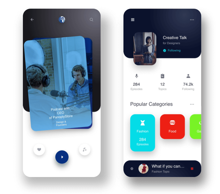
If the colors look appealing, your users will be more tolerant. If not, they'll be more judgmental towards the app. This is human nature. We all react in this way, don't we?
When designing a new app, it’s often difficult to decide on a color scheme, primary colors, and complementary colors. In this article, we will cover what nature has to offer to make it easy and how you can enhance your app UI design.
Get Inspired Of Nature For The Color In Mobile App Design
Observing what others are doing is crucial for any creative business. When it comes to design, be it product design or UI/UX design, nature is the best artist. Because, we, as human beings, are hard-wired to the beauty of nature. That's why the nature-inspired designs have always been appreciated the most.
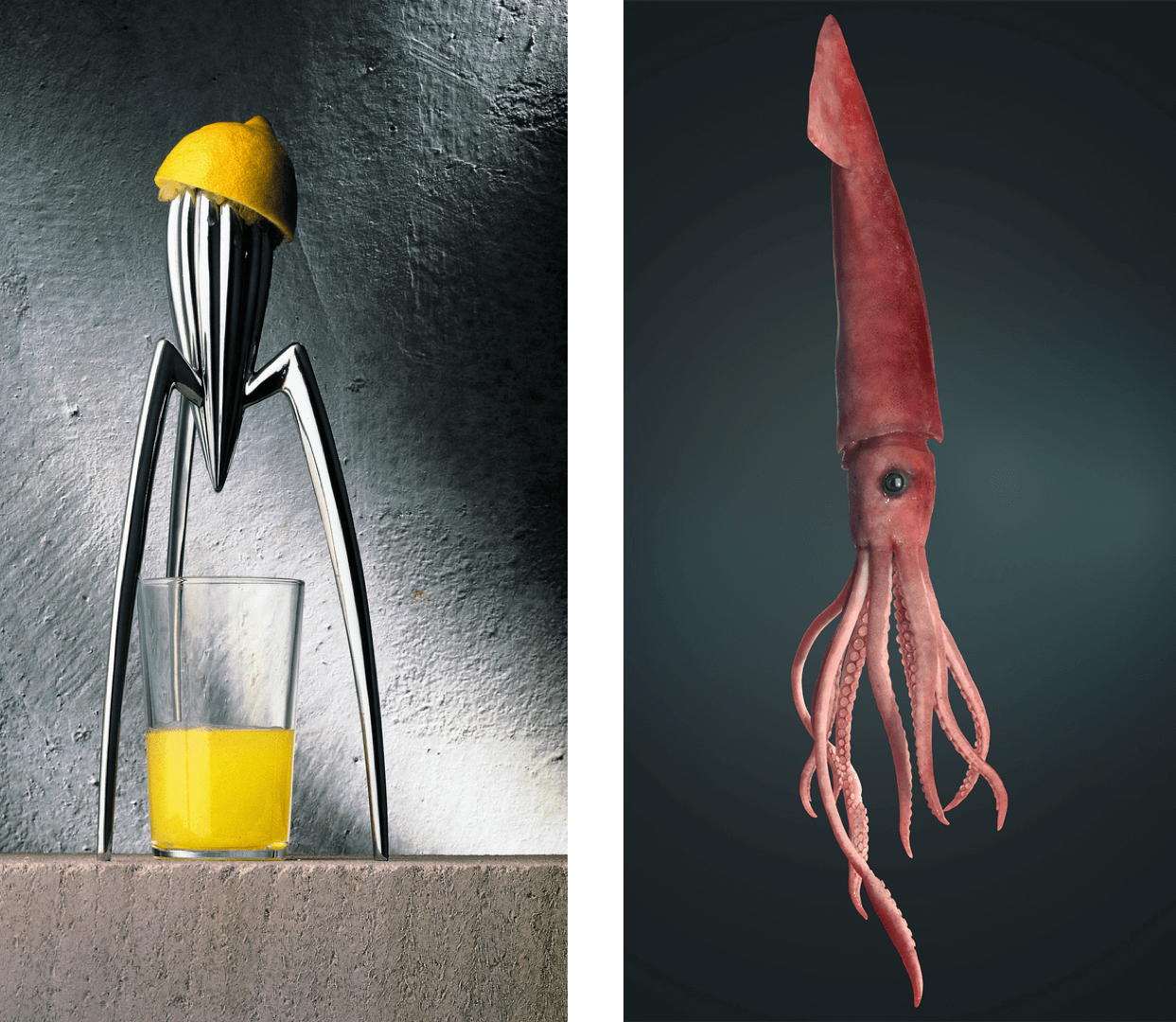
One of the most iconic results of nature-inspired design is Philippe Starck's squeezer. Whatever your opinion, the squid inspired design now ranks among the greatest of modern design with a place in the Museum of Modern Art in New York.
The Only Permanent Color and Design Trend
As you see, nature offers amazing forms to get inspired for your mobile app user interface. When it comes to colors, it has even more to inspire. Have a look at the species below. Aren't they mind-blowing?

I am personally obsessed with the colors of birds. After a quick bird photography tour on Instagram, you don't need to worry about color palette inspiration. You will get more than enough. And it will be fun than spending time in the color wheel of Adobe Color CC. It's a personal technique that I use a lot in design processes. And I recommend you to try as well.
How Can You Select An Effective Color Scheme With Nature Inspiration?
There are several different ways of creating color schemes. You can check out Nick Babich's detailed article about it. I would like to mention those briefly here. But first, let's put the ground rules of color scheme for a great mobile app UI/UX:
- It is not overwhelming to the eye.
- It makes your content easier to understand.
- It features important actions in the mobile app
- It makes a decent contrast between layers and creates harmony.
What Are The Color Scheme Standards?
As I mentioned, there are several ways of creating schemes for color in your mobile app UI. Here they are:
Monochromatic: In this approach, each color is taken from the same base color. They go well together and produce a soothing effect.

Analogous: Analogous color schemes are created from related colors that don’t stand out from one another; one color is used as a dominant color while others are used to enrich the scheme.

Custom: As the the name indicates, the way that you create this type of scheme is all up to you. Adding a bright accent color into an otherwise neutral palette is one of the easiest ways.

How To Create Your Color Palette Inspired By Nature?
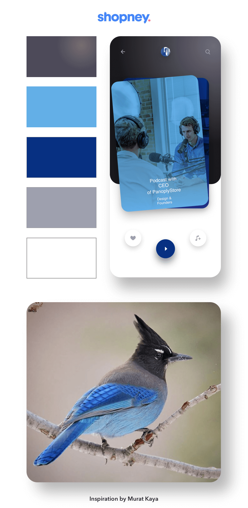
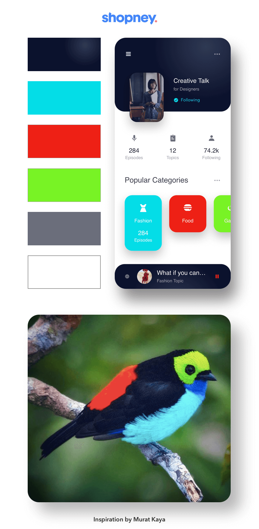
Creating your own custom color schemes is not as complicated as many people think. Actually, with the help of nature's beauty, it is a piece of cake. Here is a set of custom color scheme examples I have prepared for this article. You can also see the picture and name of species that I am inspired by in the images.
What Is The Effect Of Nature In User Interface Design Color?
As you can see, the set colors in the apps' are taking the design into another level. I bet, there are few people who won't like these color palettes and beautiful contrast ratios used in the example mobile app designs above. Because we are hard-wired to nature as I mentioned in the beginning.
Conclusion
I have shared my technique and ideas about a fundamental of color in mobile app design in this article. I hope you find it helpful and inspiring. If you want to master this technique, you need to observe and practice a lot.
And if you liked this piece, please share it with everyone who might be interested!


